🎬 Lesson 16: Three-Point Lighting Setup
Welcome to the cornerstone of professional lighting! Three-point lighting is the gold standard technique used in photography, cinematography, and 3D visualization. This classic setup—consisting of a key light, fill light, and rim light—creates dimensional, professional-looking illumination that brings your subjects to life. Whether you're rendering characters, products, or architectural interiors, mastering three-point lighting will elevate your work from amateur to professional. In this lesson, you'll learn not just how to set up these three lights, but why they work and how to adapt the technique for any situation.
🎯 What You'll Learn
- The history and philosophy of three-point lighting
- Understanding the role of each light: key, fill, and rim
- Setting up classic three-point lighting step-by-step
- Lighting ratios and how they control mood
- Positioning lights for optimal results
- Variations: high-key, low-key, and creative setups
- Adapting three-point lighting for different subjects
- Common mistakes and how to avoid them
- Advanced techniques: four-point and five-point lighting
- Troubleshooting lighting problems
- Complete hands-on project with character lighting
⏱️ Estimated Time: 50-65 minutes
🎯 Project: Create a professional three-point lighting setup for a character
In This Lesson
🎭 Introduction to Three-Point Lighting
Three-point lighting is the foundation of professional lighting. Developed in the early days of cinema and refined over decades, this technique remains the go-to approach for creating dimensional, compelling illumination. Let's understand what makes it so powerful and timeless.
What is Three-Point Lighting?
🔺 The Three-Light Triangle
The concept:
- A lighting technique using three lights positioned around the subject
- Each light has a specific role and purpose
- Together they create dimensional, professional-looking illumination
- Works for portraits, products, characters, interviews—almost anything
The three lights:
- Key Light: Main light source, primary illumination and modeling
- Fill Light: Secondary light that softens shadows created by key
- Rim Light (Back Light): Creates edge highlight for subject separation
Why it works:
- Creates depth through controlled shadows and highlights
- Separates subject from background
- Reveals form and texture through directional lighting
- Provides complete control over contrast and mood
- Predictable, repeatable, professional results
Main illumination
45° to side] --> S F[Fill Light
Shadow softener
Opposite side] --> S R[Rim Light
Edge highlight
Behind subject] --> S style S fill:#FFD93D,stroke:#333,stroke-width:3px,color:#000 style K fill:#667eea,stroke:#333,stroke-width:2px,color:#fff style F fill:#6BCF7F,stroke:#333,stroke-width:2px,color:#000 style R fill:#FF6B9D,stroke:#333,stroke-width:2px,color:#000
History and Origins
🎬 From Hollywood to 3D
The cinematic roots:
- Developed in 1930s-40s Hollywood during the Golden Age of cinema
- Born from necessity: early film stock needed controlled lighting
- Cinematographers refined the technique for consistent, flattering results
- Became standard for portrait photography soon after
Why it became universal:
- Solves the fundamental problem: Flat, single-source lighting looks boring
- Works with human perception: Mimics how we naturally see depth
- Highly adaptable: Can be dramatic or subtle, high or low contrast
- Efficient: Three lights are enough for professional results
Evolution to 3D:
- Translated perfectly to 3D rendering in 1990s-2000s
- Same principles apply whether using real lights or virtual ones
- 3D actually makes it easier—perfect control, no physical limitations
- Standard technique in games, animation, visualization, and VFX
💡 The "Why Three?" Question: Why not two lights? Or four? Three is the minimum needed to achieve complete dimensional control: one light for primary modeling (key), one to control shadow depth (fill), and one for separation (rim). Two lights can't provide all three functions. Four or more can work but are often unnecessary—three is the sweet spot of efficiency and effectiveness.
The Philosophy of Three-Point Lighting
🎨 Understanding the Approach
Core principles:
1. Hierarchy of importance
- Key light is dominant (strongest, most visible)
- Fill light is supportive (softens but doesn't compete)
- Rim light is accent (separates but doesn't illuminate broadly)
- Each light knows its place in the hierarchy
2. Dimensional modeling
- Light from one direction alone creates harsh shadows (dramatic but often unflattering)
- Light from all directions equally creates flatness (no depth, boring)
- Three-point balances dimension with control
- Shadows define form; highlights reveal surface
3. Subject separation
- Subject must visually separate from background
- Rim light creates edge highlight (literal separation)
- Without separation, subject can merge with background
- Depth is created through layering of light and shadow
4. Flexibility within structure
- Three-point is a framework, not rigid rules
- Adjust positions, powers, colors for different effects
- Can be subtle (beauty lighting) or dramatic (film noir)
- Understanding the roles lets you break rules effectively
When to Use Three-Point Lighting
✅ Perfect Scenarios for Three-Point
Ideal for:
- Character/portrait rendering: Faces, busts, full characters
- Product visualization: Items that need dimensional appearance
- Interviews/talking heads: Standard for video/film interviews
- Hero objects: Main focus objects in scenes
- Small to medium subjects: Works best when subject is relatively contained
- Studio/controlled environments: Where you have full lighting control
Less ideal for:
- Large environments: Entire rooms or outdoor landscapes (too many subjects)
- Natural/environmental lighting: When simulating realistic location lighting
- Highly stylized looks: Some artistic styles call for different approaches
- Multiple subjects: Many characters need more complex setups
Adaptations for challenging scenarios:
- Multiple characters: Create three-point for each, or shared key with individual rims
- Large scenes: Use three-point for hero area, broader lighting for environment
- Outdoor scenes: Combine with sun/HDRI, use three-point for close-ups
✅ The Three-Point Mindset
Approach lighting like this:
- Start with darkness: Remove all lights, start from black
- Add key first: Primary illumination defines the look
- Evaluate shadows: Are they too harsh? Too dark?
- Add fill sparingly: Only enough to soften, not eliminate shadows
- Add rim for pop: That edge highlight creates professional separation
- Refine ratios: Adjust relative powers for desired mood
- Iterate: Small adjustments make big differences
Remember: Three-point lighting is about relationships between lights, not absolute values. The ratio of key to fill matters more than specific wattages.
🔑 The Key Light
The key light is the star of your lighting setup—it's the main source of illumination and defines the overall look of your scene. Every other light supports or modifies what the key light establishes. Let's master this essential component.
What is the Key Light?
⭐ The Primary Light Source
Definition and purpose:
- Main light source in the scene (brightest, most visible)
- Establishes primary direction of lighting
- Creates the dominant shadows and highlights
- Defines the overall exposure and brightness
- Sets the mood foundation (other lights modify it)
Characteristics:
- Brightest: Typically 2-4x brighter than fill light
- Directional: Clear angle/direction (not ambient)
- Modeling light: Reveals form and dimension
- Creates primary shadow: This shadow is intentional and important
Visual impact:
- Determines which side of face/object is bright vs. shadowed
- Reveals texture and surface detail through angle
- Establishes time of day/lighting scenario (if motivated)
- Your eye is naturally drawn to key-lit areas
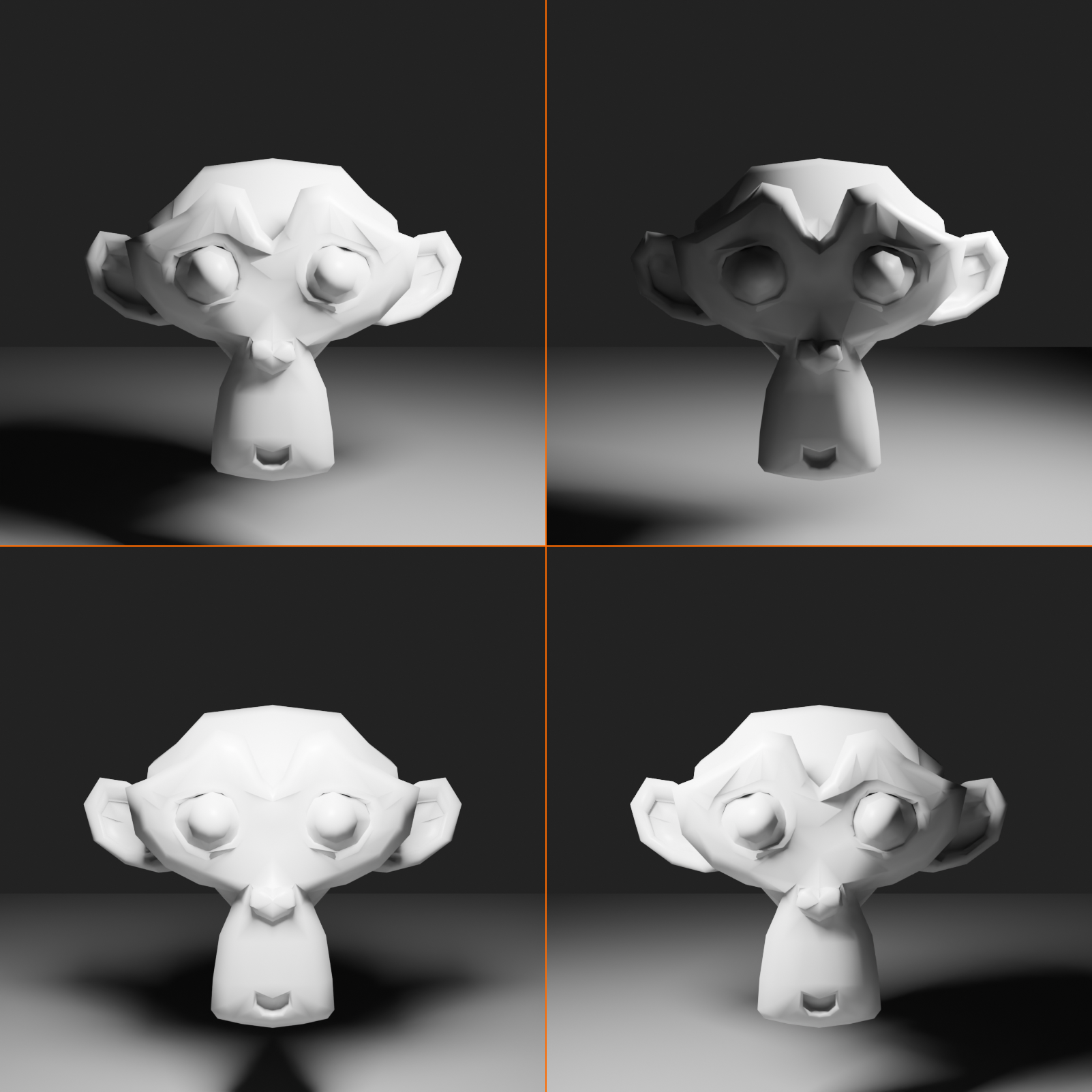
Key Light Positioning
📍 The Classic 45-45 Rule
Standard key light placement:
- Horizontal angle: 30-45° to one side of camera/subject
- Vertical angle: 30-45° above subject's eye level
- Distance: Close enough for soft shadows, far enough for even coverage
- This creates the classic, flattering portrait look
Why this angle works:
- Mimics natural light from sun or window (familiar, comfortable)
- Creates dimension through modeling (one side lit, one side shadowed)
- Above-eye angle is universally flattering (lifts features)
- Shadows fall naturally downward and to side (realistic)
The triangle of light (Rembrandt lighting):
- Classic portrait technique from painter Rembrandt
- Key at 45° creates triangle of light on shadowed cheek
- Highly flattering, adds visual interest
- Look for inverted triangle under far eye on cheek
Alternative positions and effects:
- Higher angle (60-70°): More dramatic, stronger shadows
- Lower angle (15-30°): Softer, more even, less dramatic
- Wider angle (60-90°): Side lighting, very dimensional, dramatic
- Narrow angle (0-15°): Flat, beauty lighting, minimal shadows
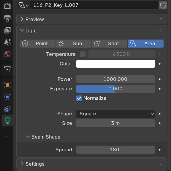
Key Light Settings
⚙️ Configuring Your Key Light
Light type choice:
- Best choice: Area Light (soft, realistic)
- Size: 3-5m for portraits (large = soft shadows)
- Shape: Square or Rectangle (Rectangle can be more flattering)
- Alternative: Spot light (more directional, faster render)
Power/intensity:
- For Area light: 800-1500W typical for portrait
- Should be brightest light in scene (2-4x fill light)
- Adjust based on scene scale and material reflectivity
- Brighter materials (metals) need less power; darker materials need more
Color temperature:
- Neutral/daylight: White (#FFFFFF) - standard, versatile
- Warm: Slight yellow/orange (#FFF8E7) - cozy, sunset, indoor
- Cool: Slight blue (#F0F5FF) - moonlight, clinical, modern
- Match color to story/mood of scene
Shadow settings:
- Shadows: Enabled (absolutely essential!)
- Shadow softness: Controlled by light size (larger = softer)
- Key light shadows should be visible but not harsh
- These shadows create the form and dimension
Common Key Light Mistakes
⚠️ Avoiding Key Light Pitfalls
Mistake 1: Key light directly in front (0° angle)
- Problem: Flat lighting, no dimension, looks amateur
- Fix: Move to 30-45° to one side
- Exception: Beauty/glamour shots can use frontal key if very large/soft
Mistake 2: Key light too low
- Problem: Unflattering upward shadows, spooky look
- Fix: Position 30-45° above eye level
- Remember: Light from below is unnatural (we're used to sun/sky from above)
Mistake 3: Key light too small/harsh
- Problem: Hard, unflattering shadows
- Fix: Use large Area light (3m+) or increase radius
- Larger relative to subject = softer result
Mistake 4: Key light too weak
- Problem: Underexposed subject, muddy appearance
- Fix: Increase power until subject is properly exposed
- Key should be brightest light—don't be timid!
Mistake 5: Key light poorly aimed
- Problem: Important areas in shadow, background over-lit
- Fix: Aim directly at subject's face/focal point
- Use Track To constraint for automatic aiming
💡 The Key Light Philosophy: Think of the key light as the sun in your scene's universe. Everything else exists in relation to it. The key asks: "Where is the primary light coming from?" Once you answer that question convincingly, the rest of the lighting falls into place. A strong, well-positioned key light is 70% of a successful lighting setup.
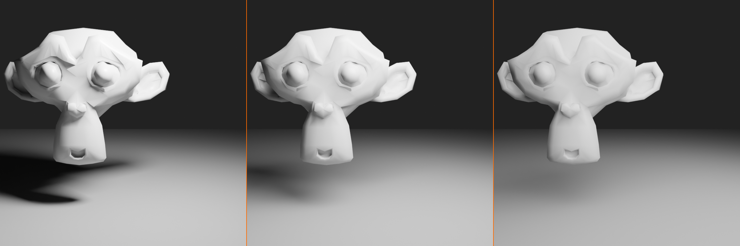
🌙 The Fill Light
The fill light is the unsung hero of three-point lighting—it works quietly in the background to soften harsh shadows without stealing the show. A good fill light is almost invisible, yet its absence would be immediately noticeable. Let's master this subtle but essential component.
What is the Fill Light?
🔆 The Shadow Softener
Definition and purpose:
- Secondary light that reduces shadow density from key light
- Fills in (hence the name) shadowed areas with soft illumination
- Controls contrast between lit and shadowed areas
- Does NOT create its own distinct shadows
- Supports the key light without competing with it
What fill light does:
- Prevents pure black shadows: Adds detail in shadow areas
- Controls lighting ratio: Determines overall contrast
- Reveals subject detail: Shows form even in shadowed areas
- Maintains dimensionality: Softens without eliminating depth
What fill light does NOT do:
- Compete with key: Should never be brighter than key
- Create obvious shadows: Its own shadows should be minimal/invisible
- Change lighting direction: Key's direction remains dominant
- Flatten the image: Properly balanced fill maintains dimension
The fill light paradox:
- When fill is done right, you don't notice it's there
- But remove it, and the image looks harsh and unflattering
- Like a good film score—supports without drawing attention
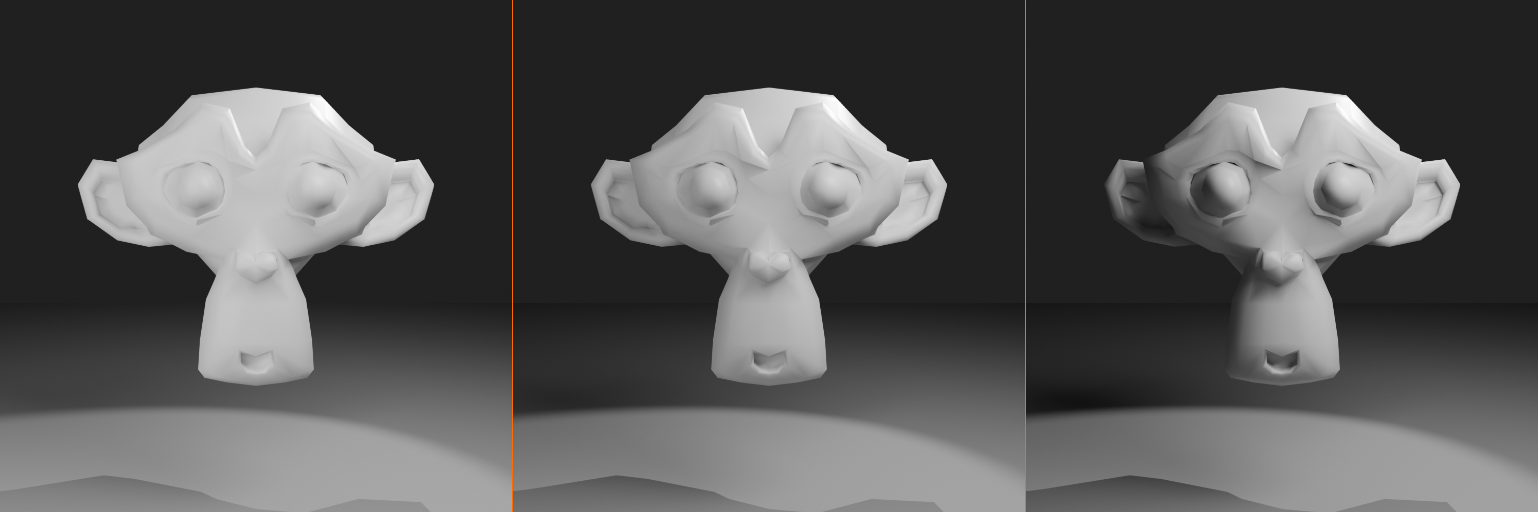
Fill Light Positioning
📍 Placement Guidelines
Standard fill light placement:
- Horizontal position: Opposite side from key light
- If key is 45° to right, fill is 45° to left
- Creates balance and fills key's shadows
- Vertical position: At or slightly below camera/eye level
- Lower than key light (key is higher)
- Near camera axis (frontal fill)
- Sometimes directly behind camera
- Distance: Farther from subject than key
- Greater distance = softer, more even fill
- Or increase light size for softness
Why opposite side from key?
- Key creates shadow on one side; fill illuminates that shadowed side
- Prevents muddy, directionless lighting
- Maintains clear lighting direction while softening contrast
- Creates wrap-around illumination without flatness
Alternative fill positions:
- Camera-mounted fill: Directly behind camera, very soft, minimal shadows
- Use for: Beauty lighting, low-contrast looks
- Most forgiving position
- Bounce fill: Aimed at wall/ceiling, reflects onto subject
- Use for: Ultra-soft, natural-looking fill
- In 3D: Simulate by using very large, dim Area light
- No fill: Dramatic high-contrast look (we'll cover this in variations!)
- Film noir, dramatic portraits
- Embrace the shadows!
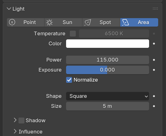
Fill Light Settings
⚙️ Configuring Your Fill Light
Light type choice:
- Best choice: Large Area Light (even larger than key)
- Size: 4-6m or larger (very soft)
- Larger size = softer, more diffused fill
- Alternative: Point light with no shadows
- Fast, simple, but less realistic
- Good for preview/quick setups
Power/intensity:
- Critical rule: Must be dimmer than key light
- Typical: 30-50% of key light power
- Key = 1000W → Fill = 300-500W
- Lighting ratio determines mood:
- 2:1 ratio (fill at 50%): Low contrast, beauty lighting
- 3:1 ratio (fill at 33%): Moderate contrast, standard
- 4:1 ratio (fill at 25%): High contrast, dramatic
- Start at 30-40% and adjust to taste
Shadow settings:
- Shadows: DISABLED (most important setting!)
- Fill should not create competing shadows
- Only illuminates, doesn't cast shadows
- Exception: Very soft shadows OK if fill is huge and subtle
- In Eevee: Uncheck "Shadow" in light properties
- In Cycles: Uncheck "Cast Shadow" (or reduce Shadow Ray Visibility)
Specular control:
- Reduce Specular: 0.2-0.5 (prevents competing highlights)
- Light Properties → Specular: Lower value
- Fill provides diffuse illumination, not shiny highlights
- Key light should have the dominant specular highlights
- Fill highlights would confuse the lighting direction
Color temperature:
- Match key: Same color as key (most common)
- Unified color palette
- Natural, consistent look
- Slightly cooler than key: Subtle color contrast
- Key warm → Fill neutral or cool
- Adds visual interest
- Simulates sky fill (cool) with sun key (warm)
- Avoid strong color difference (looks unnatural)
Getting Fill Light Right
🎯 The Fill Light Balance
Too much fill (overlit):
- Symptoms:
- Image looks flat, no dimension
- Shadows are gray instead of defined
- Can't tell where light is coming from
- Overall washed-out appearance
- Fix: Reduce fill power by 20-30%, embrace shadows
Too little fill (underlit):
- Symptoms:
- Shadows are pure black, no detail visible
- Very high contrast (unless that's the goal!)
- Harsh, unflattering appearance
- Loss of information in shadows
- Fix: Increase fill power or add reflector/ambient light
Just right (balanced):
- Shadows visible but not black—you can see detail in them
- Clear distinction between lit and shadowed areas
- Dimensional form with comfortable contrast
- Fill is invisible—you'd only notice if it were gone
The squint test:
- Squint your eyes while looking at your render
- You should still see clear light vs. shadow areas
- If everything becomes uniform gray → too much fill
- If it's just bright and black blobs → too little fill
- Perfect balance: Clear form with comfortable detail everywhere
✅ Fill Light Quick Setup
Copy this workflow for perfect fill every time:
- Start with key only: Set up key light, render, evaluate shadows
- Identify shadow side: Note which side is in shadow from key
- Add fill opposite key: Place on shadowed side, 45° from center
- Size large: 5m+ Area light for soft fill
- Power at 30% of key: Start conservative
- Disable shadows: Turn off shadow casting
- Reduce specular: Set to 0.3 or lower
- Render and adjust: Increase/decrease until shadows have detail but dimension remains
💡 The Fill Light Wisdom: The fill light is like the supporting actor in a film—it makes the star (key light) look better without stealing the spotlight. A great fill light is so well-integrated that viewers would never consciously notice it, yet the image would feel wrong without it. Master the art of restraint with fill—less is often more.
✨ The Rim Light
The rim light (also called back light, hair light, or edge light) is the finishing touch that transforms a good lighting setup into a great one. It creates that professional "pop" that separates the subject from the background and adds depth to your renders. This is where lighting becomes truly three-dimensional.
What is the Rim Light?
🌟 The Separation Light
Definition and purpose:
- Light positioned behind subject, aimed at edges
- Creates bright highlight along subject's outline/edges
- Separates subject from background visually
- Adds depth and three-dimensionality
- Also called: back light, edge light, hair light, kicker
What rim light creates:
- Edge highlight: Bright line along subject's silhouette
- Visual separation: Subject "pops" off background
- Dimensional depth: Third light creates Z-axis depth
- Professional polish: Signature of high-end lighting
- Hair definition: Especially important for characters (hence "hair light")
Why rim light matters:
- Without rim: Subject can merge with background (flat, 2D appearance)
- With rim: Clear foreground/background separation (3D depth)
- Particularly crucial when subject and background are similar values
- That edge glow is what makes professional renders look professional
Rim Light Positioning
📍 Behind and Above
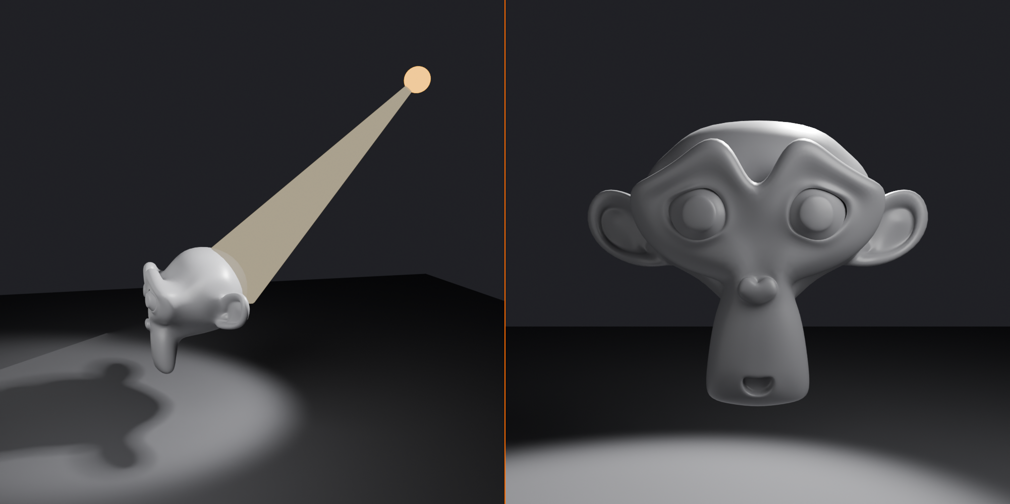
Standard rim light placement:
- Horizontal position: Behind subject, 30-45° from directly behind
- Not directly behind (would hide light completely)
- Slightly to one side (often same side as key for cohesion)
- Vertical position: Above and behind subject
- 45-60° above horizontal
- Shines down and forward onto edges
- Creates that iconic hair/shoulder highlight
- Aiming: At subject's edges (hair, shoulders, outline)
- Should graze the edges, not illuminate front
- Light the "halo" not the face
The rim light triangle:
- Think of camera → subject → rim light as a triangle
- Camera at front, rim at back corner
- Rim "separates" subject from camera's view
- Creates that all-important edge definition
Common rim positions:
- Upper back-right: If key is front-left (classic asymmetry)
- Upper back-left: If key is front-right
- Directly behind: Centered rim for halo effect (more stylized)
- Double rim: One on each back corner (advanced, dramatic)
Height variations:
- High (60°+): Top-of-head/hair highlight, strong separation
- Medium (45°): Balanced hair and shoulder highlight, standard
- Low (30°): More shoulder, less hair, broader effect
Rim Light Settings
⚙️ Configuring Your Rim Light
Light type choice:
- Option 1: Spot Light (common choice)
- Focused beam, precise control
- Spot Size: 30-50° (narrow to medium)
- Blend: 0.3-0.5 (moderate edge softness)
- Great for controlled edge highlights
- Option 2: Small-Medium Area Light
- Size: 1-2m (smaller than key/fill)
- Softer, more natural edge glow
- Slightly slower to render
- Choose based on desired effect:
- Sharp, defined edge → Spot
- Soft, glowing edge → Area
Power/intensity:
- Typical range: 50-100% of key light power
- Can be as bright as key (rim isn't frontal, so doesn't compete)
- Sometimes even brighter for dramatic edge glow
- Spot Light: 400-800W common
- Area Light: 500-1000W common
- Adjust for effect:
- Subtle rim: 50% of key power
- Standard rim: Equal to key power
- Dramatic rim: 150% of key power
Color temperature:
- Option 1: Match key (most common)
- Unified color scheme
- Cohesive lighting direction
- Option 2: Complementary to key (creative)
- Warm key → Cool rim (or vice versa)
- Adds visual interest and separation
- Common: Warm sun key, cool sky rim
- Option 3: Motivated color
- Blue if representing sky/moonlight
- Orange if representing sunset/fire
- Match the story of where rim light "comes from"
Shadow settings:
- Shadows: ENABLED (opposite of fill!)
- Rim should cast shadows (helps sell the lighting)
- These shadows typically fall forward, away from camera
- Usually not visible in final frame (behind subject)
Diffuse vs. Specular balance:
- Diffuse: 1.0 (normal) or reduce to 0.5-0.7
- Lower diffuse = rim creates highlight without brightening matte surfaces much
- Specular: 1.0 or increase to 1.5-2.0
- Higher specular = stronger edge highlights on glossy surfaces
- Great for emphasizing hair, metal, wet surfaces
Rim Light Effects and Variations
🎨 Creative Rim Techniques
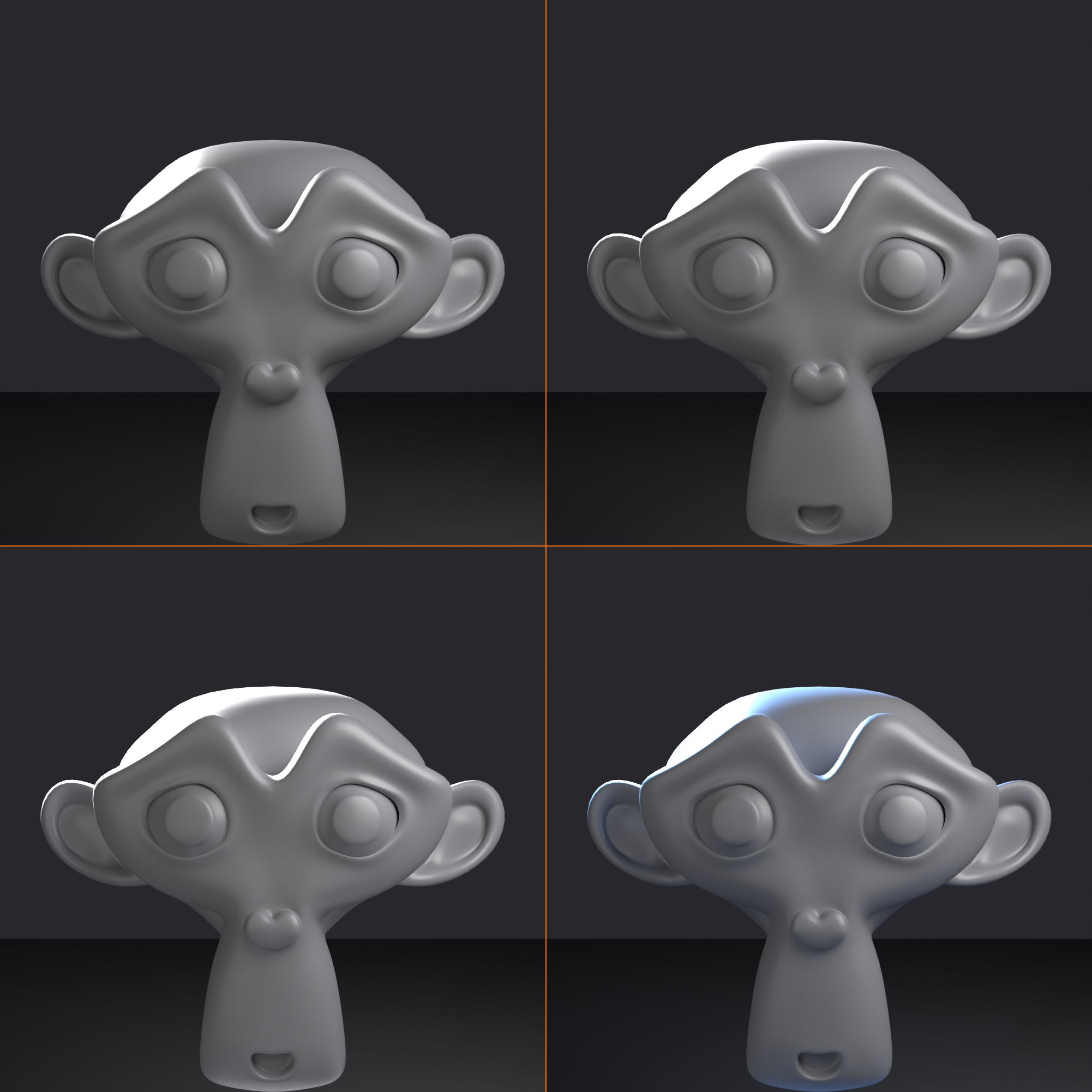
The subtle rim:
- Barely visible edge glow
- Natural, understated separation
- Power: 50-70% of key
- Use for: Realistic, documentary-style lighting
The standard rim:
- Clear edge highlight, professional look
- Visible but not overpowering
- Power: Equal to key light
- Use for: Most portrait/product work, standard setup
The dramatic rim:
- Bright, glowing edge outline
- Theatrical, high-impact
- Power: 150-200% of key
- Use for: Action shots, dramatic portraits, hero moments
Double rim (four-point lighting):
- Two rim lights, one on each back corner
- Complete edge highlight around subject
- More complex but stunning result
- Use for: High-end product shots, glamour portraits
Colored rim effects:
- Blue rim: Cool, modern, sci-fi, moonlight
- Orange/red rim: Warm, sunset, fire, dramatic
- Green/purple rim: Stylized, fantasy, unnatural
- Rainbow rim: Multiple colored rims for creative/music video look
⚠️ Common Rim Light Mistakes
Mistake 1: Rim too bright (over-rimmed)
- Problem: Glowing halo overpowers subject, looks artificial
- Fix: Reduce power to match or slightly exceed key
- Remember: Rim should enhance, not dominate
Mistake 2: Rim illuminating face (wrong aim)
- Problem: Rim lights front of face, looks like second key
- Fix: Aim at edges only—hair, shoulders, outline
- Adjust position farther back and/or higher
Mistake 3: No rim light at all
- Problem: Subject merges with background, lacks depth
- Fix: Add rim! Even subtle rim makes huge difference
- This is often the missing piece in amateur lighting
Mistake 4: Rim from wrong angle
- Problem: From front = not rim; from side = just another key
- Fix: Must be behind subject (30-45° from dead center back)
- Should create edge glow, not frontal illumination
Mistake 5: Rim too diffuse (no definition)
- Problem: Soft, scattered light instead of crisp edge
- Fix: Use Spot or smaller Area light
- Rim should be focused on edges, not broad illumination
✅ Perfect Rim Light Workflow
- Set up key and fill first: Get front lighting right before adding rim
- Position behind subject: 30-45° from dead center, 45° above
- Aim at edges: Target hair, shoulders, outline (not face)
- Start bright: Match key light power initially
- Check edge highlight: Should see bright outline in render
- Adjust power: Reduce if too bright, increase if too subtle
- Fine-tune position: Small angle changes = big effect
- Consider color: Try warm or cool for added interest
💡 The Rim Light Revelation: Professional photographers and cinematographers guard their rim light secrets closely because it's what gives their work that "expensive" look. The rim light is the difference between a snapshot and a professional portrait. It's the finishing touch that says "I know what I'm doing." Never skip the rim—it's the signature of professional lighting.
⚖️ Lighting Ratios and Mood
Lighting ratios—the relationship between key and fill light intensities—are the secret to controlling mood and atmosphere in your scenes. This mathematical relationship determines whether your lighting feels bright and cheerful or dark and mysterious. Let's master this crucial concept.
Understanding Lighting Ratios
📊 The Key-to-Fill Relationship
What is a lighting ratio?
- Mathematical relationship between key light and fill light intensity
- Expressed as ratio: 2:1, 3:1, 4:1, etc.
- First number = key light side brightness
- Second number = fill light side (shadow area) brightness
- Controls overall contrast in the image
How to calculate:
- 2:1 ratio: Fill is 50% power of key
- Key = 1000W, Fill = 500W
- Shadow side is half as bright as lit side
- 3:1 ratio: Fill is 33% power of key
- Key = 1000W, Fill = 333W
- Shadow side is one-third as bright
- 4:1 ratio: Fill is 25% power of key
- Key = 1000W, Fill = 250W
- Shadow side is one-quarter as bright
Why ratios matter more than absolute values:
- 1000W key + 500W fill = same look as 100W key + 50W fill
- The relationship between lights determines contrast, not individual powers
- Think in ratios, not watts

Common Lighting Ratios
🎨 Ratio Guide for Different Moods
1:1 Ratio (No contrast - flat lighting)
- Setup: Key and fill equal power, or very strong ambient
- Appearance: No visible shadows, completely flat
- Use for: Scientific documentation, passport photos
- Mood: Neutral, clinical, no emotion
- Avoid for: Almost everything else (too flat!)
2:1 Ratio (Low contrast - beauty lighting)
- Setup: Fill at 50% of key power
- Appearance: Very soft shadows, gentle modeling
- Use for: Beauty shots, commercial portraits, flattering lighting
- Mood: Soft, positive, approachable, gentle
- Best for: When you want to minimize flaws and maximize flattery
3:1 Ratio (Medium contrast - standard portrait)
- Setup: Fill at 33% of key power
- Appearance: Visible but pleasant shadows, good dimension
- Use for: Standard portraits, general photography, most scenarios
- Mood: Balanced, natural, professional
- Best for: Your default starting point—works for almost everything
4:1 Ratio (High contrast - dramatic)
- Setup: Fill at 25% of key power
- Appearance: Strong shadows, high contrast
- Use for: Dramatic portraits, character shots, artistic work
- Mood: Serious, intense, mysterious, powerful
- Best for: When drama and impact are more important than flattery
8:1 Ratio and beyond (Very high contrast - film noir)
- Setup: Very weak fill (12.5% or less) or no fill at all
- Appearance: Deep black shadows, extreme contrast
- Use for: Film noir, horror, extreme drama, silhouettes
- Mood: Dark, mysterious, dangerous, theatrical
- Best for: Stylized, artistic projects where realism isn't the goal
Choosing the Right Ratio
🎯 Matching Ratio to Purpose
For product visualization:
- General products: 2:1 to 3:1 (show detail, minimize harsh shadows)
- Luxury products: 3:1 to 4:1 (more dramatic, premium feel)
- Technical products: 2:1 (clarity and visibility of all features)
For character/portrait work:
- Beauty/glamour: 2:1 (soft, flattering)
- Standard portrait: 3:1 (natural, professional)
- Character portrait: 3:1 to 4:1 (personality, dimension)
- Villain/dramatic: 4:1 to 8:1 (menacing, powerful)
For narrative/storytelling:
- Happy/positive scene: 2:1 to 3:1 (bright, open)
- Neutral scene: 3:1 (standard, balanced)
- Tense/conflict scene: 4:1 (increased drama)
- Dark/threatening scene: 8:1+ (ominous, dangerous)
Time of day considerations:
- Bright daylight: 2:1 to 3:1 (sun + sky fill creates low contrast)
- Overcast day: 2:1 (very diffused, soft)
- Late afternoon: 3:1 to 4:1 (more directional sun)
- Night/low light: 4:1 to 8:1+ (limited fill sources)
High-Key vs. Low-Key Lighting
🔆 Understanding Key Terminology
High-Key Lighting:
- Definition: Low contrast, bright overall, minimal shadows
- Ratio: 2:1 or less
- Characteristics:
- Most of image is well-lit
- Soft, gentle shadows
- Bright, positive feel
- Lots of white and light tones
- Use for: Comedies, commercials, beauty shots, optimistic content
- Examples: Sitcoms, product ads, fashion photography
Low-Key Lighting:
- Definition: High contrast, lots of shadow, dramatic
- Ratio: 4:1 or higher
- Characteristics:
- Large areas of shadow/darkness
- Strong, defined shadows
- Mysterious, dramatic feel
- Lots of black and dark tones
- Use for: Film noir, horror, thrillers, dramatic portraits
- Examples: Detective films, psychological thrillers, moody portraits
Mid-Key Lighting (normal):
- Definition: Balanced contrast, natural appearance
- Ratio: 3:1
- Characteristics: Mix of light and shadow, realistic
- Use for: Most content, standard approach
✅ Working with Ratios in Blender
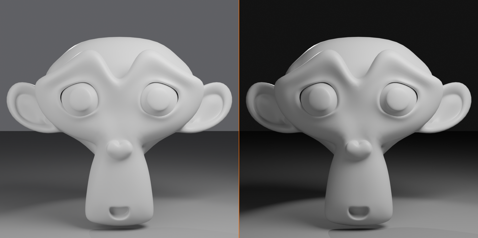
Practical ratio workflow:
- Set key light power first: Get subject properly exposed (e.g., 1000W)
- Decide on desired ratio: Choose based on mood (start with 3:1)
- Calculate fill power:
- 2:1 → Fill = Key × 0.5
- 3:1 → Fill = Key × 0.33
- 4:1 → Fill = Key × 0.25
- Set fill light to calculated value: (e.g., 330W for 3:1 ratio)
- Render and evaluate: Does it match the mood you want?
- Adjust by feel: Numbers are starting points, trust your eyes!
💡 The Ratio Reality: Cinematographers and photographers obsess over ratios because they're the language of mood. A director might say "make it feel more optimistic"—the DP translates that to "2:1 ratio." "Make it darker and more threatening"—that's "8:1 ratio." Once you internalize what different ratios feel like, you can dial in the exact emotional tone your scene needs. The ratio is your mood dial.
📐 Positioning and Angles
The exact placement of your three lights can make or break your setup. Small changes in position create dramatically different results. Let's understand the geometry of three-point lighting and how to position lights for maximum effect.
The Classic Triangle Setup
🔺 Spatial Relationships
Top-down view (bird's eye):
- Camera: At front, facing subject
- Key light: 30-45° to one side of camera
- Forms one point of triangle
- Camera → Subject → Key Light = triangle
- Fill light: Opposite side from key, 30-45° from camera
- Often closer to camera axis than key
- Can be directly behind camera
- Rim light: Behind subject, 30-45° from center back
- Often on same side as key for cohesion
- Forms back point of larger triangle
Side view (profile):
- Key light: 30-45° above eye level
- Shines down and forward at subject
- Creates downward shadows (natural, flattering)
- Fill light: At or below eye level
- More horizontal than key
- Lifts shadows without creating own shadows
- Rim light: 45-60° above subject
- Shines down and forward onto top/back edges
- Highest of the three lights
45° right] -->|Main Light| S F[Fill Light
45° left] -->|Shadow Fill| S R[Rim Light
Behind] -->|Edge Light| S end style S fill:#FFD93D,stroke:#333,stroke-width:3px style K fill:#667eea,stroke:#333,stroke-width:2px,color:#fff style F fill:#6BCF7F,stroke:#333,stroke-width:2px style R fill:#FF6B9D,stroke:#333,stroke-width:2px style C fill:#888,stroke:#333,stroke-width:2px,color:#fff
Distance Considerations
📏 How Far Should Lights Be?
Key light distance:
- Close (1-2m): Very soft light, strong falloff
- Good for: Close-up portraits, intimate lighting
- Creates: Very soft shadows, gentle wrap
- Medium (3-5m): Standard setup distance
- Good for: Most portrait/product work
- Creates: Balanced softness and coverage
- Far (6m+): Harder light, more even coverage
- Good for: Full-body shots, multiple subjects
- Creates: More directional, harder shadows
- Remember: Closer = softer (light is relatively larger)
Fill light distance:
- Often farther than key light
- Greater distance = softer, more even fill
- Can be very far (8-10m) for ultra-soft fill
- Or use much larger light at same distance as key
Rim light distance:
- Can be closer than key (3-4m typical)
- Distance less critical (lighting edges, not front)
- Adjust to get desired edge highlight intensity
Height and Angle Variations
⬆️ Vertical Positioning Effects
High key light (60°+ above):
- Effect: Strong downward shadows, dramatic
- Use for: Dramatic portraits, mysterious mood
- Caution: Can create unflattering shadows under eyes/nose
Standard key light (30-45° above):
- Effect: Natural, flattering, balanced
- Use for: Most situations—your default
- Why it works: Mimics natural overhead light (sun, ceiling lights)
Low key light (15-30° above):
- Effect: Soft, even, minimal shadows
- Use for: Beauty lighting, glamour, commercial
- Benefit: Very flattering, minimizes flaws
Eye-level key light:
- Effect: Flat, straight-on lighting
- Use for: Specific stylized looks only
- Usually avoid: Lacks dimension
Below eye-level key light:
- Effect: Spooky, unnatural, horror-movie
- Use for: Horror, villain reveals, campfire stories
- Why it's unsettling: Reverses natural lighting (we expect light from above)

Adapting to Subject Position
🎯 Subject-Specific Adjustments
For seated subjects:
- Key light slightly higher (compensate for seated height)
- Ensure rim clears chair back
- May need to adjust distances (closer overall)
For standing subjects:
- Standard angles work well
- Consider full-body lighting (key farther back for even coverage)
- Multiple rim lights for top and bottom separation
For product/objects:
- Key from top-side (shows form and surface)
- Lower height OK (objects don't have "flattering" angles like faces)
- Rim often from directly above (top highlight)
For groups/multiple subjects:
- Key light farther back to cover everyone
- May need multiple rim lights (one per person)
- Consider broader, more even lighting approach
✅ Position Quick Reference
Default three-point setup (portrait):
- Key: 45° to right, 40° above, 4m distance
- Fill: 45° to left, 20° above, 5m distance
- Rim: 40° behind right, 50° above, 3m distance
Start here, then adjust to taste!
🎨 Lighting Variations
While classic three-point lighting is versatile, different situations call for variations on the formula. Let's explore how to adapt the technique for different moods, styles, and creative effects.
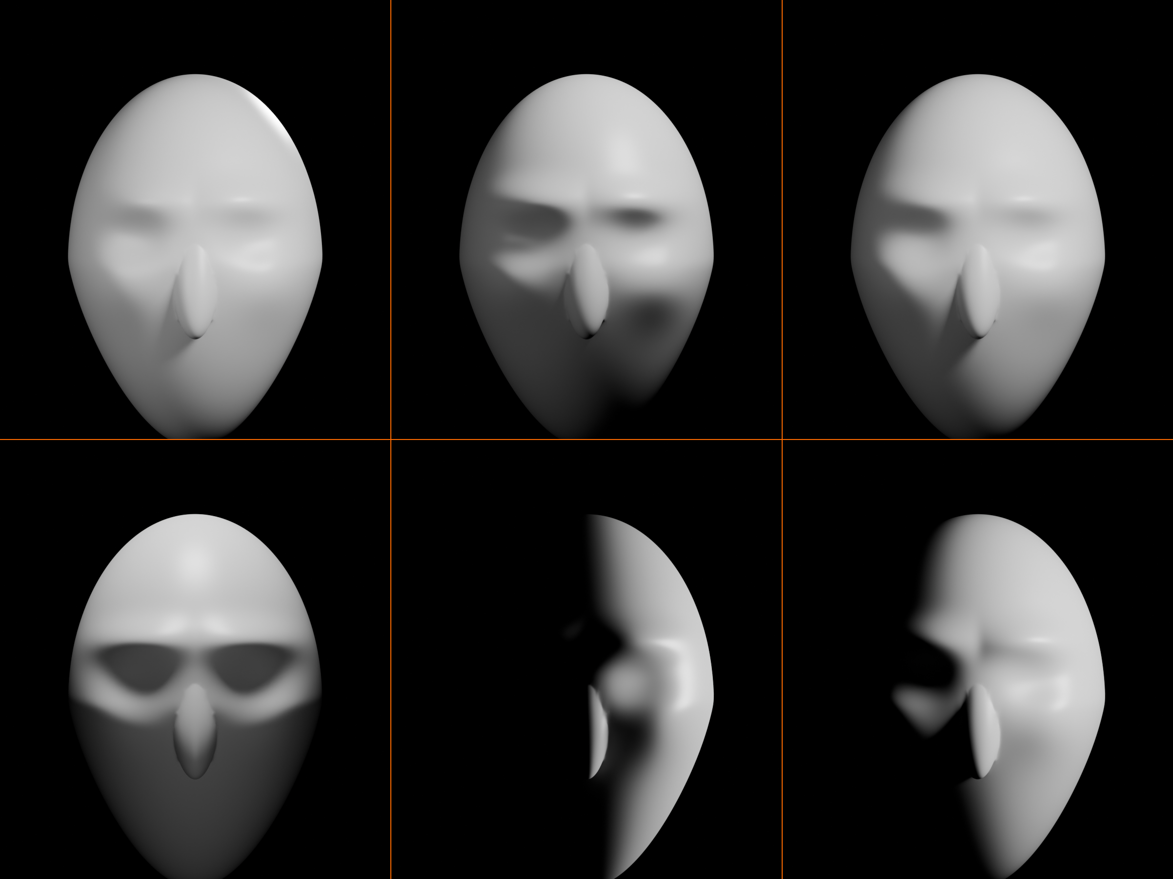
High-Key Portrait Lighting
✨ Bright and Beautiful
Setup characteristics:
- Ratio: 2:1 (very low contrast)
- Key: Large area light (5m+), 30° angle, moderate power
- Fill: Very large area light (6m+), high power (50% of key)
- Rim: Soft, subtle rim or omit entirely
- Background: Brightly lit (white or light background)
Purpose and mood:
- Flattering, minimizes imperfections
- Cheerful, optimistic, positive
- Commercial, beauty, fashion photography
- Emphasizes subject, de-emphasizes form
When to use:
- Beauty and glamour shots
- Product advertising (clean, bright)
- Corporate headshots
- Happy, uplifting content
Low-Key Dramatic Lighting
🌑 Dark and Moody
Setup characteristics:
- Ratio: 8:1 or higher (very high contrast)
- Key: Medium area or spot, 60° angle, strong and directional
- Fill: Very minimal or none (embrace the shadows!)
- Rim: Strong, bright rim for dramatic separation
- Background: Dark or black (let it fall to shadow)
Purpose and mood:
- Mysterious, dramatic, intense
- Emphasizes form through shadow
- Film noir, thriller, horror aesthetic
- Selective illumination (what's hidden matters as much as what's shown)
When to use:
- Dramatic character portraits
- Film noir style
- Villain or antagonist reveals
- Moody, atmospheric scenes
Pro technique - split lighting:
- Key from 90° to side (straight side lighting)
- No fill at all
- One half of face lit, one half in complete shadow
- Extremely dramatic, good vs. evil visual
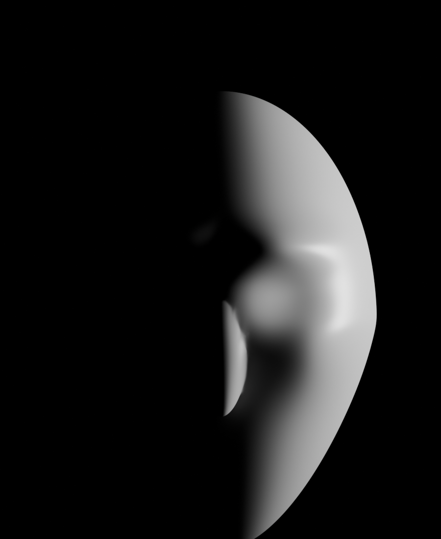
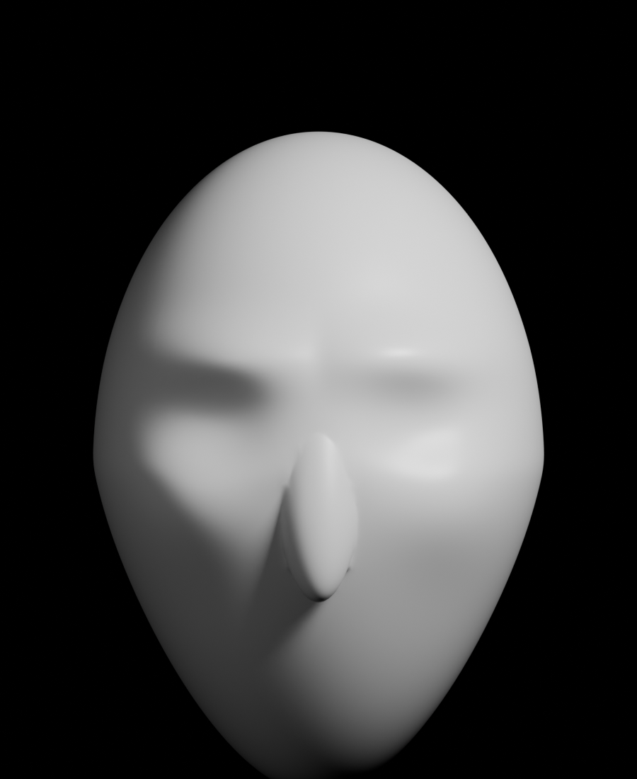
Rembrandt Lighting
🎨 The Master's Triangle
Setup characteristics:
- Key light: 45° to side AND 45° above
- Positioned precisely to create triangle of light on shadow-side cheek
- Fill: Moderate (3:1 ratio typical)
- The signature: Inverted triangle of light under far eye on cheek
Purpose and mood:
- Classic, timeless portrait style
- Named after painter Rembrandt (used this lighting in paintings)
- Sophisticated, artistic, professional
- Perfect balance of dimension and flattery
How to achieve the triangle:
- Key light high enough to create nose shadow
- Shadow from nose should just touch shadow from side of face
- Creates distinctive triangle on cheek
- Adjust angle until you see it—it's very specific!
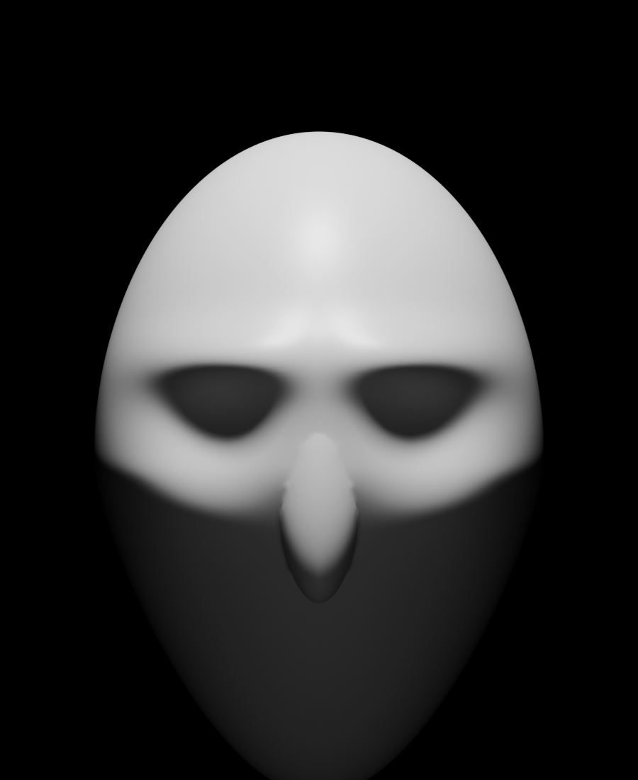
Butterfly Lighting (Paramount Lighting)
🦋 Glamour Hollywood Style
Setup characteristics:
- Key light: Directly in front, high above camera
- Creates butterfly-shaped shadow under nose
- Fill: Below and in front (reflector position) or very soft frontal
- Rim: Standard or strong for added glamour
Purpose and mood:
- Glamorous, Hollywood golden age aesthetic
- Very flattering for most face shapes
- Emphasizes cheekbones, de-emphasizes wrinkles
- Classic beauty lighting
When to use:
- Beauty and glamour photography
- Fashion portraits
- Older subjects (hides wrinkles)
- When maximum flattery is goal
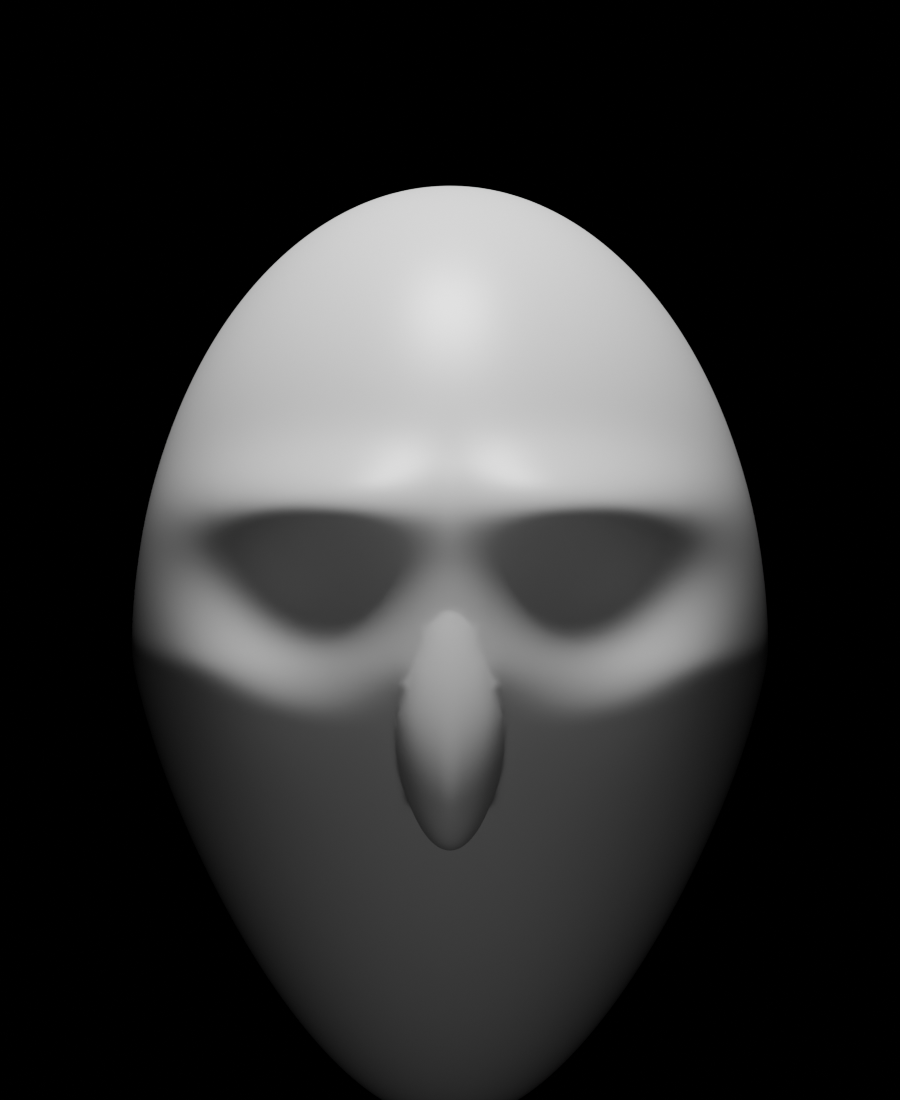
Loop Lighting
➰ Subtle and Flattering
Setup characteristics:
- Key light: 30-45° to side, 30-40° above
- Creates small loop-shaped shadow from nose toward side of face
- Similar to Rembrandt but nose shadow doesn't touch face shadow
- Fill: Standard, opposite side
Purpose and mood:
- Flattering, natural, professional
- Good dimension without being dramatic
- Versatile, works for almost everyone
- Industry standard for corporate headshots
When to use:
- Professional headshots
- Standard portrait photography
- When you want dimension without drama
- Your "safe" default for portraits
💡 Choosing Your Variation
Decision guide:
- Need flattery? → Butterfly or Loop lighting
- Need drama? → Low-key or Rembrandt lighting
- Need brightness? → High-key lighting
- Need versatility? → Classic three-point (3:1 ratio)
- Need artistic look? → Rembrandt or Split lighting
- Not sure? → Start with Loop lighting, adjust from there
🎯 Adapting for Different Subjects
Three-point lighting adapts beautifully to different subjects and scenarios. Let's learn how to modify the technique for products, characters, and various situations you'll encounter.
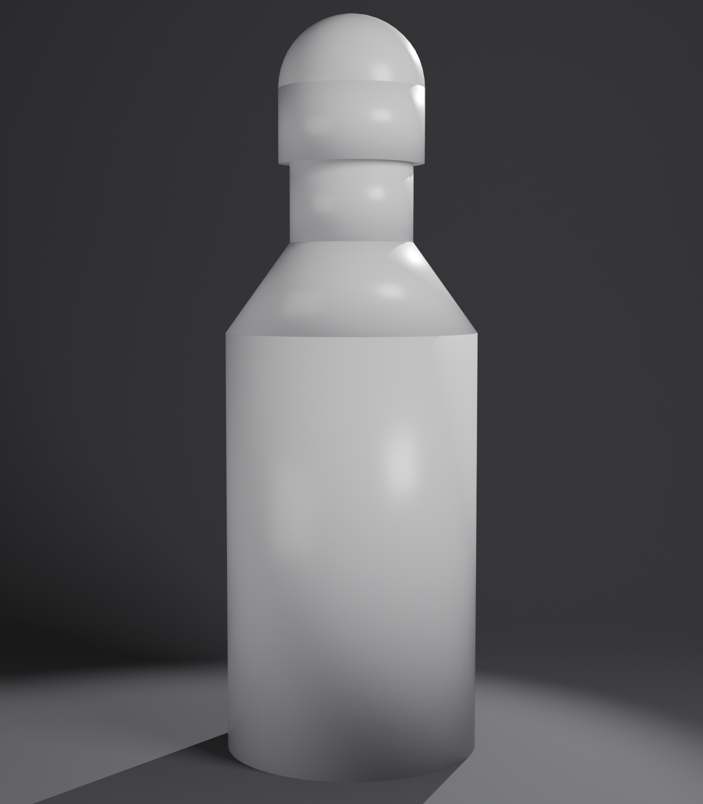
Product Lighting
📦 Three-Point for Products
Adjustments for products:
- Key light: Often from above-side (reveals form and texture)
- 45-60° above typical
- Shows top and front surface
- Fill light: Lower, frontal (shows detail)
- 2:1 or 3:1 ratio (products need clarity)
- Ensures all features visible
- Rim light: From top-back or side-back
- Creates edge definition
- Separates from background
- Often brighter than for portraits
Product-specific considerations:
- Reflective products (metal, glass):
- Large, soft lights (avoid hard reflections)
- Multiple small rim lights for controlled highlights
- Watch for unwanted reflections in render
- Matte products (fabric, plastic):
- More freedom with light hardness
- Can use smaller, more dramatic lights
- Emphasize texture with side lighting
- Transparent products (bottles, glass):
- Backlight critical (rim becomes main light)
- Light from behind shows transparency
- Front lights add surface definition
Character Lighting
👤 Three-Point for Characters
Full-body character lighting:
- Key light farther back: Cover entire character (6-8m distance)
- Ensures even coverage from head to toe
- May need second key for lower body
- Multiple rim lights:
- Top rim: Hair and head separation
- Mid rim: Body and arm edges
- Creates complete edge definition
- Fill adjusted for scene:
- Interior scene: Moderate fill
- Outdoor scene: Strong fill (simulates sky)
Face-only character lighting:
- Use standard portrait three-point
- Pay attention to character personality
- Hero: Bright, flattering (2:1-3:1)
- Villain: Dramatic, shadowy (4:1-8:1)
- Neutral: Standard balanced (3:1)
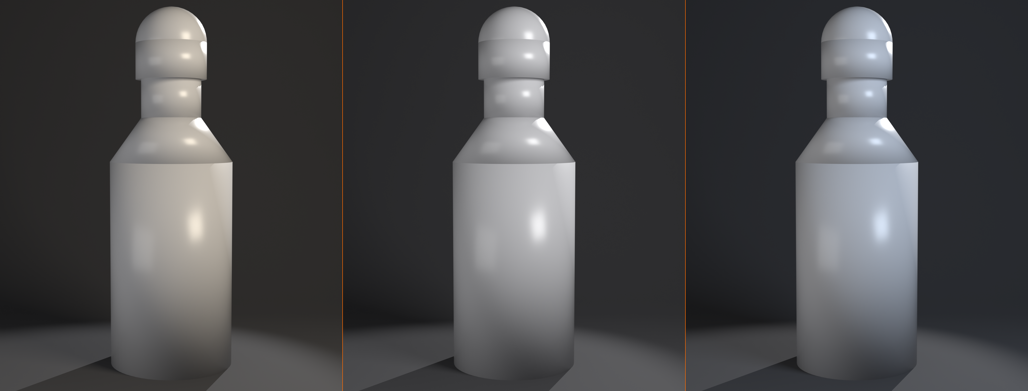
Environmental Integration
🌍 Three-Point in Realistic Scenes
Indoor scene integration:
- Key light: Motivated by window or practical light
- Position suggests sun through window
- Or lamp in scene creates key
- Make it believable!
- Fill light: Simulates bounce light from walls/ceiling
- Can match room color slightly (beige tint if beige walls)
- Motivated by environment
- Rim light:
- Hidden behind subject or furniture
- Justifiable as second window or lamp
- Can be "cheated" if necessary for good result
Outdoor scene integration:
- Key light = Sun: Use Sun light type
- Strong, directional
- Appropriate angle for time of day
- Fill light = Sky: Large area light or HDRI
- Cool blue tint
- Simulates diffused skylight
- Rim light:
- Can be motivated by sun (if subject facing away)
- Or secondary environmental light
- Sometimes omitted in favor of pure sun+sky
🚀 Advanced Multi-Light Techniques
Once you've mastered three-point lighting, you can expand to more sophisticated setups. Let's explore four-point, five-point, and specialized techniques.
Four-Point Lighting
💡 Adding the Background Light
The fourth light:
- Background light: Illuminates backdrop behind subject
- Position: Behind subject, aimed at background
- Purpose: Create separation, add depth, prevent black void
- Power: Variable (dim for subtle, bright for gradient)
Background light effects:
- Centered behind subject: Halo/glow effect on background
- To one side: Gradient across background (visual interest)
- Colored: Adds mood (blue, purple, warm orange)
- Gobo pattern: Project pattern on background (leaves, windows, etc.)
When to use four-point:
- Studio portraits with solid backgrounds
- Product shots on seamless backdrops
- When background is visible and important
- Interviews and talking-head videos
Five-Point Lighting and Beyond
✨ Complex Multi-Light Setups
Five-point lighting:
- Three-point setup PLUS:
- Background light (light 4)
- Second rim/kicker (light 5)
- Opposite side from first rim
- Creates complete edge highlight around subject
- Very polished, high-end look
Specialized additional lights:
- Hair light: Dedicated top light for hair highlight (especially for characters)
- Eye light: Small light reflected in eyes (catchlight)
- Clothing light: Accent specific costume elements
- Prop lights: Illuminate specific props or details
When complexity is warranted:
- High-end commercial work
- Hero character showcases
- Complex products with many features
- When render time isn't a constraint
When to stay simple:
- Faster iterations needed
- Natural/realistic look desired
- Three-point already achieving goals
- Remember: More lights ≠ better results
🔧 Troubleshooting Common Issues
Even with careful setup, three-point lighting can present challenges. Let's solve the most common problems you'll encounter.
Common Problems and Solutions
❌ Problem: Image looks flat (no dimension)
Causes:
- Fill light too strong (ratio too low)
- Key light too frontal (no modeling angle)
- All lights same intensity
Solutions:
- Reduce fill power to 25-33% of key (aim for 3:1 or 4:1 ratio)
- Move key to 45° side angle (not straight on)
- Ensure clear hierarchy: Key brightest, Fill dimmer, Rim accent
❌ Problem: Shadows too harsh/ugly
Causes:
- Light sources too small
- Lights too far from subject
- Using Point lights instead of Area lights
Solutions:
- Increase Area light size (3m minimum for key)
- Move lights closer to subject (softer relative size)
- Switch to Area lights from Point/Spot
- Add slight fill to soften (but maintain dimension)
❌ Problem: Subject merges with background
Causes:
- No rim light
- Rim light too weak
- Subject and background same value
Solutions:
- Add rim light if missing!
- Increase rim power (can match or exceed key)
- Add background light to separate
- Change background color/value for contrast
❌ Problem: Competing shadows (confusing)
Causes:
- Fill light has shadows enabled
- Multiple key lights
- Lights at conflicting angles
Solutions:
- Disable shadows on fill light (critical!)
- Only ONE key light creates main shadow
- Ensure light hierarchy is clear
❌ Problem: Uneven illumination across subject
Causes:
- Light too close (strong falloff)
- Light not aimed at center of subject
- Subject too large for light coverage
Solutions:
- Move key light farther back
- Aim directly at subject center
- Use larger or additional lights for big subjects
❌ Problem: Colors look wrong/weird
Causes:
- Conflicting light colors
- Too much colored light
- Wrong color temperature for scene
Solutions:
- Use neutral white for key and fill (safest)
- Only add color intentionally and sparingly
- Match color temperature to story (warm = cozy, cool = clinical)
❌ Problem: Render too dark or too bright
Causes:
- Overall light power too low/high
- Camera exposure not adjusted
- Material reflectivity affects apparent brightness
Solutions:
- Adjust key light power first (primary exposure control)
- Maintain ratios while scaling all lights up/down proportionally
- Check camera exposure settings
- Test with standard gray sphere to evaluate lighting
🎯 Project: Character Lighting Setup
Time to put everything into practice! You'll create a complete three-point lighting setup for a character, demonstrating all the principles and techniques you've learned.
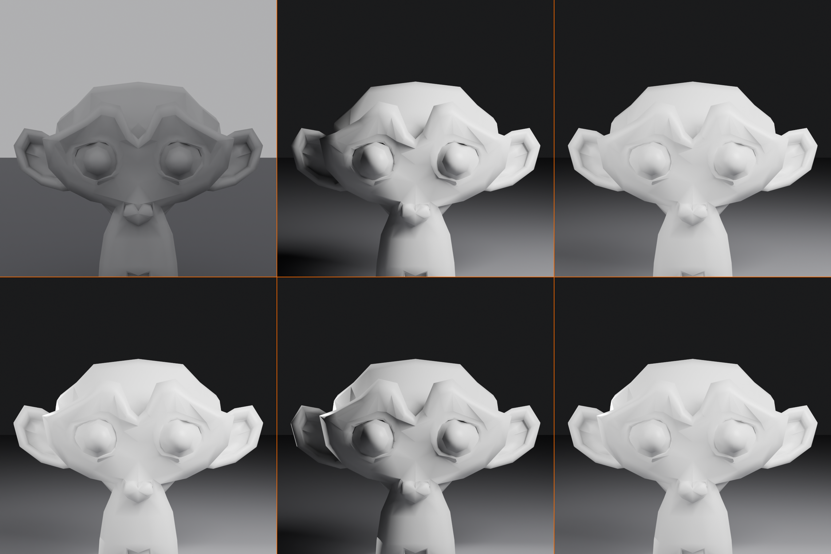
🎨 Project Goal
Create a professional three-point lighting setup for Suzanne (Blender's monkey head) using the classic technique. Experiment with different ratios and variations to see how lighting changes mood.
Learning objectives:
- Practice positioning key, fill, and rim lights
- Understand lighting ratios experientially
- See how small changes affect the overall look
- Create multiple lighting variations for comparison
Step 1: Scene Setup
🎬 Prepare Your Scene
- New file: File → New → General
- Delete default: Delete cube and default light (X → Delete)
- Add Suzanne:
- Shift+A → Mesh → Monkey
- This is Suzanne, Blender's mascot—great for lighting practice!
- Add material:
- Material Properties → New
- Roughness: 0.4 (semi-glossy)
- Leave other settings default
- Add ground plane:
- Shift+A → Mesh → Plane
- S → 20 → Enter (scale large)
- G → Z → -1 → Enter (move down)
- Position camera:
- Select camera (click in outliner)
- G → Y → -5 → Enter (move back)
- G → Z → 1 → Enter (move up slightly)
- Numpad 0 (camera view)
- Adjust so Suzanne fills frame nicely
- Switch to Rendered viewport: Z → Rendered (or click 4th sphere icon)
Step 2: Add Key Light
🔑 Your Primary Light
- Add Area light: Shift+A → Light → Area
- Position:
- G → X → 3 → Enter (move right)
- G → Y → -2 → Enter (move toward camera side)
- G → Z → 3 → Enter (move up)
- Rotate to aim at Suzanne:
- R → X → -30 → Enter (tilt down)
- R → Z → -30 → Enter (rotate toward subject)
- Or use Track To: Select light, Shift+Select Suzanne, Ctrl+T
- Configure light:
- Light Properties (bulb icon)
- Size: 3m
- Power: 1000W
- Color: White
- Evaluate:
- One side of Suzanne lit, one in shadow
- Clear shadow on ground
- Dimensional appearance
Step 3: Add Fill Light
🌙 Soften Those Shadows
- Add second Area light: Shift+A → Light → Area
- Position opposite key:
- G → X → -3 → Enter (move left, opposite of key)
- G → Y → -2 → Enter (toward camera)
- G → Z → 2 → Enter (lower than key)
- Aim at subject: Select fill, Shift+Select Suzanne, Ctrl+T
- Configure for fill:
- Size: 4m (larger than key)
- Power: 330W (33% of key for 3:1 ratio)
- Color: White
- Shadow: DISABLE (uncheck in light settings)
- Specular: 0.3 (reduce highlights)
- Evaluate:
- Shadows now softer, not pure black
- Can see detail in shadow areas
- Still dimensional (not flat)
Step 4: Add Rim Light
✨ The Professional Touch
- Add Spot light: Shift+A → Light → Spot
- Position behind and above:
- G → X → 2 → Enter (slight to right, same side as key)
- G → Y → 3 → Enter (behind Suzanne)
- G → Z → 4 → Enter (high up)
- Aim at Suzanne's edges:
- Select spot, Shift+Select Suzanne, Ctrl+T
- Enable "Show Cone" in Light Properties → Viewport Display
- Adjust position until light hits edges/top of head
- Configure rim:
- Power: 1000W (equal to key)
- Spot Size: 40°
- Blend: 0.4
- Color: White or slight warm (#FFF8E7)
- Evaluate:
- Bright edge highlight on Suzanne's outline
- Separation from background
- Professional, polished look
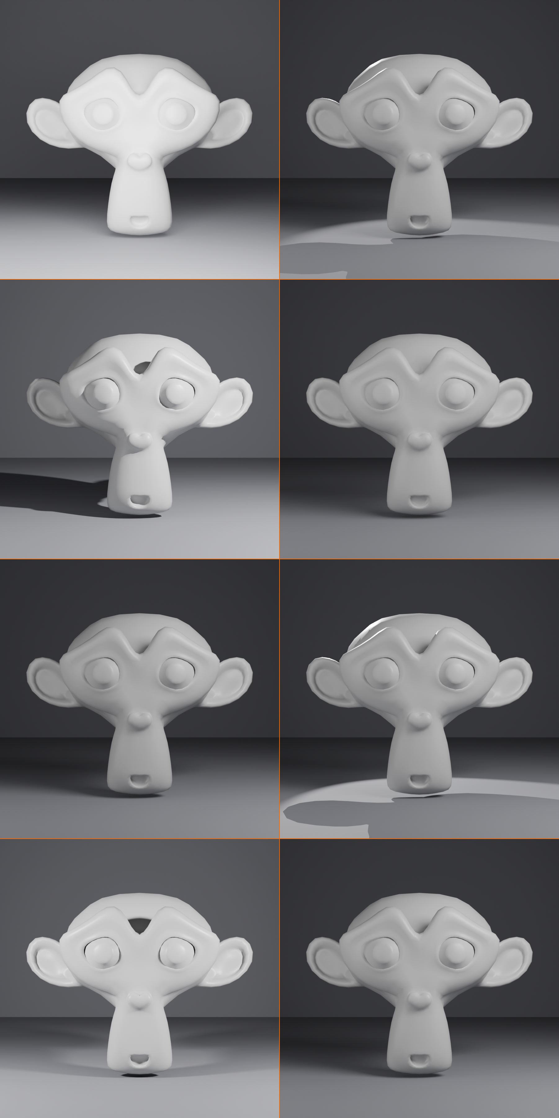
Step 5: Experimentation and Variations
🎨 Explore Different Looks
Try these variations (save renders for comparison):
Variation 1: High-key (bright and cheerful)
- Increase fill to 500W (2:1 ratio)
- Result: Softer, more flattering, less dramatic
Variation 2: Low-key (dark and dramatic)
- Reduce fill to 125W (8:1 ratio)
- Or disable fill entirely
- Result: Strong contrast, mysterious mood
Variation 3: Colored lighting
- Key: Warm orange (#FFB366)
- Fill: Cool blue (#B0C4DE)
- Rim: Match key or pure white
- Result: Cinematic color contrast
Variation 4: Double rim (four-point)
- Duplicate rim light (Shift+D)
- Position on opposite back corner
- Result: Complete edge highlight around subject
Variation 5: Rembrandt lighting
- Increase key height to 60°
- Adjust angle to create triangle on cheek
- Result: Classic, artistic portrait look
Step 6: Final Polish
🎯 Finishing Touches
- Name your lights:
- Select each → Properties → Object Properties
- Rename: "Key_Light", "Fill_Light", "Rim_Light"
- Add background (optional):
- Add 4th light behind Suzanne aimed at ground
- Creates gradient on background
- Test render:
- F12 to render final image
- Image → Save As → save your best result
- Save project: File → Save As → "Three_Point_Lighting_Practice.blend"
✅ Project Success Checklist
- ✅ Key light positioned 45° to side and above, creating main modeling
- ✅ Fill light opposite key, dimmer (3:1 ratio), shadows disabled
- ✅ Rim light behind and above, creating edge highlight
- ✅ Clear hierarchy: Key brightest, Fill supportive, Rim accent
- ✅ Dimensional appearance with controlled shadows
- ✅ Subject separated from background
- ✅ Experimented with at least 2 variations
- ✅ Saved renders showing different moods/ratios
Bonus Challenges
🌟 Take It Further
- Try different subjects: Replace Suzanne with cube, sphere, or other character
- Create lighting presets: Save different ratio setups for reuse
- Combine with materials: Test three-point with metal, glass, various materials
- Animation: Keyframe lights moving, show how lighting changes feel
- Study references: Find portrait photos you like, try to recreate lighting
🎓 Lesson Summary
What You've Mastered
Congratulations! You've learned the most fundamental and powerful lighting technique in 3D and photography. Three-point lighting is a skill that will serve you throughout your entire 3D career.
Key concepts mastered:
- Three-point fundamentals: Key, fill, and rim light roles and relationships
- Key light: Primary illumination, modeling, shadow creation
- Fill light: Shadow control, contrast management, supportive role
- Rim light: Edge definition, subject separation, professional polish
- Lighting ratios: How key-to-fill relationships control mood (2:1 to 8:1)
- Positioning: The geometry of three-point, angles and distances
- Variations: High-key, low-key, Rembrandt, Butterfly, Loop lighting
- Adaptation: Applying three-point to different subjects and scenarios
The Three-Point Philosophy
"Three lights, infinite possibilities."
Three-point lighting isn't rigid rules—it's a flexible framework. The key light establishes direction. The fill light controls mood through shadow density. The rim light adds dimension and separation. Together, they create professional results that adapt to any style or subject.
Remember these fundamentals:
- 🔑 Key light is king: Get this right, everything else follows
- 🌙 Fill light is servant: Supports key without competing
- ✨ Rim light is magic: The difference between good and great
- ⚖️ Ratio controls emotion: 2:1 = happy, 8:1 = dramatic
- 📐 Position matters: Small moves create big changes
- 🎨 Less is more: Three well-placed lights beat ten random ones
What's Next?
With three-point lighting mastered, you're ready to explore advanced lighting environments and render techniques!
Coming up in Module 4:
- Lesson 17: HDRI and World Lighting
- Image-based lighting for realistic environments
- Combining HDRI with manual lights
- Creating and using custom HDRIs
- Lesson 18: Eevee Real-time Rendering
- Fast render engine optimizations
- Eevee-specific lighting techniques
- Real-time workflow strategies
- Lesson 19: Cycles Path Tracing
- Photorealistic rendering
- Global illumination mastery
- Optimization for quality and speed
🎉 You're Now a Lighting Professional!
Three-point lighting is the foundation of professional lighting in film, photography, and 3D. You now have the knowledge and skills that cinematographers and photographers spend years developing.
Practice recommendations:
- Light at least 10 different subjects with three-point technique
- Try each variation (high-key, low-key, Rembrandt, etc.)
- Study professional portraits—identify their key, fill, and rim
- Experiment with different ratios to internalize mood relationships
- Make mistakes! That's how you truly learn lighting
Three-point lighting is your reliable friend—it works every time, adapts to any situation, and always makes your work look professional. Use it well! 🎬✨