🎨 Lesson 13: Texture Painting Basics
Welcome to one of the most creative and satisfying aspects of 3D art—texture painting! In this lesson, you'll learn how to paint directly on your 3D models, transforming plain gray surfaces into vibrant, detailed, and realistic objects. Whether you want to create stylized hand-painted textures or add weathering and detail to realistic models, texture painting is an essential skill in your 3D artist toolkit.
🎯 What You'll Learn
- Understanding texture painting and why it matters
- Setting up Blender's Texture Paint workspace
- Creating and managing texture images
- Mastering the paint brush and its settings
- Working with colors, opacity, and blend modes
- Using texture slots and multiple maps
- Painting techniques for different effects
- Working with layers and masks
- Saving and exporting your painted textures
- Complete hands-on project: painting a stylized prop
⏱️ Estimated Time: 45-60 minutes
🎯 Project: Paint a complete hand-painted texture on a 3D object
In This Lesson
🖌️ What is Texture Painting?
Texture painting is the process of painting color, details, and surface information directly onto your 3D models. Instead of applying pre-made images or procedural materials, you become the artist—wielding digital brushes to create custom textures that are uniquely yours!
🎨 Texture Painting Explained
The basic concept:
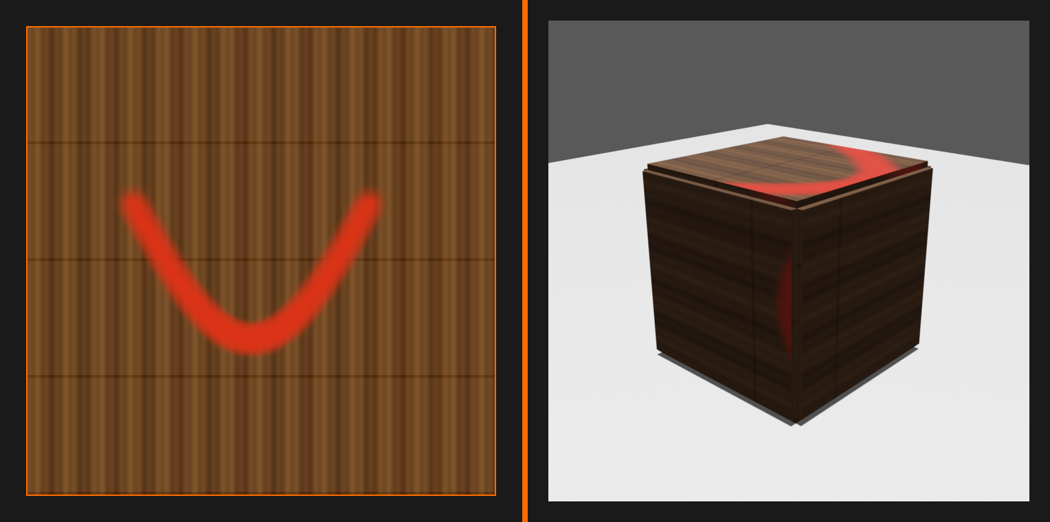
- You paint directly on the 3D model's surface in the 3D viewport
- Blender projects your brush strokes onto the UV-mapped texture image
- The painted texture is saved as an image file
- This image is then applied to the model via materials
- You see results in real-time as you paint!
What makes it special:
- Paint in 3D space while seeing 2D texture result
- Brush strokes wrap around curves and corners naturally
- No need to unwrap mentally—paint where you see it
- Immediate visual feedback
💡 The Artist's Canvas Analogy: Imagine your 3D model is a physical sculpture, and you're painting it with actual brushes and paint. The difference? Your "sculpture" exists in digital space, your brush never runs out of paint, you can undo mistakes instantly, and gravity doesn't make the paint drip! Texture painting gives you all the creative freedom of traditional painting with the superpowers of digital art.
How Texture Painting Works
Understanding the relationship between 3D painting and 2D textures is crucial:
🔄 The Paint-to-Texture Pipeline
Step-by-step process:
- You paint on the 3D model
- Brush strokes appear on model surface
- You see color/detail in 3D viewport
- Blender uses UVs to map strokes
- Your UV unwrap determines where paint goes on texture
- Brush stroke in 3D = paint on 2D texture image
- Texture image updates in real-time
- See your strokes appear in UV Editor
- Image file contains all painted data
- Material displays the texture
- Shader uses painted image as color source
- Model shows painted result in renders
Types of Textures You Can Paint
Texture painting isn't just for color! You can paint various texture maps:
🗺️ Paintable Texture Types
Base Color (Diffuse):
- The main color information
- What most people think of as "the texture"
- RGB color values defining object appearance
- Example: Red paint on a toy, wood grain color, fabric patterns
Roughness:
- Controls how shiny or matte surfaces appear
- Grayscale values (black = glossy, white = rough)
- Example: Shiny metal areas vs. worn matte spots
Metallic:
- Defines which areas are metallic vs. non-metallic
- Usually binary (0 = non-metal, 1 = metal)
- Example: Gold trim on wooden chest
Normal Map:
- Fake surface detail and bumps
- RGB colors represent surface angle information
- Advanced technique (covered in later lessons)
Emission:
- Areas that glow or emit light
- Color and intensity of self-illumination
- Example: Glowing runes, LED lights

✅ In This Lesson
We'll focus primarily on Base Color texture painting—the foundation of all texture work. Once you master painting color, the same techniques apply to roughness, metallic, and other maps!
Texture Painting vs. Other Texturing Methods
Let's understand how texture painting fits into the broader texturing ecosystem:
| Method | Best For | Advantages | Limitations |
|---|---|---|---|
| Texture Painting (Blender) | Stylized art, quick texturing, custom details | Direct, intuitive, see results in 3D | Basic tools compared to dedicated apps |
| Procedural Textures | Generic materials, tiling textures, technical surfaces | No UV unwrapping needed, infinitely scalable | Hard to create unique, artistic details |
| Image Textures | Photorealistic surfaces, pre-made assets | Fast, high quality, professional libraries available | Generic, not customized to your model |
| Substance Painter | Professional game/film assets, PBR workflows | Industry-standard, powerful tools, smart materials | Expensive, separate software, learning curve |
| Photogrammetry | Realistic scanned objects, environments | Ultimate realism, captures real-world detail | Requires photo equipment, processing time |
⚡ When to Use Blender's Texture Painting
Perfect for:
- Stylized, hand-painted, or cartoon-style textures
- Quick texturing for personal projects or tests
- Adding custom details to procedural materials
- Painting wear, dirt, and variation on surfaces
- Learning texture painting fundamentals
- Budget-conscious workflows (it's free!)
Consider alternatives for:
- Professional game assets (Substance Painter might be better)
- Hyper-realistic characters (specialized software helps)
- Large-scale production (dedicated tools offer more efficiency)
The truth: Blender's texture painting is surprisingly capable! Many professionals use it for specific tasks even when they own dedicated software.
🌟 Why Paint Textures in Blender?
You might wonder: "Why learn texture painting when there are thousands of pre-made textures available online?" Great question! Here's why texture painting is a skill worth mastering:
Creative Freedom and Customization
🎨 Be the Artist
Complete creative control:
- Your vision, your colors, your style
- Not limited to what exists in texture libraries
- Perfect match for your specific project needs
- Express unique artistic voice
Customization examples:
- Want a purple dragon with gold spots? Paint it!
- Need a rusty robot with specific wear patterns? Paint it!
- Creating a fantasy weapon with magical runes? Paint it!
- No searching for "the perfect texture"—create it yourself!
Perfect Integration with Your Model
🎯 Custom-Fit Textures
Model-specific details:
- Paint exactly where details are needed
- Weathering and wear in logical locations
- Details that follow your model's geometry
- No generic stretching or misalignment
Example scenario:
You modeled a treasure chest. Generic wood texture looks okay, but with texture painting you can add:
- Scratches around the lock (where someone tried to pry it open)
- Darker stains in corners (where water collected)
- Worn edges (where hands grabbed it)
- Decorative designs that align perfectly with geometry
Stylized and Hand-Painted Aesthetics
🖼️ The Hand-Painted Look
Why hand-painted textures are popular:
- Timeless, artistic quality
- Stands out from generic PBR photorealism
- Perfect for games (especially stylized genres)
- Lower performance cost (simple textures)
- Forgiving of imperfections (part of the charm!)
Famous examples:
- World of Warcraft: Iconic hand-painted style
- Overwatch: Stylized character textures
- Fortnite: Bright, painted aesthetics
- Pixar films: Hand-painted quality even in 3D
Workflow Efficiency
⚡ Speed and Convenience
All-in-one solution:
- No switching between applications
- Model, UV, and paint in same software
- See results immediately in context
- Faster iteration and experimentation
Quick adjustments:
- Client wants color change? Paint it in minutes
- Spot something wrong in render? Jump in and fix it
- Want to try different color scheme? Save versions and test
Learning and Skill Development
✅ Educational Value
Foundation for advanced techniques:
- Understand how textures work at fundamental level
- Skills transfer to Substance Painter, Mari, etc.
- Learn color theory and painting principles
- Develop artistic eye for detail and realism
Career relevance:
- Many game studios use hand-painted textures
- Valuable skill for indie game development
- Demonstrates artistic ability beyond technical modeling
- Portfolio pieces that show personality and style
Cost-Effectiveness
💰 Free Tools, Professional Results
No additional costs:
- Blender is free and open-source
- No subscription fees (unlike Substance Painter)
- No need to buy texture packs
- Create unlimited unique textures
Perfect for:
- Students and hobbyists
- Indie developers on tight budgets
- Learning before investing in premium tools
- Personal projects where budget matters
🎯 The Bottom Line: Texture painting gives you superpowers. You're no longer limited by what textures you can find or afford—you become the texture creator. Every model becomes a canvas, and your imagination is the only limit. Whether you're creating stylized characters, weathered props, or fantastical creatures, texture painting lets you bring your unique vision to life!
🖥️ The Texture Paint Workspace
Blender's Texture Paint workspace is specifically designed for painting textures. Let's explore this workspace and understand how to set it up for maximum efficiency.
Switching to Texture Paint Mode
🎨 Accessing Texture Paint
Method 1: Use the Texture Paint workspace
- Look at the tabs at the top of Blender window
- Click on "Texture Paint" tab
- Workspace automatically configures for painting
- You'll see split view: 3D Viewport + Image Editor
Method 2: Switch mode manually
- In 3D Viewport, find mode dropdown (top-left, says "Object Mode")
- Click and select "Texture Paint"
- Viewport changes to show paintable surface
Quick tip: The workspace tab is faster and sets up everything automatically!
Understanding the Texture Paint Workspace Layout
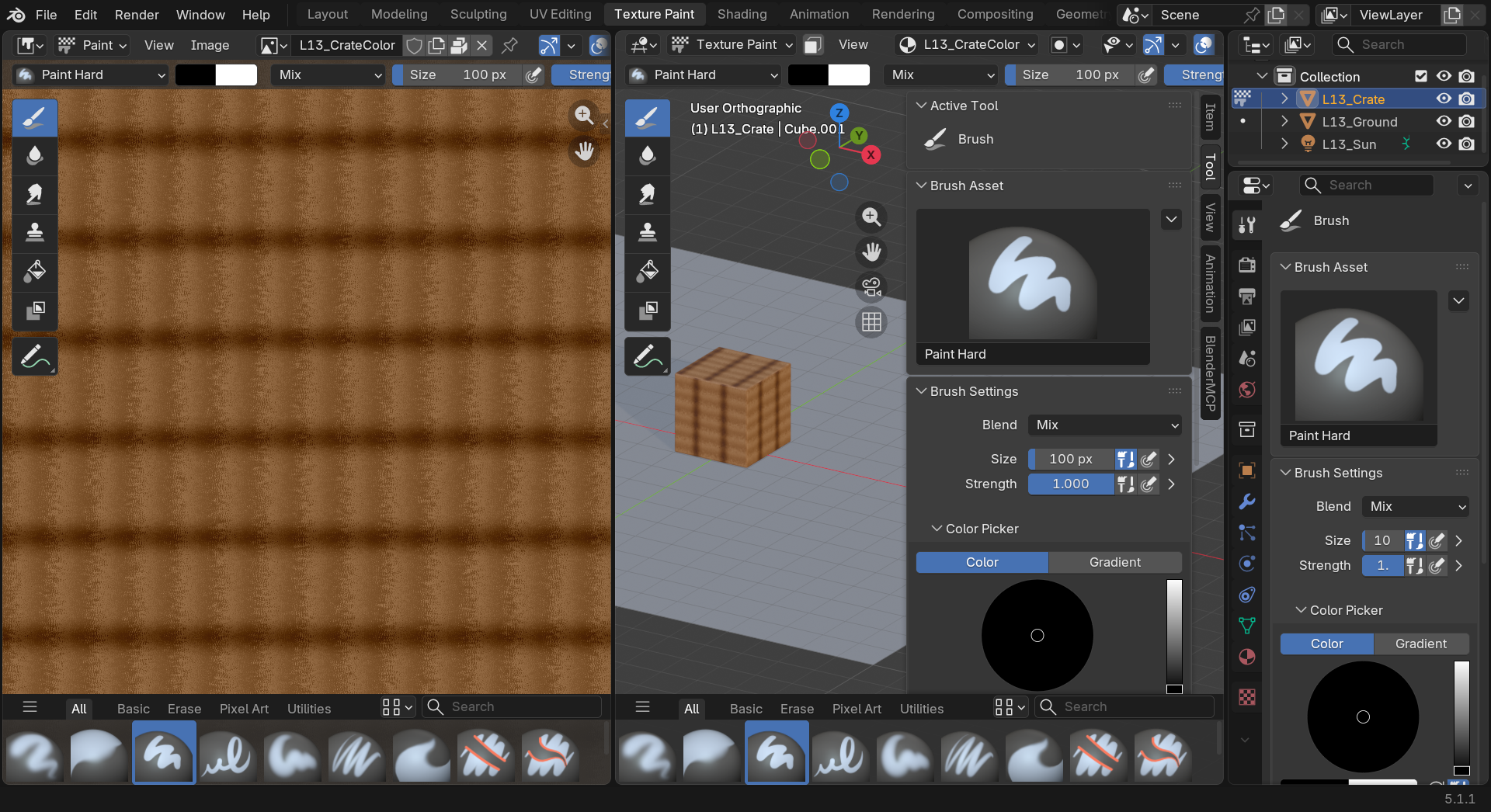
When you switch to Texture Paint workspace, Blender arranges editors specifically for texturing:
📐 Workspace Layout
Default layout includes:
- Left side: Image Editor
- Shows your texture in 2D (flat image)
- Can paint directly on the flat texture here
- See exactly what's being saved to the image file
- Center/Right: 3D Viewport
- Shows your 3D model with texture applied
- Paint directly on the model surface
- See how texture looks in 3D context
- Top right: Shader Editor (sometimes)
- Shows material node setup
- Can connect textures to material
- Advanced users can customize this area
- Properties panels:
- Right sidebar: Tool settings, brush options
- Press
Nto toggle sidebar visibility
💡 Two Views, One Texture: Think of it like having a mirror. The 3D Viewport shows your sculpture, and the Image Editor shows the flat canvas you're painting on. Paint on either one, and both update! This dual view helps you see artistic result (3D) and technical detail (2D) simultaneously.
3D Viewport in Texture Paint Mode
The 3D Viewport has special features when you're in Texture Paint mode:
👁️ Viewport Display Options
Shading modes (top-right of viewport):
- Solid: Basic shading, shows painted colors
- Fast, good for performance
- Good enough for basic painting
- Material Preview: Shows materials with basic lighting
- Better representation of final look
- Recommended for most texture painting
- Balance of quality and speed
- Rendered: Full render preview
- Most accurate representation
- Can be slow on complex scenes
- Use for final checks
Navigation in paint mode:
- Rotate view:
Middle Mousedrag (as usual) - Pan view:
Shift + Middle Mousedrag - Zoom: Scroll wheel or
Ctrl + Middle Mousedrag - Frame object:
Numpad Periodor View menu → Frame Selected
✅ Recommended Viewport Setup
For the best texture painting experience:
- Use Material Preview shading mode
- Enable Cavity shading (header → Shading dropdown → Cavity)
- This adds subtle shadows in crevices, making details easier to see
- Adjust lighting if needed (Shading dropdown → Studio/MatCap options)
Tool Shelf and Settings
The left toolbar contains all your painting tools:
🧰 Tool Shelf (Press T to toggle)
Essential tools you'll find:
- Draw: Standard paint brush (your main tool)
- Soften: Blur and smooth painted areas
- Smear: Drag colors around like wet paint
- Clone: Copy texture from one area to another
- Fill: Flood-fill areas with solid color
- Mask: Paint mask to protect areas
- Gradient: Paint smooth color transitions
Tool settings appear at top of viewport:
- Brush radius (size)
- Strength (opacity/intensity)
- Blend mode
- Color picker
![The Image Editor header Texture Slot selector · the [image icon] L13_CrateColor control that switches which texture map you paint on](images/lesson_13_06_texture_slot_dropdown.png)
Properties Sidebar
The right sidebar (press N) contains detailed settings:
⚙️ Sidebar Panels (Press N to toggle)
Tool panel:
- Advanced brush settings
- Texture settings for brush
- Falloff curves
- Stroke method options
Texture Slots panel:
- Lists all texture slots in active material
- Switch between different maps (Color, Roughness, etc.)
- Create new texture slots
Options panel:
- Unified settings (share brush size across tools)
- Occlude/Cull/Normal options
- Bleed and dilation settings
Image Editor in Texture Paint
The Image Editor on the left shows your texture as a flat image:
🖼️ Image Editor Features
What you can do here:
- View your texture: See the actual image being painted
- Paint in 2D: Paint directly on flat texture (like Photoshop)
- Zoom and pan: Inspect details closely
- See UV layout: Toggle UV overlay to see island boundaries
Why use Image Editor for painting?
- Easier for straight lines and precise patterns
- Better for filling large areas uniformly
- Good for text or geometric designs
- Can use image editing tools more effectively
Image Editor controls:
- Zoom: Scroll wheel
- Pan:
Middle Mousedrag - Frame image:
Homekey - Toggle UV overlay: Header dropdown → UVs
Customizing Your Workspace
🎨 Personalize Your Setup
You can customize the workspace to your preferences:
- Resize editors: Drag borders between editors
- Split editors: Drag corner to create new area
- Change editor type: Click editor icon (top-left) to switch
- Full-screen editor:
Ctrl+Spacetoggles full-screen
Common custom layouts:
- Maximized 3D view: Hide Image Editor, use full screen for painting in 3D
- Triple view: 3D Viewport + Image Editor + Shader Editor
- Dual 3D views: Two 3D viewports from different angles
Save custom workspace:
- Click
+next to workspace tabs - Duplicate current workspace
- Customize as desired
- Rename by double-clicking tab
📄 Creating and Setting Up Textures
Before you can paint, you need a texture image to paint on! Let's learn how to create and configure textures for painting.
Creating a New Texture Image
🆕 Creating Your First Texture
Method 1: In Texture Paint mode (recommended)
- Switch to Texture Paint workspace
- Select your model
- In 3D Viewport header, look for texture slot dropdown
- Click "+ New" button next to it
- A dialog appears with texture creation settings
- Configure settings (see below)
- Click OK
- Texture is created and ready to paint!
Method 2: In Image Editor
- Go to Image Editor (left side in Texture Paint workspace)
- Click Image menu → New Image
- Configure settings in popup
- Click OK
- Manually connect to material (we'll cover this)
Texture Creation Settings
When creating a new texture, you'll see several important settings:
⚙️ New Image Settings
Name:
- Give your texture a descriptive name
- Example: "Chest_BaseColor", "Character_Diffuse", "Prop_Color"
- Helps organize when you have multiple textures
Width and Height:
- Resolution of your texture in pixels
- Always use power of 2 (512, 1024, 2048, 4096)
- Common choices:
- 1024×1024: Good for small/medium props
- 2048×2048: Standard for most objects
- 4096×4096: High detail, hero assets
- 512×512: Low detail, background objects
- Square textures (1024×1024) are most common
- Can use rectangular (2048×1024) if needed
Color:
- Starting background color
- Default is black (0, 0, 0, 1)
- Can choose white, gray, or any color
- Often best to start with mid-gray or base color
Alpha (Transparency):
- Check this if you need transparency
- Most textures don't need alpha channel
- Adds RGBA instead of RGB (increases file size)
Generated Type:
- Blank: Solid color (most common for painting)
- UV Grid: Checker pattern (for testing UVs)
- Color Grid: Colored squares
32-bit Float:
- Higher precision color values
- Usually unnecessary for painting
- Use for special cases (HDR painting)
✅ Recommended Settings for Beginners
- Name: [ObjectName]_Color
- Width/Height: 2048×2048
- Color: White or light gray (easier to see brush strokes)
- Alpha: Unchecked
- Generated Type: Blank
- 32-bit Float: Unchecked
This gives you a clean 2K texture perfect for learning!
Connecting Texture to Material
For your painted texture to show up, it needs to be connected to the material:
🔗 Material Connection
Automatic connection (using "+ New" in Texture Paint mode):
- Blender automatically creates material if none exists
- Automatically adds Image Texture node
- Connects it to Principled BSDF Base Color
- You can start painting immediately!
Manual connection (if needed):
- Switch to Shading workspace (or open Shader Editor)
- Select your object
- In Shader Editor:
Shift+A→ Texture → Image Texture - Click folder icon, select your created texture
- Connect Color output to Principled BSDF → Base Color input
- Return to Texture Paint workspace
Texture Slot Selection
You can paint on different texture maps (color, roughness, etc.). Here's how to switch between them:
🎯 Switching Active Texture Slot
In Texture Paint mode:
- Look at 3D Viewport header
- Find Texture Slots dropdown
- Lists all textures in active material
- Select which one you want to paint on
In Sidebar (N key) → Tool panel:
- Texture Slots section shows available slots
- Click to activate different slot
- Shows which node the texture is connected to
Common slots you might paint:
- Base Color: Main diffuse color
- Roughness: Shiny/matte information
- Metallic: Metal vs. non-metal
- Normal: Fake surface bumps (advanced)
- Emission: Glowing areas
Texture Resolution Considerations
📐 Choosing the Right Resolution
Resolution guidelines:
- 512×512:
- Small objects
- Background props
- Very simple textures
- Fast to paint, low memory
- 1024×1024 (1K):
- Medium-sized props
- Accessories and secondary objects
- Good balance of quality and performance
- 2048×2048 (2K):
- Standard choice for most projects
- Main character pieces
- Hero props
- Good detail without huge file size
- 4096×4096 (4K):
- High-detail hero assets
- Character faces
- Cinematic close-ups
- Large file size, slower to work with
- 8192×8192 (8K):
- Extreme detail
- Film production
- Very large surfaces
- Requires powerful computer
Factors to consider:
- Object size on screen: Bigger = needs higher resolution
- Level of detail needed: Intricate patterns = higher resolution
- Performance: Game assets often use lower resolutions
- File size: Higher resolution = larger files
- Hardware: Painting on 8K textures needs good GPU
⚡ Pro Tip: Start Lower, Scale Up Later
When learning or blocking out ideas:
- Start with 1024×1024 for speed
- Paint your design and get it looking good
- Once satisfied, you can scale up resolution
- Re-paint details at higher resolution if needed
Lower resolution = faster painting, quicker saves, less waiting!
Saving Your Texture
CRITICAL: Textures are separate from your .blend file and must be saved independently!
🚨 IMPORTANT: Saving Textures
Key concept: Saving your .blend file does NOT save your painted textures!
Textures are marked with asterisk (*) when unsaved:
- Look at Image Editor header
- If texture name has
*, it has unsaved changes - Example:
Chest_Color*means unsaved
To save texture:
- In Image Editor: Image menu → Save
- Or Image menu → Save As (choose location and name)
- Choose file format (PNG is recommended)
- Navigate to save location
- Click Save
Auto-save option:
- Edit → Preferences → File Paths
- Enable "Auto Save Images"
- Textures auto-save when you save .blend file
- Still need to manually save first time!
Texture File Formats
💾 Choosing a File Format
PNG (Recommended for most uses):
- Lossless compression (no quality loss)
- Supports alpha transparency
- Good file size
- Industry standard
JPEG:
- Lossy compression (some quality loss)
- Smaller file sizes
- No transparency support
- Use only if file size is critical
TIFF:
- High quality, large files
- Used in professional pipelines
- Supports layers (in some apps)
OpenEXR:
- HDR format, 32-bit
- For special workflows only
- Not for typical texture painting
Recommendation: Use PNG for learning and most projects!
🖌️ Brush Basics and Settings
The brush is your primary tool for texture painting. Understanding brush settings and how to control them is essential for creating beautiful textures. Let's master the brush!
The Paint Brush Tool
✏️ Selecting and Using the Brush
Activating the Draw tool:
- In Texture Paint mode, look at left toolbar
- Click "Draw" tool (brush icon)
- Or press
Dkey to activate Draw tool - Cursor changes to circle showing brush size
Basic brush usage:
- Paint:
Left-clickand drag on model - Continuous stroke: Hold
Left-clickand move mouse - Single dab: Single
Left-click(one stamp) - Straight line: Click start point,
Shift+Clickend point
Essential Brush Settings
Let's explore the most important brush settings you'll use constantly:
🎚️ Core Brush Parameters
Radius (Brush Size):
- Controls how large your brush is
- Measured in pixels
- Shortcut:
Fkey, then move mouse (interactive resize) - Alternative:
[to decrease,]to increase - Can also type exact value in header
- Tip: Frequently adjust size while painting for different details
Strength:
- Controls opacity/intensity of brush
- Range: 0.0 (invisible) to 1.0 (fully opaque)
- Shortcut:
Shift+F, then move mouse - Lower strength = subtle, buildable strokes
- Higher strength = bold, opaque strokes
- Recommended: Start around 0.5-0.7 for control
Blend Mode:
- How new paint combines with existing paint
- Mix: Normal painting (default, most common)
- Add: Brightens existing colors
- Multiply: Darkens existing colors
- Overlay: Enhances contrast
- Many more advanced modes available
💡 The F Key is Your Friend: Press
Fand move your mouse to resize the brush interactively. You'll see a circle that follows your mouse—move closer to center for smaller, away for larger. This becomes muscle memory and is WAY faster than using sliders!
Brush Falloff and Shape
📉 Falloff Curve
What is falloff?
- Controls how brush strength decreases from center to edge
- Affects how soft or hard your brush strokes are
- Found in Sidebar (N) → Tool → Falloff section
Common falloff presets:
- Smooth: Soft, gradual fade (default)
- Good for blending and organic painting
- Most versatile option
- Sharp: Harder edge, less falloff
- More defined strokes
- Good for details and edges
- Root: Very soft, subtle
- Gentle blending
- Atmospheric effects
- Constant: No falloff, flat intensity
- Hard-edged stamps
- Graphic styles
Custom curves: Click curve to edit points, create custom falloff shapes
Advanced Brush Settings
These settings offer more control over brush behavior:
⚙️ Advanced Brush Options (Sidebar)
Stroke panel:
- Stroke Method:
- Space: Stamps placed at intervals (default)
- Dots: Single dab per click (no continuous stroke)
- Line: Click-drag creates straight line
- Curve: Draw bezier curve, paint follows it
- Spacing: Distance between brush stamps (when using Space method)
- Lower spacing = smoother strokes (but slower)
- Higher spacing = textured, stamp-like strokes
- Default 10% works well for most cases
Texture panel:
- Add texture to your brush strokes
- Can use image textures or procedural patterns
- Great for adding noise, grain, or patterns
- Advanced technique (we'll keep it simple for now)
Symmetry/Mirror:
- Paint on one side, automatically mirrors to other
- Perfect for symmetrical objects (characters, props)
- Enable X, Y, or Z axis mirroring
- Found in Sidebar → Tool → Symmetry
Color Selection
Choosing colors is a fundamental part of painting. Here's how to work with color in Blender:
🎨 Color Picker and Selection
Accessing color picker:
- Look at top of 3D Viewport in Texture Paint mode
- Find color swatch (small colored square)
- Click it to open color picker
- Or in Sidebar (N) → Tool → Color section
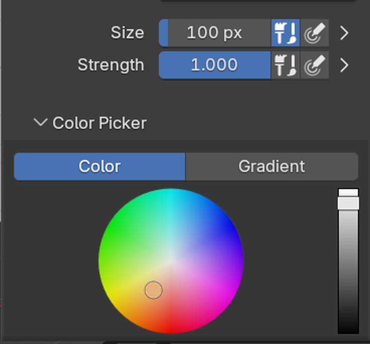
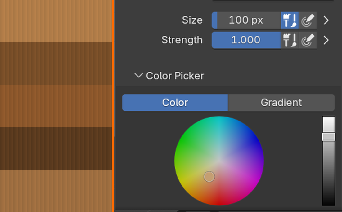
Color picker interface:
- Color wheel/square: Choose hue and saturation
- Value slider: Control brightness
- RGB sliders: Precise numeric control (0-1 range)
- Hex input: Enter hex color codes (#FF5733)
- Swatches: Save favorite colors for quick access
Eyedropper tool:
- Press
Skey while hovering over color - Samples color from 3D viewport or texture
- Super useful for color matching and picking existing colors
- Works on your painted texture or reference images
Primary and Secondary colors:
- Two color slots available
- Press
Xto swap primary/secondary - Useful for quickly switching between two colors
Brush Libraries and Presets
📚 Managing Brush Presets
Default brushes:
- Blender includes several pre-configured brushes
- Find them in header dropdown (next to Draw tool)
- Each has different size, strength, and falloff settings
Creating custom brushes:
- Configure brush settings to your liking
- Click
+button next to brush name - New preset is created
- Rename by clicking name field
- Saved with your Blender preferences
Common custom brushes to make:
- Detail brush: Small size (20-50px), high strength
- Blending brush: Large size, low strength (0.2-0.3)
- Hard edge brush: Medium size, constant falloff
- Texture brush: With noise texture applied
Unified Settings
🔗 Unified Settings
What are unified settings?
- Option to share certain settings across all tools
- Found in Sidebar (N) → Options → Unified Settings
- When enabled, changing size in one tool affects all tools
Available unified options:
- Size: All brushes use same radius
- Strength: All brushes use same strength
- Color: All brushes use same color
When to use unified settings:
- Enable Size: If you want all tools at same scale (common)
- Enable Color: To share color across tools
- Disable Strength: Different tools often need different strengths
Recommendation for beginners: Enable unified Size and Color, disable Strength
Pressure Sensitivity (For Tablet Users)
🖊️ Graphics Tablet Support
If you have a drawing tablet (Wacom, Huion, etc.):
- Blender automatically detects pressure
- Pen pressure can control various brush properties
Enabling pressure sensitivity:
- Look for small icon next to Radius/Strength sliders
- Looks like a hand/pen icon
- Click it to enable pressure control for that property
Common pressure mappings:
- Size: Light pressure = small brush, heavy = large
- Strength: Light = transparent, heavy = opaque (most common)
- Both: For maximum natural feel
For mouse users:
- Don't worry! You can still create beautiful textures
- Adjust strength/size manually as needed
- Build up strokes with multiple passes
✅ Recommended Brush Setup for Beginners
Start with these settings:
- Radius: 50-100px (adjust with
Fkey as you paint) - Strength: 0.6-0.7 (buildable strokes)
- Blend Mode: Mix
- Falloff: Smooth
- Spacing: 10%
- Unified: Size and Color enabled
These settings give you good control while learning!
🎨 Essential Painting Techniques
Now that you understand brushes, let's learn fundamental painting techniques that will help you create professional-looking textures.
Basic Stroke Techniques
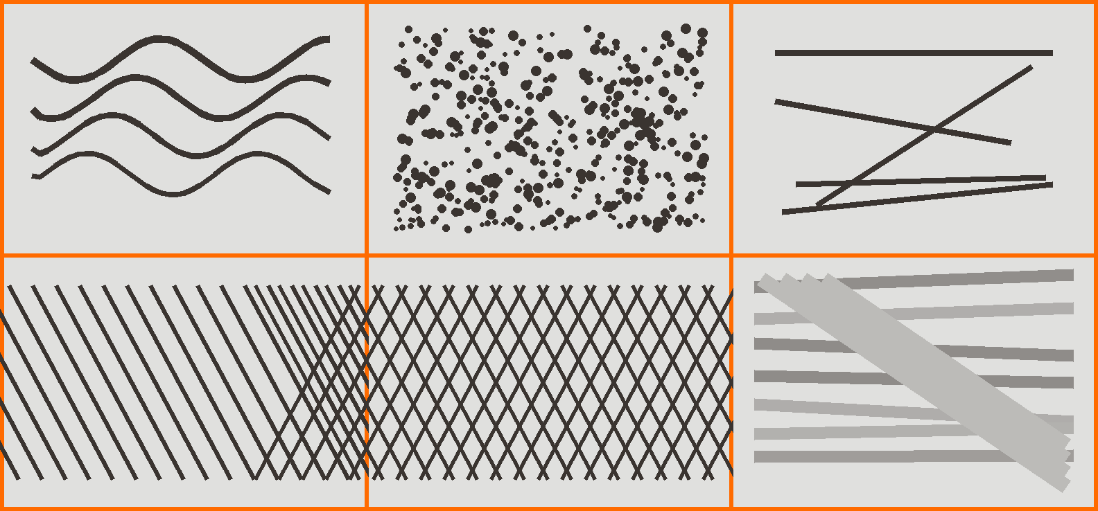
✏️ Fundamental Strokes
Continuous strokes:
- Click and drag smoothly
- Good for painting large areas
- Coverage depends on spacing and strength
- Tip: Use lower strength, build up gradually
Stippling/Dotting:
- Single clicks to place individual dabs
- Great for texture variation
- Creates organic, hand-painted feel
- Vary size and color for best effect
Straight lines:
- Click start point
- Hold
Shift, click end point - Blender draws straight line between points
- Perfect for edges, seams, geometric designs
Hatching/Cross-hatching:
- Parallel lines to build up tone
- Crossed lines for darker values
- Traditional drawing technique adapted to 3D
- Great for stylized, hand-drawn aesthetics
Layering and Building Color
🎨 The Layering Approach
Why layer paint?
- Easier to control than trying to get it perfect first time
- Creates depth and richness
- More forgiving of mistakes
- Mimics traditional painting techniques
Layering workflow:
- Base layer: Broad strokes, general colors
- Use large brush, medium strength
- Establish overall color scheme
- Don't worry about details yet
- Mid-layer: Define forms and shapes
- Add shadows and highlights
- Suggest details without fully rendering
- Build up focal areas
- Detail layer: Refine and polish
- Small brush for fine details
- Edge definition
- Final accents and highlights
Strength settings for layers:
- Base: 0.7-1.0 (opaque)
- Mid: 0.4-0.6 (semi-transparent)
- Detail: 0.6-0.8 (varies by need)
💡 The Bob Ross Principle: "We don't make mistakes, just happy little accidents." Lower strength (0.5-0.7) lets you build up color gradually. If you paint too light, add another layer. If too dark, paint lighter color on top to adjust. This forgiving approach is perfect for learning!
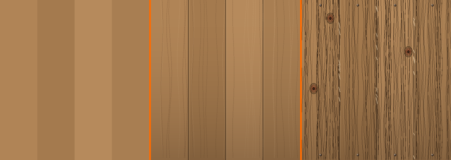
Color Variation for Realism
🌈 Adding Color Variation
Why vary color?
- Nothing in real world is perfectly uniform color
- Variation adds life and interest
- Suggests weathering, age, material properties
- Makes textures feel organic and believable
Techniques for color variation:
- Hue shifting: Slightly change hue as you paint
- Blue wall? Add touches of purple, cyan, gray-blue
- Makes surface more visually interesting
- Value variation: Lighter and darker versions
- Simulate lighting, form, and depth
- Darker in crevices, lighter on raised areas
- Saturation variation: More and less intense areas
- Focal points more saturated
- Edges and backgrounds less saturated
- Temperature shifts: Warm and cool variations
- Shadows cooler, highlights warmer (or vice versa)
- Adds sophistication to color palette
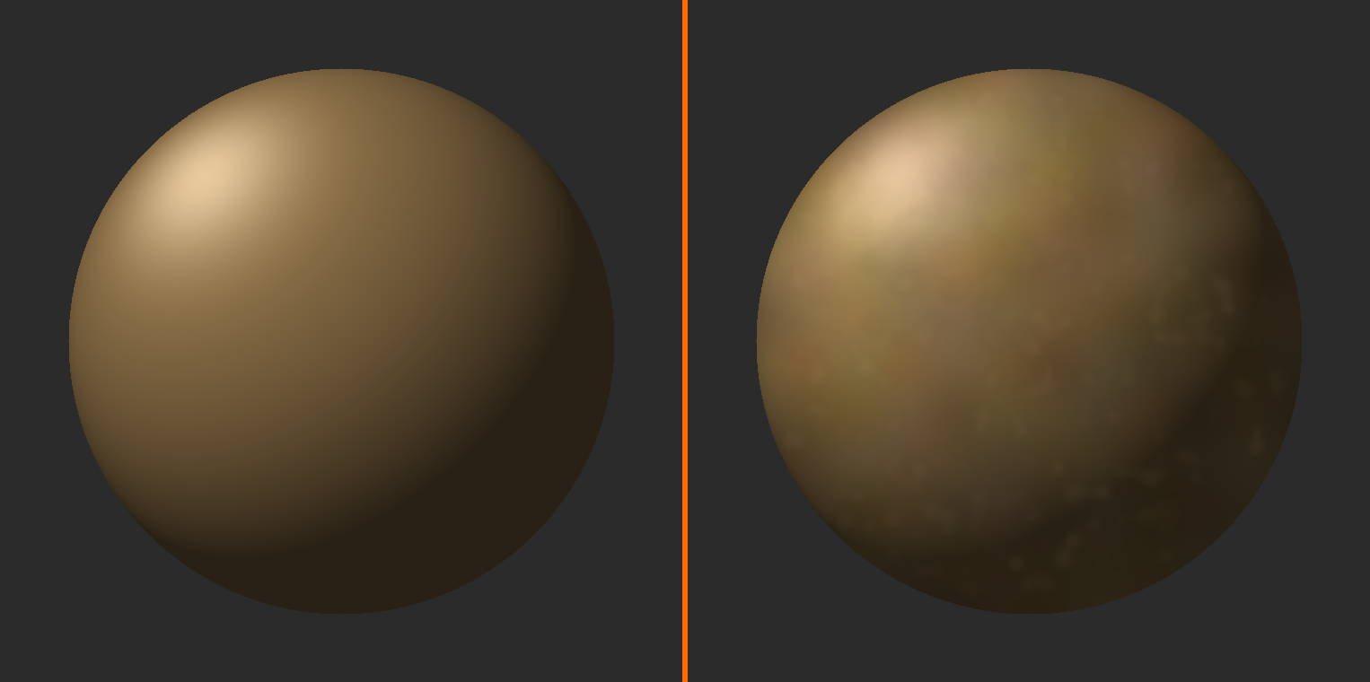
Blending and Smoothing
🌊 Blending Techniques
Soften tool:
- Located in left toolbar (blur icon)
- Blurs and softens painted areas
- Great for smooth color transitions
- Use after painting to blend harsh edges
Low-strength layering method:
- Paint overlapping strokes at low strength (0.3-0.5)
- Colors naturally blend where they overlap
- More control than Soften tool
- Builds gradual transitions
Smear tool:
- Drags colors around like wet paint
- Found in left toolbar
- Creates organic, painterly blends
- Good for stylized effects
Painting Details
🔍 Detail Painting Techniques
Sharp edges and lines:
- Use smaller brush (radius 10-30px)
- Increase strength to 0.8-1.0
- Use sharp falloff curve
- Shift+Click for straight edges
Highlights and accents:
- Small, bright strokes on raised areas
- Suggests light catching surfaces
- Don't overdo—subtle is better
- Place strategically for maximum impact
Shadows and depth:
- Darker colors in recesses and corners
- Creates sense of 3D form
- Multiply blend mode can intensify shadows
- Don't make pure black—use dark colored grays
Texture and surface detail:
- Small dots and marks suggest material texture
- Wood grain: Long, varied strokes
- Stone: Irregular spots and variations
- Metal: Sharp highlights and reflective patches
Working with Symmetry
🪞 Symmetrical Painting
Enabling symmetry:
- Sidebar (N) → Tool → Symmetry
- Check X, Y, or Z axis (X is most common)
- Paint on one side mirrors to other automatically
Best for:
- Character faces
- Symmetrical props
- Vehicles and mechanical objects
- Anything with left/right symmetry
Tips for symmetrical painting:
- Model must be perfectly centered on origin
- Paint base colors symmetrically first
- Disable symmetry for final asymmetrical details
- Adds realism (nothing is perfectly symmetrical in nature)
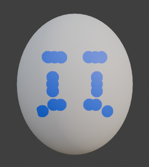
Fill Tool
🪣 Filling Areas Quickly
What is the Fill tool?
- Flood-fills connected areas with color
- Like paint bucket in 2D programs
- Found in left toolbar
How to use Fill:
- Select Fill tool from toolbar
- Choose color
- Click on area to fill
- Connected pixels of similar color are filled
Fill settings:
- Mode:
- Fill: Fills area with solid color
- Gradient: Creates color gradient
- Affected area:
- Connected: Only fills connected pixels
- All: Fills all pixels of similar color (entire texture)
Best uses:
- Filling base colors quickly
- Creating solid color backgrounds
- Blocking out color areas before detailing
Clone and Sample
📋 Clone Tool
What does Clone do?
- Copies texture from one area to another
- Like "stamp" or "clone stamp" in Photoshop
- Great for repeating patterns or fixing issues
Using Clone tool:
- Select Clone tool from toolbar
Ctrl+Clickto set clone source (where to copy from)- Paint normally—brush copies from source location
- Source offset maintains as you paint
Clone use cases:
- Repeating texture patterns
- Fixing mistakes by copying good areas
- Creating variation (clone then modify)
🌈 Working with Colors
Understanding color theory and how to work with colors effectively is crucial for creating beautiful textures. Let's explore color concepts and practical color techniques for texture painting.
Basic Color Theory for Texture Artists
🎨 Essential Color Concepts
The three properties of color:
- Hue: The actual color (red, blue, green, etc.)
- Position on the color wheel
- What we typically mean by "color"
- Saturation: Color intensity or purity
- High saturation = vivid, pure color
- Low saturation = grayish, muted color
- Zero saturation = grayscale
- Value: Lightness or darkness
- High value = light (toward white)
- Low value = dark (toward black)
- Most important for readability and form
🌟 Color Relationships
Complementary colors:
- Opposite on color wheel (red-green, blue-orange, yellow-purple)
- Create strong contrast and visual interest
- Use for focal points or dramatic effects
- Example: Orange rust on blue-gray metal
Analogous colors:
- Next to each other on color wheel (blue, blue-green, green)
- Create harmony and cohesion
- Feel natural and pleasing
- Example: Yellow-green grass with green leaves and blue-green shadows
Warm vs. Cool:
- Warm: Reds, oranges, yellows
- Advance visually (feel closer)
- Energetic, active feeling
- Use for highlights and focal points
- Cool: Blues, greens, purples
- Recede visually (feel farther)
- Calm, passive feeling
- Use for shadows and backgrounds
💡 The Value Is King Rule: When in doubt, prioritize value (light/dark) over hue and saturation. A texture with good value contrast but limited colors will look better than one with many colors but poor value contrast. Squint at your texture—can you still see the forms? That's good value structure!
Color Palettes for Texture Painting
🎨 Building a Color Palette
Limited palette approach (recommended for beginners):
- Choose 3-5 main colors before you start
- Variations come from mixing and layering these colors
- Creates cohesive, professional look
- Easier than choosing colors on the fly
Creating a palette:
- Base color: Primary surface color (e.g., brown for wood)
- Highlight color: Lighter version or complementary warm tone
- Shadow color: Darker version or complementary cool tone
- Accent color: Small pops of contrasting color (optional)
- Detail color: For fine details and variation
Example palette - Fantasy treasure chest:
- Base: Rich brown (#8B4513)
- Highlight: Warm tan (#D2B48C)
- Shadow: Dark brown with blue (#3D2817)
- Accent: Gold for metal parts (#FFD700)
- Detail: Deep red for interior (#8B0000)
Saving and Using Color Swatches
🎨 Color Swatches
What are swatches?
- Saved colors you can quickly access
- Found in color picker panel
- Like a painter's palette
Adding colors to swatches:
- Pick the color you want to save
- In color picker, look for swatch area (bottom)
- Click
+button to add current color - Color is saved to palette
Using saved swatches:
- Click any swatch to instantly select that color
- Much faster than recreating colors
- Ensures color consistency
Organizing swatches:
- Can create custom palette files
- Save palette per project
- Share palettes between blend files
Color Picking from References
👁️ Using Reference Images for Color
Eyedropper in Blender:
- Press
Swhile hovering over any color in viewport - Samples color from texture, reference image, or UI
- Works in 3D viewport and Image Editor
Adding reference images:
- In 3D Viewport: Add → Image → Reference
- Browse to your reference image
- Image appears in viewport as plane
- Use
Sto sample colors from it - Move it aside when not needed
External color picking:
- Take screenshots of references
- Use external color picker tools
- Note RGB/Hex values and enter manually
Color Tips for Different Materials
🎨 Material-Specific Color Guidance
Wood:
- Never pure brown—add orange, red, or yellow tints
- Vary from light tan to dark chocolate
- Grain should be darker than base
- Highlights slightly warm, shadows slightly cool
Metal:
- Use mostly desaturated colors (grays with slight tint)
- Strong value contrast (very dark and very light)
- Rust/wear: Orange, red-brown accents
- Reflections: Sample from environment
Stone:
- Desaturated earth tones (grays, browns, tans)
- Subtle color variation is key
- Weathering: Darker in crevices, lighter on edges
- Moss/lichen: Muted greens and yellows
Fabric:
- Can be highly saturated or muted (depends on material)
- Fold shadows: Darker, slightly cooler version of base
- Highlights: Lighter, slightly warmer version
- Wear areas: Slightly desaturated and lighter
Skin:
- Never pure pink/brown—mix of reds, yellows, oranges
- Subsurface scattering gives translucent quality
- Shadows: More red/purple tones
- Highlights: Yellower, desaturated
Avoiding Common Color Mistakes
⚠️ Color Pitfalls to Avoid
Mistake 1: Over-saturation
- Problem: Using fully saturated colors everywhere
- Result: Garish, unrealistic, hard to look at
- Fix: Reduce saturation to 60-80% for most surfaces
Mistake 2: Pure black and white
- Problem: Using RGB (0,0,0) black or (1,1,1) white
- Result: Flat, digital-looking, no depth
- Fix: Darks: Very dark colored grays. Lights: Tinted off-whites
Mistake 3: No color variation
- Problem: Using single flat color for entire surface
- Result: Boring, lifeless, unrealistic
- Fix: Add subtle hue/value/saturation shifts
Mistake 4: Ignoring color temperature
- Problem: No warm/cool distinction in lighting
- Result: Flat, lacks dimension
- Fix: Warm highlights, cool shadows (or reverse)
Mistake 5: Too many colors
- Problem: Random colors everywhere without plan
- Result: Chaotic, lacks cohesion
- Fix: Limited palette (3-5 main colors)
🗂️ Understanding Texture Slots
Texture slots allow you to paint different types of information on your model—not just color, but also roughness, metallic properties, and more. Let's understand how to work with multiple texture maps.
What Are Texture Slots?
🎯 Texture Slot Concept
The basic idea:
- Each material can have multiple texture images
- Each image serves a different purpose
- All images use the same UV map
- Together they define the complete material appearance
Common texture slots in PBR workflow:
- Base Color (Diffuse): Main color information (RGB)
- Roughness: How matte or glossy (Grayscale)
- Metallic: Metal vs. non-metal (Grayscale)
- Normal Map: Surface detail/bumps (RGB, special format)
- Height/Displacement: Actual geometry detail (Grayscale)
- Ambient Occlusion: Contact shadows (Grayscale)
- Emission: Self-illumination (RGB)
Creating Additional Texture Slots
➕ Adding New Texture Slots
Method 1: In Shading workspace (recommended)
- Switch to Shading workspace
- Select your object
- In Shader Editor:
Shift+A→ Texture → Image Texture - Click "+ New" to create new texture
- Name it appropriately (e.g., "Chest_Roughness")
- Connect to appropriate input (e.g., Principled BSDF → Roughness)
- Switch back to Texture Paint workspace
- New slot appears in Texture Slots dropdown
Method 2: In Texture Paint mode
- Sidebar (N) → Tool → Texture Slots
- Click
+to add new slot - Configure texture settings
- Blender creates and connects automatically
Switching Between Texture Slots
🔄 Slot Selection
In Texture Paint mode:
- Look at viewport header
- Find Texture Slots dropdown
- Shows list of all paintable textures
- Click to activate different slot
- Active slot is what you'll paint on
In Sidebar:
- Sidebar (N) → Tool → Texture Slots panel
- Radio buttons for each slot
- Click to activate
- Shows which material input each is connected to
Visual indicator:
- Active slot is highlighted
- Painting only affects active slot
- Can view different slots in Image Editor
Painting Roughness Maps
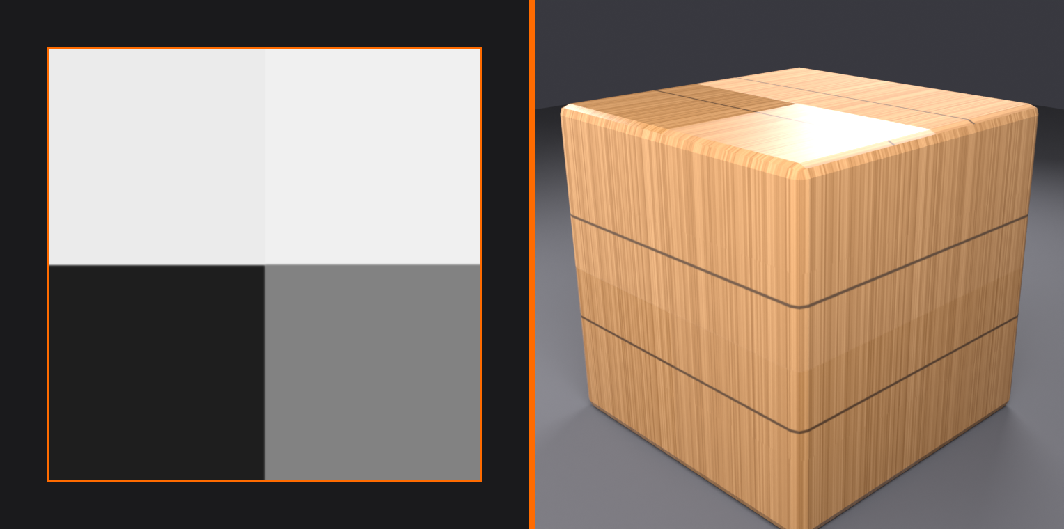
✨ Roughness Texture Painting
What is roughness?
- Controls how shiny or matte surface appears
- Grayscale texture (white = rough/matte, black = smooth/glossy)
- Affects how light reflects off surface
Painting roughness:
- Create roughness texture slot (grayscale image)
- Connect to Principled BSDF → Roughness
- Switch to roughness slot in Texture Paint mode
- Paint with white where surface should be rough
- Paint with black where surface should be shiny
- Gray values for in-between
Roughness painting tips:
- Metal: Shiny (darker values), with rough scratches (lighter marks)
- Wood: Generally rough (medium to light gray)
- Fabric: Very rough (near white)
- Plastic: Medium roughness (medium gray)
- Wear: Edges and high points shinier (from use)
Painting Metallic Maps
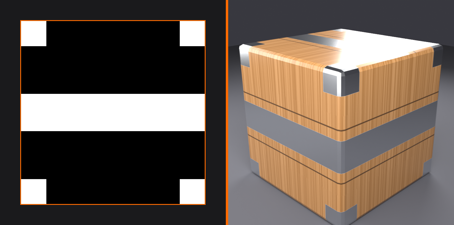
🏆 Metallic Texture Painting
What is metallic?
- Binary choice: Metal (white/1.0) or Non-metal (black/0.0)
- Grayscale texture, but usually pure black or white
- Changes how material interacts with light fundamentally
Painting metallic:
- Create metallic texture slot (grayscale)
- Connect to Principled BSDF → Metallic
- Switch to metallic slot
- Paint white on metal parts
- Paint black on non-metal parts
- Generally avoid gray values (rarely needed)
Metallic workflow:
- Most objects are either 100% metal or 0% metal
- Use Fill tool to quickly mark metal areas white
- Everything else stays black
- Simple binary mask
Coordinating Multiple Maps
🎯 Multi-Map Workflow
Typical painting order:
- Base Color first:
- Establish overall look
- Get colors and details right
- Easiest to visualize
- Roughness second:
- Define surface shine/matte areas
- Add variation and interest
- Big impact on realism
- Metallic third (if needed):
- Simple mask of metal parts
- Quick to paint
- Other maps as needed:
- Normal maps (advanced)
- Emission for glowing parts
Coordination tips:
- Keep Image Editor open showing active slot
- Switch slots frequently to check consistency
- Details should align across all maps
- Scratches in color should also appear in roughness
Viewing Multiple Slots
👁️ Visualizing Different Maps
Viewport shading options:
- Change to see different map contributions
- Material Preview mode shows combined result
- Can temporarily disconnect maps to isolate effects
Checking roughness effect:
- Use Material Preview or Rendered mode
- Rotate lighting to see reflections
- Shiny areas reflect more
- Rough areas diffuse light
Image Editor slot viewing:
- Image Editor dropdown shows all texture images
- Switch to view different maps in 2D
- Useful for comparing consistency
✅ Simplified Approach for Beginners
Start with just Base Color:
- Focus on painting color only at first
- Master basic painting techniques
- Get comfortable with brushes and workflow
Add Roughness when ready:
- Adds huge visual impact
- Relatively easy to paint (just grayscale)
- Instant boost in realism
Metallic as needed:
- Only if you have metal parts
- Simple binary mask
Don't feel pressured to use all maps immediately! Quality color painting beats mediocre multi-map work.
🎓 Advanced Painting Features
Once you're comfortable with basic painting, these advanced features will help you work more efficiently and create even better results.
Masking
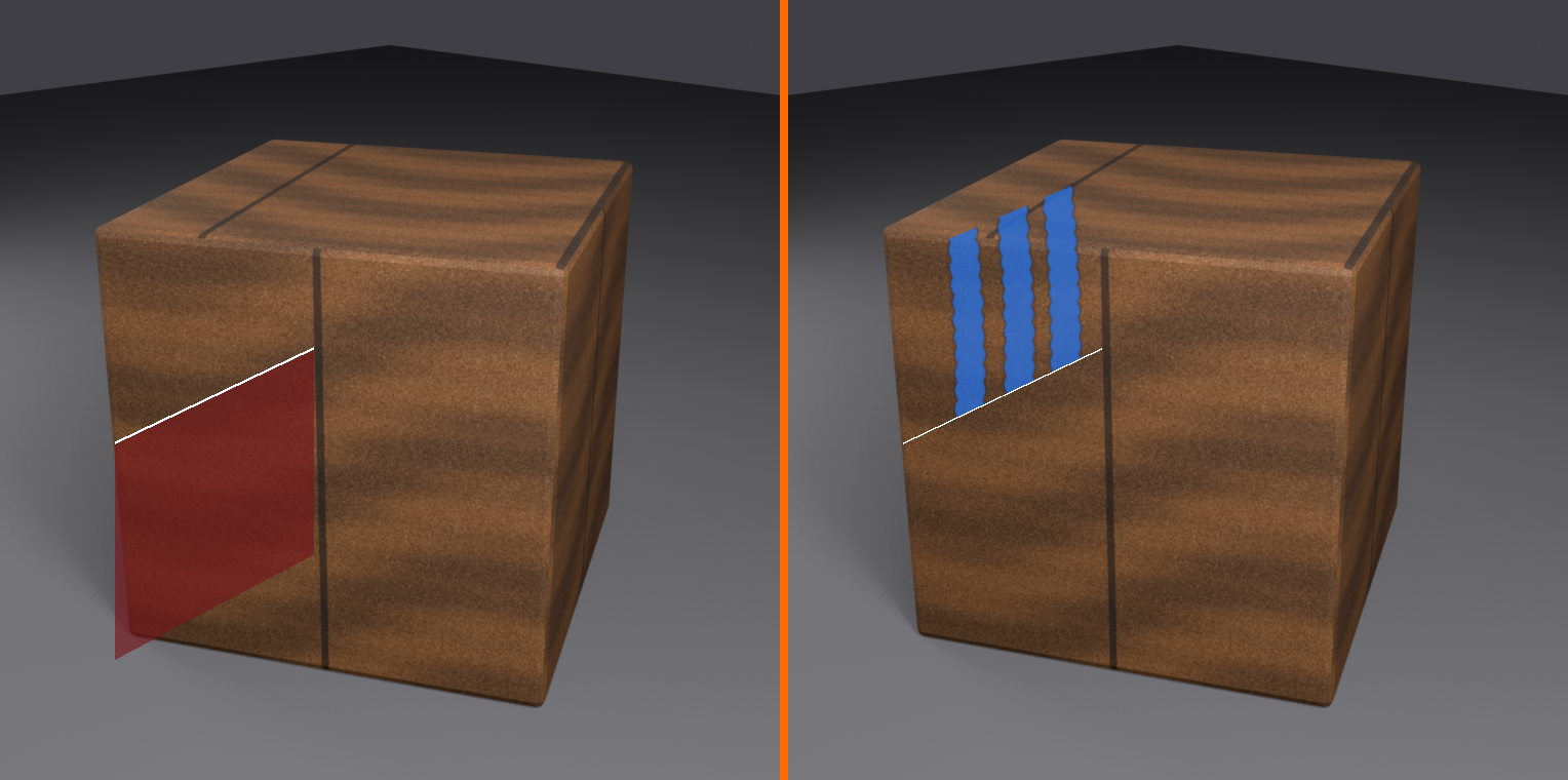
🎭 Texture Painting Masks
What is masking?
- Protects certain areas from being painted
- Like painter's tape in traditional painting
- Black areas = protected (can't paint)
- White areas = paintable
- Gray = partially protected
Using the Mask tool:
- Select Mask tool from toolbar (shield icon)
- Paint with white to create paintable areas
- Paint with black to create protected areas
- Switch back to Draw tool
- Can only paint in white (unmasked) areas
Mask visualization:
- Masked areas appear darkened/tinted in viewport
- Toggle mask visibility in Sidebar (N) → Options
- Adjust mask opacity for better visibility
Clearing masks:
- Paint → Clear Mask (in viewport header menu)
- Or paint entire surface white with Mask tool
Use cases for masking:
- Protect finished areas while working on others
- Create hard-edged designs (mask then fill)
- Paint patterns without going outside lines
- Work on specific UV islands without affecting others
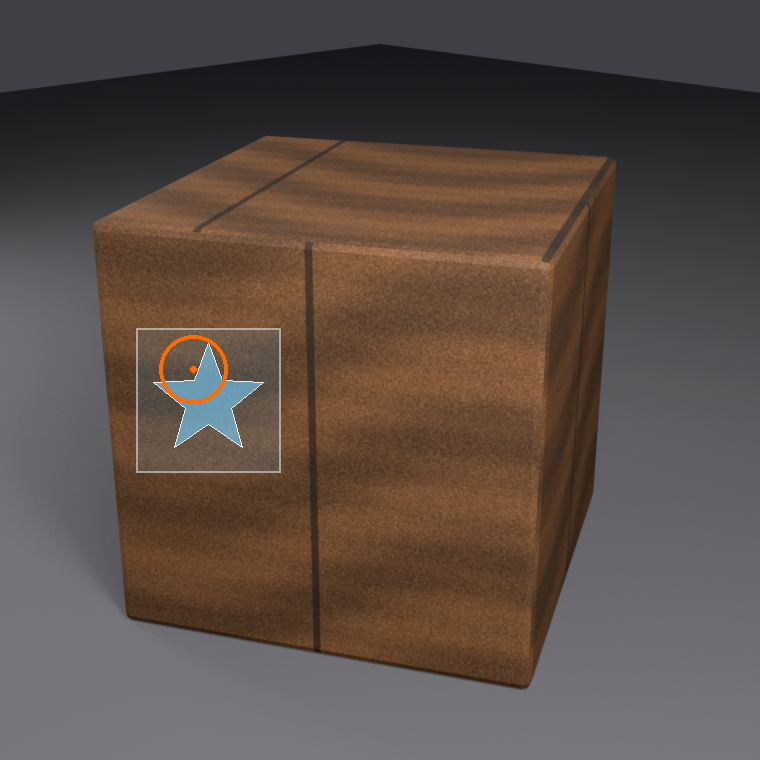
Stencil Painting
📐 Using Stencils
What are stencils?
- Images overlaid on your model
- Control where brush paints based on stencil image
- Like physical stencils in spray painting
- Great for logos, patterns, complex shapes
Setting up stencil:
- Sidebar (N) → Tool → Texture → Mode: Stencil
- Click folder icon to load stencil image
- Stencil appears as overlay on model
- Right-click drag to move stencil
- Right-click + Shift drag to scale
- Right-click + Ctrl drag to rotate
Painting with stencil:
- Paint normally with brush
- Brush only affects areas shown in stencil
- Stencil image acts as a mask
- Black areas in stencil = no paint
- White areas in stencil = full paint
Stencil use cases:
- Adding logos or text to models
- Complex decorative patterns
- Repeating elements
- Grunge and dirt maps
Texture Projection Painting
📽️ Projection Painting
What is projection painting?
- Projects image from camera view onto model
- Like projecting slide onto surface
- Great for photo textures and specific details
How it works:
- Position camera to view area you want to paint
- Load image as brush texture or stencil
- Image projects onto visible surfaces
- Paint to "stamp" projected image onto texture
Best for:
- Using photographic references
- Texturing from concept art
- Quick placeholder textures
Cavity Masking
🌊 Cavity Mask
What is cavity masking?
- Automatically affects crevices and edges differently
- Based on model geometry, not UVs
- Paint accumulates in recesses (like real wear)
Enabling cavity mask:
- Sidebar (N) → Options → Cavity Mask
- Adjust settings:
- Mix: How strongly cavity affects painting
- Angle: What counts as cavity vs edge
Use cases:
- Automatic weathering and wear
- Dirt accumulation in crevices
- Edge highlights
- More realistic, less uniform painting
Normal and Displacement Painting
⛰️ Painting Surface Detail
Normal map painting (advanced):
- Paint fake surface bumps and detail
- Uses special RGB format (each channel = direction)
- Requires special brushes/tools
- More complex than color painting
Displacement painting:
- Paint actual height information
- Can create real geometry detail
- Grayscale (white = raised, black = lowered)
- Used with displacement modifier
Note for beginners:
- Normal/displacement painting is advanced
- Master color painting first
- Often easier to bake normals from high-poly models
- Not necessary for stylized or simple textures
Brush Texture and Spacing
🖌️ Textured Brushes
Adding texture to brush:
- Sidebar (N) → Tool → Texture panel
- Click "+ New" or select existing texture
- Brush strokes now have texture pattern
- Great for organic effects
Texture mapping modes:
- Tiled: Texture tiles within brush
- 3D: Texture is 3D procedural
- Random: Texture rotates randomly
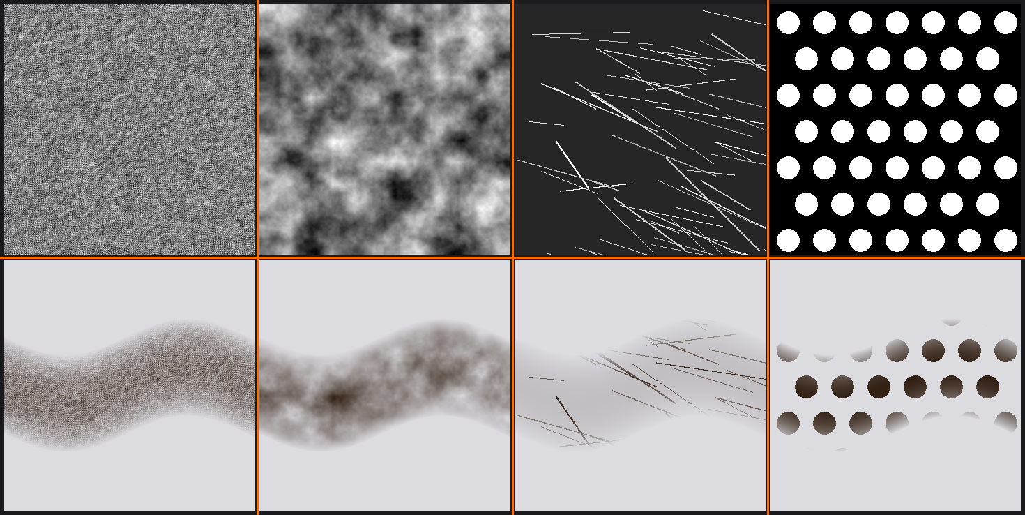
Useful brush textures:
- Noise: General roughness and variation
- Clouds: Soft, organic variations
- Scratches: Linear wear patterns
- Custom images: Import any black/white image
Spacing effects:
- Lower spacing (5-10%): Smooth, continuous strokes
- Higher spacing (20-50%): Textured, stamp-like appearance
- Very high spacing (100%+): Individual stamps, no overlap
Curve Stroke Method
📏 Painting Along Curves
Curve stroke mode:
- Sidebar (N) → Tool → Stroke → Stroke Method: Curve
- Click to place curve control points
- Draw bezier curve path
- Brush follows curve when you paint
- Press Enter to confirm, Esc to cancel
Use cases:
- Long, smooth brush strokes (hair, fabric folds)
- Precise paths (seams, stitching, decorative lines)
- Symmetrical curves
- When hand steadiness is challenging
Quick Edit Mode
⚡ Image Editor Painting
Painting in 2D vs 3D:
- Can paint in Image Editor (left side) instead of 3D view
- Easier for certain tasks:
- Straight lines and geometric shapes
- Large area fills
- Precise pixel work
- Text and logos
Switching between 2D and 3D:
- Both Image Editor and 3D Viewport update live
- Paint where it's easiest
- Use 3D for context, 2D for precision
External Image Editing
🔄 Round-Tripping to External Apps
Editing textures externally:
- Save your texture (Image → Save As)
- In Image Editor: Image → Edit Externally
- Choose external program (Photoshop, GIMP, Krita, etc.)
- Make edits in external program
- Save in external program
- Back in Blender: Image → Reload Image
- Changes appear on model
Why use external editors?
- More powerful tools (layers, filters, effects)
- Faster for certain operations
- Leverage specialized software strengths
- Combine Blender's 3D painting with 2D power tools
Workflow tip:
- Block out colors in Blender (see it on model)
- Fine-tune in Photoshop/GIMP (more tools)
- Return to Blender for final touches in 3D
- Best of both worlds!
🎯 Hands-On Project: Paint a Stylized Crate
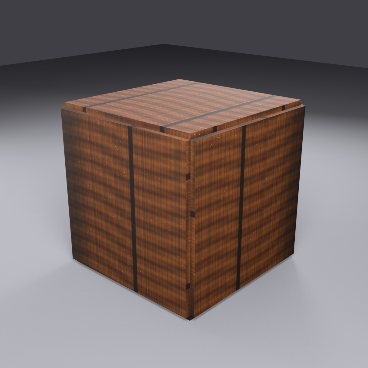
Time to apply everything you've learned! In this project, you'll create a complete hand-painted texture for a wooden crate. This exercise combines modeling basics with texture painting fundamentals.
🎯 Project Goals
What you'll accomplish:
- Create a simple 3D crate model
- UV unwrap the crate properly
- Set up texture painting workspace
- Paint a hand-painted wood texture with details
- Add color variation and weathering
- Create a complete, game-ready asset
Estimated time: 30-45 minutes
Style: Stylized/hand-painted (perfect for games!)
Step 1: Model the Crate
📦 Creating the Basic Crate
- Start with a cube:
- Delete default cube (
X) Shift+A→ Mesh → Cube- Scale slightly:
S→1.2→Enter
- Delete default cube (
- Add wood plank detail:
- Enter Edit Mode (
Tab) - Select all faces (
A) - Press
I(inset) → Move mouse slightly → Click - Creates border around each face (plank frame effect)
- Enter Edit Mode (
- Add corner reinforcements (optional):
- Select edge loops at corners
- Press
Ctrl+B(bevel) - Move mouse slightly → Click
- Suggests metal or wood corner braces
- Shade smooth:
- Object Mode
- Right-click → Shade Smooth (optional, or keep flat for stylized look)
Step 2: UV Unwrap the Crate
🗺️ Unwrapping for Painting
- Mark seams:
- Edit Mode, Edge Select (
2) - Select vertical edge on one corner
Ctrl+E→ Mark Seam- Select edges around top face
Ctrl+E→ Mark Seam- Select edges around bottom face
Ctrl+E→ Mark Seam
- Edit Mode, Edge Select (
- Unwrap:
Ato select allU→ Unwrap- Check UV Editor to verify good unwrap
- Optimize UVs:
- Switch to UV Editing workspace
- In UV Editor:
Ato select all UVs - UV menu → Average Island Scale
- UV menu → Pack Islands
Step 3: Set Up Texture Paint Workspace
🎨 Preparing to Paint
- Switch to Texture Paint workspace:
- Click "Texture Paint" tab at top
- Create base color texture:
- Make sure crate is selected
- In 3D Viewport header, click "+ New" next to texture slot
- Name: "Crate_Color"
- Size: 2048×2048
- Color: Medium tan/brown (#C19A6B)
- Click OK
- Verify material setup:
- Blender auto-created material with texture
- Change viewport to Material Preview mode
- Crate should show tan/brown color
Step 4: Paint Base Wood Colors
🎨 Establishing Wood Tones
- Create color palette:
- Base wood: Medium brown (#8B6F47)
- Dark wood: Dark brown (#5C4033)
- Light wood: Tan (#D4A574)
- Save these as swatches in color picker
- Paint base layer:
- Select Draw tool
- Radius: 80-100px
- Strength: 0.7
- Use medium brown color
- Paint broad strokes covering all surfaces
- Don't worry about details yet
- Add color variation:
- Switch to dark brown
- Strength: 0.4
- Paint random patches and streaks
- Think: wood grain variation
- Switch to light brown occasionally
- Build up organic color variety
Step 5: Paint Wood Grain
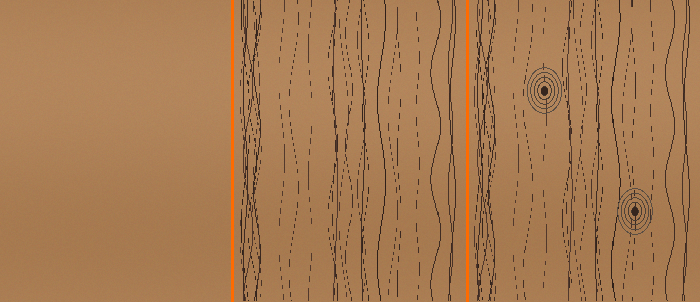
🌲 Adding Wood Grain Detail
- Set up grain brush:
- Radius: 20-40px (smaller)
- Strength: 0.5-0.6
- Color: Dark brown (#5C4033)
- Paint grain lines:
- Paint long, slightly wavy strokes
- Follow direction of wood planks
- Vary thickness and darkness
- Don't make perfectly straight—organic variation!
- Some close together, some spread apart
- Add knots (optional):
- Small circular dark spots
- Add rings around them for realism
- Don't overdo—1-2 per plank is enough
Step 6: Add Highlights and Shadows
✨ Creating Depth with Light and Dark
- Paint shadows in recesses:
- Very dark brown color (almost black)
- Small brush (10-20px)
- Strength: 0.6
- Paint thin lines in inset areas (plank borders)
- Paint corners slightly darker
- Add highlights on edges:
- Light tan color (#E8C896)
- Small brush (15-25px)
- Strength: 0.5
- Paint thin lines along top edges of planks
- Suggests light catching raised surfaces
Step 7: Weather and Detail
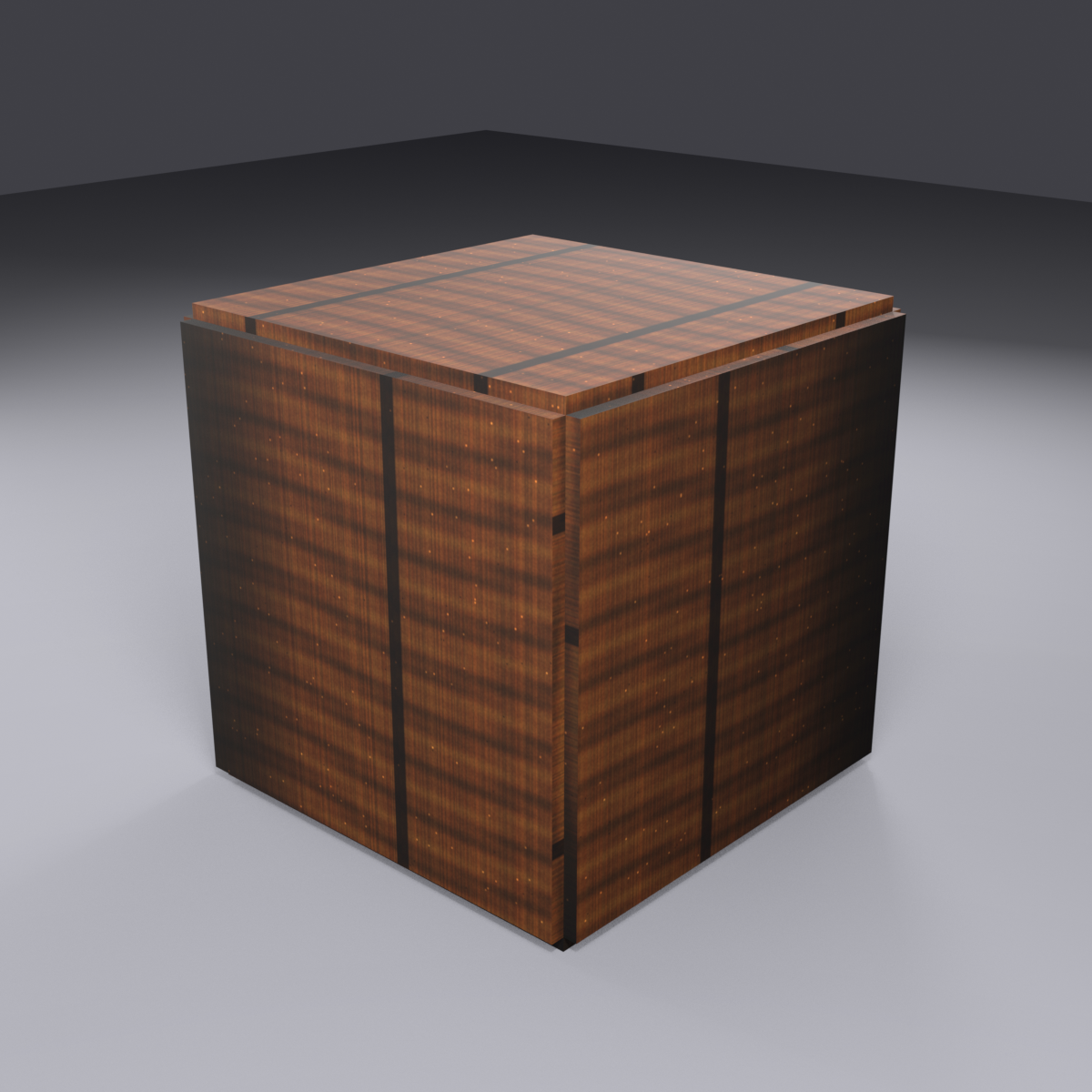
🌦️ Adding Weathering and Character
- Add scratches and wear:
- Small brush (5-15px)
- Light tan color
- Strength: 0.7
- Paint short, random scratches
- Concentrate on corners and edges (where crate would be handled)
- Add dirt and stains:
- Dark brown or gray-brown color
- Medium brush (40-60px)
- Very low strength (0.2-0.3)
- Build up darker patches near bottom and corners
- Suggests accumulated dirt
- Optional - Add stenciled text/logo:
- Use stencil or paint freehand
- "FRAGILE" or shipping markings
- Dark paint color
- Slightly faded for realism
Step 8: Final Touches and Polish
✨ Finishing Up
- Review from all angles:
- Rotate around crate in 3D viewport
- Check all sides have detail
- Look for overly uniform areas
- Add variation where needed
- Soften harsh edges (optional):
- Select Soften tool from toolbar
- Lightly brush over any too-sharp transitions
- Blend colors slightly
- Don't overdo—keep painterly style
- Add final highlights:
- Very light, almost white color
- Tiny brush (5-10px)
- Single clicks on highest corners
- Suggests strongest light reflection
Step 9: Save Your Work
💾 CRITICAL: Save Everything!
- Save texture image:
- In Image Editor: Image → Save As
- Name: "Crate_Color.png"
- Choose location (same folder as .blend file recommended)
- Format: PNG
- Click Save
- Save Blender file:
Ctrl+Sor File → Save- Name: "Painted_Crate.blend"
Remember: Textures are separate files! Saving .blend doesn't save texture images!
Step 10: Test and Admire
🎉 See Your Results!
- Switch to rendered view:
- Change viewport to "Rendered" shading mode
- See crate with full lighting
- Rotate and admire your work!
- Test different lighting:
- Add light sources if needed
- Change environment lighting
- See how texture responds to light
- Render a beauty shot:
- Position camera nicely
- Press
F12to render - Save render for portfolio!
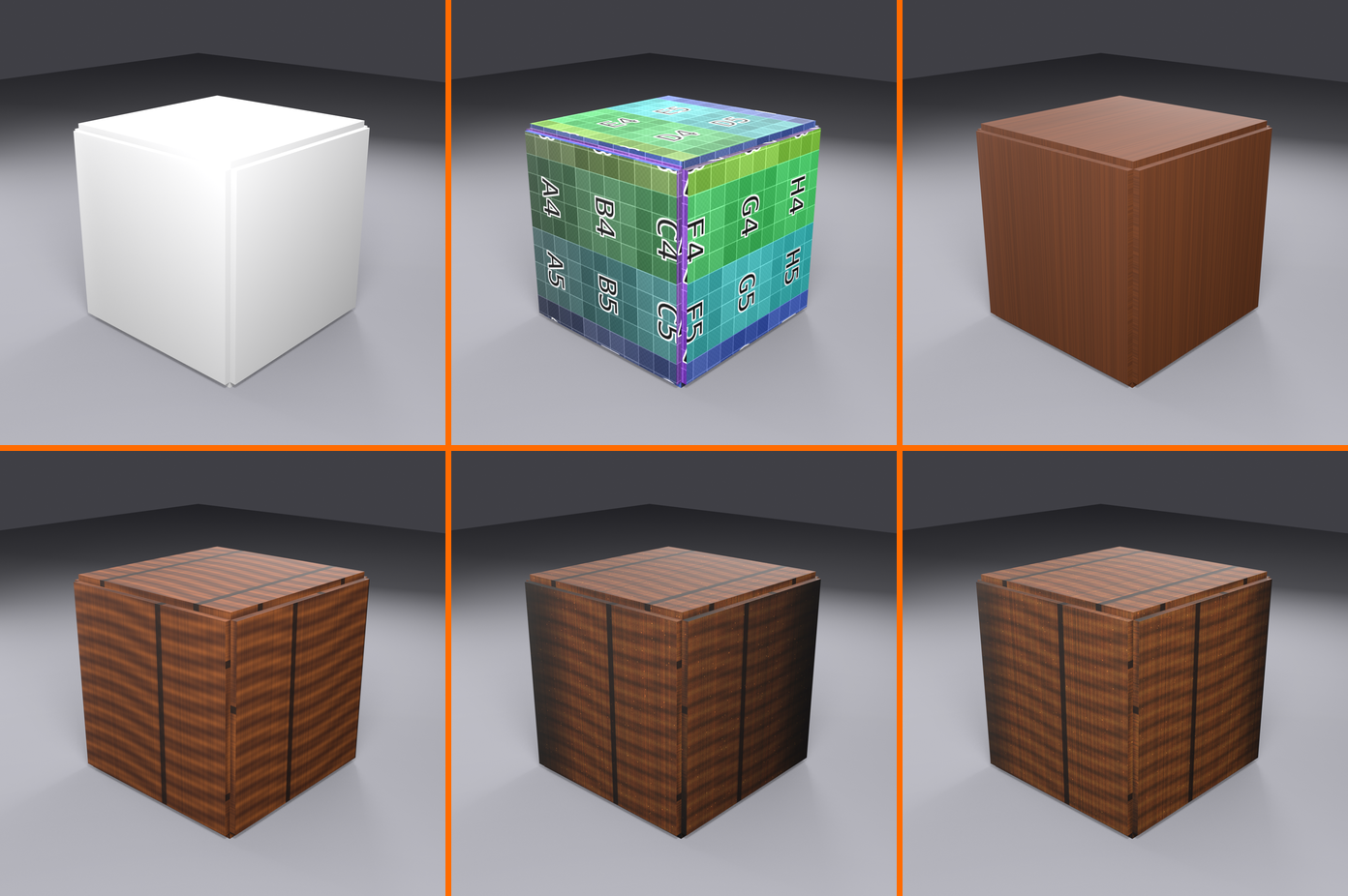
✅ Success Checklist
Your completed crate should have:
- ✅ Proper UV unwrap with good use of texture space
- ✅ Base wood color with variation (not flat single color)
- ✅ Wood grain detail painted convincingly
- ✅ Shadows in recesses, highlights on edges
- ✅ Weathering and wear appropriate for wooden crate
- ✅ Details visible from all angles
- ✅ Hand-painted, stylized aesthetic
- ✅ Texture saved as PNG file
Bonus Challenges
🌟 Take It Further
Challenge 1: Add roughness map
- Create roughness texture slot
- Paint grayscale roughness variation
- Scratched areas shinier, wood grain rougher
Challenge 2: Add metal corners
- Model simple corner braces
- Paint metallic texture on them
- Add rust and oxidation
Challenge 3: Create variations
- Duplicate crate
- Create new texture ("Crate_Color_02")
- Paint different colors/styles
- Build a collection of crate variations
Challenge 4: Paint a logo/label
- Design company logo or shipping label
- Use stencil or paint freehand
- Add weathering so it looks old and faded
⚠️ Common Texture Painting Mistakes
Learning what NOT to do is just as important as learning what to do. Here are the most common mistakes beginners make in texture painting (and how to avoid them):
Mistake 1: Not Saving the Texture Image
❌ The Problem
Painting for hours, saving the .blend file, then closing Blender—only to discover all painted work is gone!
What happens:
- Texture exists only in Blender's memory until explicitly saved
- Saving .blend file does NOT save texture images
- Closing Blender discards unsaved textures forever
- Hours of work lost!
The fix:
- Image Editor → Image → Save (or Save As)
- Do this FREQUENTLY while painting
- Watch for asterisk (*) next to texture name = unsaved
- Enable "Auto Save Images" in preferences as backup
- Make it a habit: Save texture every 5-10 minutes
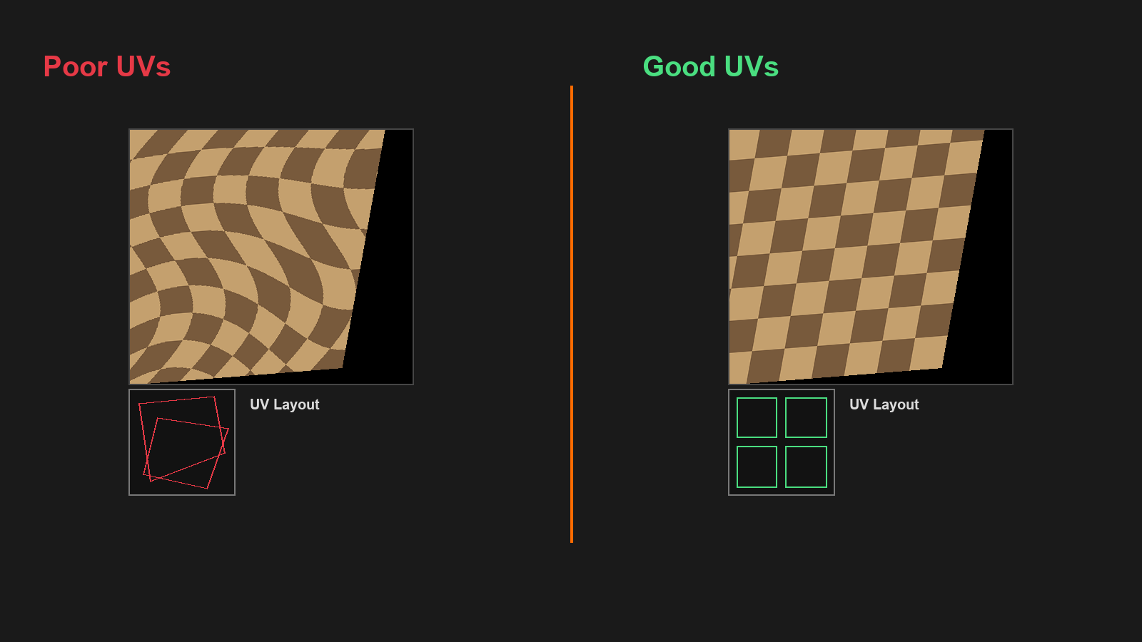
Mistake 2: Painting Without Proper UVs
❌ The Problem
Jumping straight into painting without checking UV unwrap quality.
What happens:
- Paint appears stretched or distorted on model
- Islands overlap causing paint to appear in wrong places
- Details painted on one area show up elsewhere unexpectedly
- Have to redo UVs AND repaint everything
The fix:
- ALWAYS check UVs before painting
- Apply UV Grid texture to test for stretching
- Use Average Island Scale for consistent texture density
- Pack islands efficiently
- Check for overlapping UVs (Select → Select Overlap)
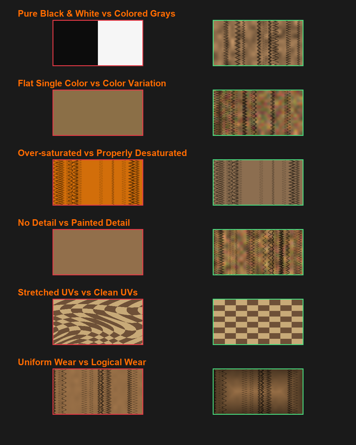
Mistake 3: Using Pure Black or Pure White
❌ The Problem
Using RGB (0,0,0) black or (1,1,1) white for shadows and highlights.
What happens:
- Texture looks flat, digital, and unrealistic
- Pure black has no information, can't be adjusted
- Pure white clips, loses detail
- No room for lighting to add variation
The fix:
- Darkest values: Very dark colored grays (RGB: 0.05, 0.05, 0.08)
- Lightest values: Tinted off-whites (RGB: 0.95, 0.95, 0.92)
- Add slight color tint to blacks and whites
- Reserve pure black/white for very special circumstances only
Mistake 4: Single Flat Color Everywhere
❌ The Problem
Painting with one solid color across entire surface without variation.
What happens:
- Texture looks boring and lifeless
- Appears very amateur
- Doesn't represent real-world materials
- No visual interest or depth
The fix:
- Always add subtle color variation
- Shift hue slightly as you paint (blue → blue-purple → blue-cyan)
- Vary value (lighter and darker patches)
- Vary saturation (more vivid in some areas, more muted in others)
- Think: "Nothing in nature is perfectly uniform"
Mistake 5: Brush Size Never Changes
❌ The Problem
Using the same brush size for all painting tasks.
What happens:
- Large areas take forever with small brush
- Details are sloppy with large brush
- Inefficient workflow
- Texture lacks fine detail and refinement
The fix:
- Constantly adjust brush size with
Fkey - Large brush (100-200px): Base colors, broad strokes
- Medium brush (40-80px): General painting, forms
- Small brush (10-30px): Details, edges, fine work
- Tiny brush (5-15px): Highlights, final accents
- Make size adjustment second nature
Mistake 6: Over-Saturated Colors
❌ The Problem
Using fully saturated, vibrant colors everywhere.
What happens:
- Texture looks garish and unrealistic
- Hard on the eyes, uncomfortable to look at
- Doesn't match real-world materials
- Very "beginner" looking
The fix:
- Reduce saturation to 60-80% for most surfaces
- Real-world materials are mostly desaturated
- Reserve high saturation for:
- Focal points and accents
- Stylized, cartoony aesthetics
- Small areas of interest
- When in doubt, desaturate a bit
Mistake 7: Ignoring Reference Images
❌ The Problem
Painting from imagination without studying real materials.
What happens:
- Textures don't look believable
- Missing key characteristics of materials
- Wrong colors, patterns, or surface qualities
- Slow progress due to guesswork
The fix:
- ALWAYS gather reference images before painting
- Study how real materials look:
- Wood: Grain patterns, knots, color variation
- Metal: Reflections, oxidation, wear patterns
- Stone: Cracks, color variation, texture
- Use reference images in Blender (Add → Image → Reference)
- Sample colors from references with eyedropper
Mistake 8: Not Testing from Multiple Angles
❌ The Problem
Painting from one view angle and never rotating the model.
What happens:
- One side looks great, others are neglected or wrong
- Details don't align properly across UV seams
- Back/bottom of model is blank or sloppy
- Discover problems too late
The fix:
- Constantly rotate model while painting
- Check from all angles frequently
- Paint a bit, rotate, paint more, rotate
- Every surface should receive attention
- Use
Numpadkeys for standard views
Mistake 9: Too High Brush Strength
❌ The Problem
Using brush at full strength (1.0) all the time.
What happens:
- Can't build up colors gradually
- Mistakes are very obvious and hard to fix
- No subtle transitions
- Hard-edged, digital-looking strokes
The fix:
- Use moderate strength (0.5-0.7) for most work
- Build up colors with multiple passes
- Allows for corrections and adjustments
- Creates more organic, painterly results
- Only use high strength (0.9-1.0) for final crisp details
Mistake 10: Painting in Wrong Color Space
❌ The Problem
Not understanding sRGB vs. Linear color spaces for textures.
What happens:
- Colors look wrong in renders
- Too bright or too dark
- Washed out appearance
- Confusion about why colors don't match
The fix:
- Base Color textures: Use sRGB color space
- Data maps (roughness, metallic, normal): Use Non-Color/Linear
- Check in Shader Editor → Image Texture node → Color Space dropdown
- Blender usually sets this correctly, but verify if colors look wrong
🎯 The Golden Rule: The most common mistake is rushing! Take your time, save frequently, check your work from all angles, and don't be afraid to undo and try again. Texture painting is an iterative process—embrace the journey of refinement!
📚 Lesson Summary
Congratulations! You've completed a comprehensive introduction to texture painting in Blender. Let's recap everything you've learned.
🎯 Key Takeaways
Core Concepts Mastered:
- Texture painting lets you paint directly on 3D models in real-time
- UVs are essential—good unwrap = good painting experience
- Brushes are versatile with size, strength, falloff, and blend modes
- Color theory matters—hue, saturation, value create depth
- Layering builds quality—base, mid-tones, details
- Multiple texture slots for color, roughness, metallic, etc.
- Save textures separately—they're not part of .blend file!
Essential Tools and Techniques
🧰 Your Texture Painting Toolkit
Workspace setup:
- Texture Paint workspace (3D view + Image Editor)
- Material Preview or Rendered shading mode
- Tool shelf (
T) and sidebar (N)
Essential tools:
- Draw brush: Primary painting tool
- Soften/Smear: Blending tools
- Fill: Quick color fills
- Clone: Copy texture areas
- Mask: Protect areas
Key shortcuts:
F- Resize brush interactivelyShift+F- Adjust strength interactivelyS- Eyedropper (sample color)X- Swap primary/secondary colorsCtrl+Z- Undo (use liberally!)
The Texture Painting Workflow
✅ Professional Workflow Recap
- Prepare model: Ensure good topology and proper scale
- UV unwrap: Create clean, efficient UV layout
- Create texture: Set up image texture (2K recommended)
- Set up material: Connect texture to shader
- Plan palette: Choose 3-5 main colors before starting
- Paint base: Broad strokes, establish overall colors
- Add variation: Color shifts, value changes
- Build layers: Shadows, mid-tones, highlights
- Add details: Fine work, accents, weathering
- Save frequently: Image → Save (not just .blend!)
- Test and refine: Check from all angles, iterate
Color Guidelines Summary
🎨 Color Best Practices
Do:
- ✅ Use limited color palette (3-5 main colors)
- ✅ Add subtle hue/saturation/value variation
- ✅ Use colored grays instead of pure black/white
- ✅ Desaturate most surfaces (60-80% saturation)
- ✅ Consider warm/cool temperature shifts
- ✅ Sample from reference images
Don't:
- ❌ Use single flat color everywhere
- ❌ Paint with fully saturated colors constantly
- ❌ Use pure RGB black (0,0,0) or white (1,1,1)
- ❌ Ignore color relationships and theory
- ❌ Paint without reference images
Painting Techniques Checklist
🖌️ Technique Reference
Stroke techniques:
- Continuous strokes for coverage
- Stippling/dotting for texture
- Straight lines (Shift+Click)
- Layering for depth and complexity
Creating realism:
- Color variation (never uniform)
- Value contrast (shadows and highlights)
- Edge definition (crisp focal points, soft backgrounds)
- Weathering and wear (scratches, dirt, age)
Advanced features:
- Symmetry for mirrored painting
- Masking to protect areas
- Stencils for complex patterns
- Multiple texture slots (color, roughness, metallic)
Common Mistakes to Avoid
| Mistake | Problem | Solution |
|---|---|---|
| Not saving texture | Work lost when closing | Image → Save frequently |
| Poor UVs | Stretched, distorted paint | Check/fix UVs before painting |
| Pure black/white | Flat, digital look | Use colored grays |
| Flat color | Boring, lifeless | Add color variation |
| Same brush size | Inefficient, lacks detail | Use F key to adjust constantly |
| Over-saturation | Garish, unrealistic | Desaturate to 60-80% |
| No references | Inaccurate materials | Study real-world examples |
What You've Accomplished
🏆 Your Achievements
You can now:
- ✅ Set up Blender's Texture Paint workspace efficiently
- ✅ Create and manage texture images properly
- ✅ Use brushes with full control over size, strength, and settings
- ✅ Apply color theory to create harmonious palettes
- ✅ Paint with proper layering technique
- ✅ Add realistic detail and weathering
- ✅ Work with multiple texture slots (color, roughness, metallic)
- ✅ Use advanced features like masking and stencils
- ✅ Save and export textures correctly
- ✅ Create complete, professional-looking hand-painted textures!
Most importantly: You completed a full hands-on project and painted a real 3D asset from scratch!
🎯 What's Next?
With texture painting fundamentals mastered, you're ready to explore more advanced texturing and material creation techniques!
📚 Coming Up: Lesson 14 - Advanced Materials and Shading
In the next lesson, you'll learn:
- Advanced shader nodes and material creation
- Procedural textures and mixing techniques
- Creating complex materials with node setups
- PBR workflow and material properties
- Texture mapping techniques (normal, displacement, etc.)
- Creating realistic glass, metal, and other materials
- Baking textures from high-poly to low-poly models
Your texture painting skills are the foundation! Understanding how to paint textures makes working with advanced materials much easier.
⚡ Practice Suggestions
Before moving to the next lesson, reinforce your skills:
- Paint 3 simple objects with different materials:
- Wooden barrel or bucket
- Stone block or brick
- Metal container or tool
- Experiment with styles:
- Create one realistic texture
- Create one stylized/cartoon texture
- Try different color palettes
- Practice multi-map workflow:
- Paint base color on an object
- Add roughness map
- Add metallic map if appropriate
- See how they interact
- Study references:
- Collect photos of real materials
- Analyze color, wear patterns, details
- Try to recreate what you see
- Speed painting challenge:
- Set 30-minute timer
- Paint complete texture start to finish
- Focus on speed and efficiency
- Builds confidence and workflow
Even 1-2 hours of practice will significantly improve your painting skills!
🎓 Continuing Your Education
Ways to improve your texture painting:
- Study traditional painting:
- Learn from traditional artists and techniques
- Color theory books and courses
- Painting fundamentals apply to 3D!
- Explore dedicated texturing software:
- Substance Painter (industry standard)
- Mari (high-end film production)
- 3D-Coat (sculpting and texturing)
- Quixel Mixer (free alternative)
- Study game textures:
- Look at how games handle textures
- Hand-painted WoW style vs. PBR realistic
- Learn from professional work
- Join communities:
- Polycount, ArtStation for texture artists
- Get feedback on your work
- Learn from others' techniques
💡 Pro Tips for Continued Growth
Build a personal workflow:
- Everyone develops their own painting style
- Experiment to find what works for you
- Save custom brushes and presets
- Document your process for future reference
Create a texture library:
- Save your best painted textures
- Organize by material type
- Reuse and remix for new projects
- Build your personal asset collection
Challenge yourself:
- Try materials outside your comfort zone
- Recreate textures from favorite games
- Set weekly painting challenges
- Track progress over time
🎉 Congratulations!
You've completed Lesson 13: Texture Painting Basics!
Texture painting is both an art and a craft. You now have the technical skills and foundational knowledge to create beautiful, professional textures. The journey from blank texture to fully painted asset is incredibly rewarding—every stroke brings your 3D models to life!
Remember: Great texture artists aren't born, they're made through practice. Every texture you paint teaches you something new. Keep experimenting, keep learning, and most importantly—keep creating!
Your painted models are waiting to be brought to life. Let's continue the journey! 🎨✨