🎨 Introduction to Shader Editor
Discover the power of Blender's node-based material system and learn to create stunning, realistic surfaces that bring your 3D models to life.
You've learned to model beautiful geometry—cubes, spheres, complex shapes with perfect precision. But right now, everything looks like gray plastic. That's about to change dramatically! In this lesson, you'll discover how to give your models realistic surfaces: shiny metal, rough wood, transparent glass, glowing emissive materials—anything you can imagine.
The Shader Editor is Blender's material creation workshop. Think of it like a painter's studio, but instead of mixing physical paints, you're connecting visual "nodes" that define how light interacts with your surfaces. It's powerful, flexible, and once you understand the basics, surprisingly intuitive. By the end of this lesson, you'll be creating materials that make people ask, "Wait, that's 3D?"
This is where your models transform from geometry into art. Materials add the final layer of believability—the difference between a gray sphere and a polished chrome ball bearing, between a flat plane and weathered wood flooring. Let's unlock this creative superpower!
🎓 What You'll Learn
- Shader Editor Basics: Navigate and understand the node-based interface
- Material Fundamentals: How materials work and interact with light
- Node System: Connect nodes to create complex material networks
- Essential Shaders: Principled BSDF, Emission, Glass, and more
- Material Properties: Roughness, metallic, color, and other key attributes
- Quick Materials: Create common materials (metal, plastic, glass) fast
- Preview and Testing: See your materials in real-time with proper lighting
⏱️ Estimated Time: 60-75 minutes
🎯 Project: Create a material library with 5 essential materials
In This Lesson
🎨 What Are Materials and Why They Matter
Before diving into the Shader Editor, let's understand what materials actually are and why they're crucial to 3D art. A material is essentially a set of instructions that tells Blender how light should interact with a surface.
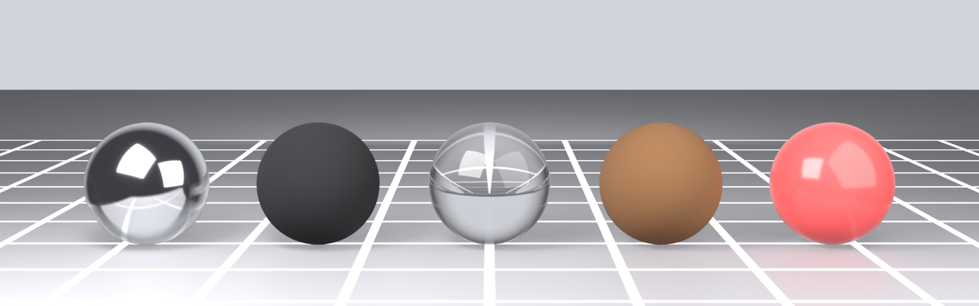
💡 The Photography Studio Analogy: Imagine photographing different objects under the same studio lighting—a chrome sphere, a rubber ball, a glass marble, and a wooden block. They're all lit identically, but they look completely different because their surfaces interact with light differently. Chrome reflects sharply, rubber absorbs most light, glass transmits and refracts it, wood scatters it diffusely. Materials define these unique light interactions in your 3D scene.
The Role of Materials in 3D
Without materials, every object in your scene would look like flat, gray clay. Materials provide:
🎯 What Materials Control
- Color and Appearance: Base color, patterns, variations across surface
- Reflectivity: How shiny or matte the surface is
- Light Response: Whether light bounces off, penetrates, or gets absorbed
- Surface Texture: Bumps, scratches, roughness at microscopic level
- Transparency: Whether objects are opaque, translucent, or transparent
- Emission: Whether surface glows or emits light
- Realism: The final 10% that makes renders look photoreal vs. "CG"
Materials vs. Textures: Understanding the Difference
People often confuse materials and textures. Here's the distinction:
📊 Materials vs. Textures
| Concept | What It Is | Example |
|---|---|---|
| Material | The complete shader setup defining surface properties | "Polished Chrome" material with metallic: 1.0, roughness: 0.1 |
| Texture | Image or procedural pattern used within a material | Wood grain image plugged into base color |
| Shader | Mathematical function calculating light interaction | Principled BSDF shader node |
Think of it this way: a material is the recipe, textures are ingredients, and shaders are cooking techniques. You combine them all to create the final result!
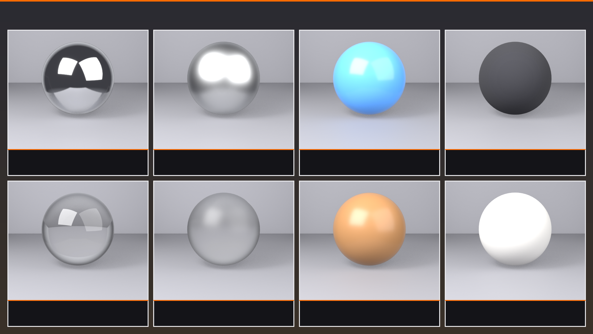
Real-World Material Examples
Let's look at how different real-world materials behave with light:
🌟 Material Behavior Patterns
| Material Type | Light Behavior | Key Properties |
|---|---|---|
| Metals | Reflects light sharply, tinted reflection | Metallic: 1.0, Low Roughness, Colored reflection |
| Dielectrics (non-metal) | Some reflection + color from absorbed/scattered light | Metallic: 0.0, Varying Roughness, Base Color important |
| Glass/Transparent | Light passes through, bends (refracts) | Transmission, IOR (Index of Refraction) |
| Subsurface (wax, skin) | Light enters, scatters inside, exits | Subsurface Scattering, Radius values |
| Emissive (lights, screens) | Emits light, doesn't just reflect | Emission strength and color |
🎯 The Photography Principle: Professional 3D artists think like photographers. They understand that material appearance depends entirely on lighting conditions. The same chrome sphere looks different under bright sunlight vs. soft studio lights vs. neon signs. Good materials respond realistically to whatever lighting you throw at them!
Why Blender Uses Node-Based Materials
Blender's Shader Editor uses a "node-based" system. Instead of just sliders and buttons, you connect visual blocks (nodes) together. This might seem complex at first, but it's actually more powerful and flexible:
✅ Benefits of Node-Based Materials
- Visual Programming: See the flow of data and connections
- Infinite Flexibility: Combine shaders in ways traditional systems can't
- Procedural Control: Create materials that adapt and respond
- Industry Standard: Most professional 3D software uses nodes
- Non-Destructive: Change connections without starting over
- Power and Simplicity: Can be as simple or complex as you need
Think of nodes like LEGO blocks—individually simple, but you can build incredibly complex things by connecting them in creative ways!
The Journey Ahead
Materials and texturing is a deep topic—entire careers are built around it. In this lesson, we're focusing on fundamentals:
🗺️ Your Learning Path
- Today (Lesson 10): Shader Editor basics, simple materials, node fundamentals
- Lesson 11: PBR (Physically Based Rendering) in depth—understanding realistic materials
- Lesson 12: UV Unwrapping—controlling where textures appear
- Lesson 13: Texture Painting—creating custom textures directly in Blender
- Lesson 14: Procedural Textures—generating textures mathematically
By the end of Module 3, you'll be creating photoreal materials that make people question whether your renders are 3D or photographs. But first, let's master the basics!
🖥️ The Shader Editor Interface
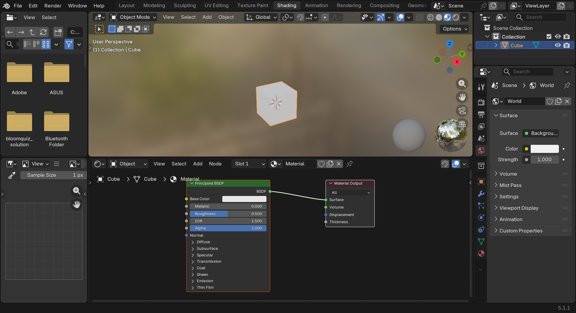
Time to open Blender's material workshop! The Shader Editor is where all material creation happens. It's a dedicated workspace designed specifically for building and connecting shader nodes.
Opening the Shader Editor
There are several ways to access the Shader Editor. Let's explore the most common methods:
📝 Method 1: Shading Workspace (Recommended for Beginners)
- Look at the top of Blender's window
- Find the workspace tabs: Layout, Modeling, Sculpting, UV Editing, Texture Paint, Shading, etc.
- Click "Shading"
- Blender switches to a pre-configured layout perfect for materials!
The Shading workspace is beautifully designed with everything you need visible at once:
🎨 Shading Workspace Layout
- Top-Left: 3D Viewport showing your objects
- Top-Right: Shader Editor with your material nodes
- Bottom-Left: Properties panel for quick adjustments
- Bottom-Right: Sometimes a File Browser or preview
📝 Method 2: Change Any Editor to Shader Editor
- Find any editor's corner icon (looks like overlapping squares)
- Click it to open editor type menu
- Choose "Shader Editor"
- That editor transforms into the Shader Editor!
💡 Workspace Tip: The Shading workspace isn't magical—it's just a pre-configured layout. You can recreate it manually by splitting editors and changing their types. But why bother? The Shading workspace is perfect for material work, so just use it! Save yourself the setup time.
Shader Editor Anatomy
Once you're in the Shader Editor, you'll see a dark workspace with (usually) two nodes already present. Let's understand what you're looking at:
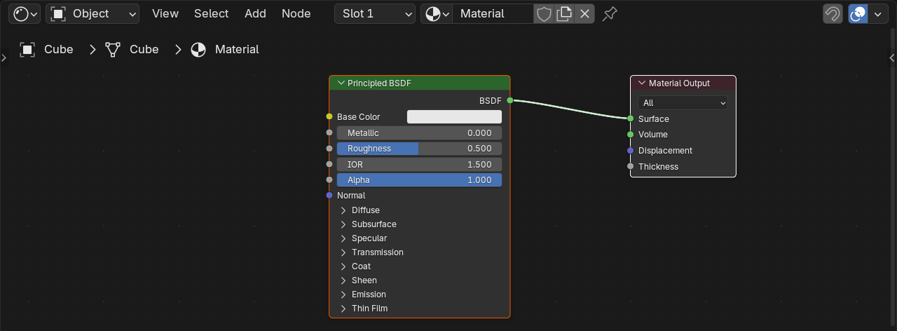
🔍 Shader Editor Components
- Header (Top): Material selector, view options, add menu
- Canvas (Main Area): Where nodes live and connect
- Default Nodes: Principled BSDF (left) and Material Output (right)
- Connections (Noodles): Lines connecting node sockets
Navigation in the Shader Editor
The Shader Editor uses similar navigation to the 3D Viewport, but there are some differences:
🎮 Shader Editor Navigation
| Action | Mouse | Why You Need It |
|---|---|---|
| Pan View | Middle Mouse Button + Drag or Shift + Alt + Left Click + Drag |
Move around large node networks |
| Zoom | Scroll Wheel or Ctrl + Middle Mouse + Drag |
Focus on specific nodes or see entire network |
| Frame All | Home key or View menu → Frame All |
Zoom to fit all nodes in view |
| Frame Selected | Numpad . or View menu → Frame Selected |
Focus on selected nodes |
The Header: Your Command Center
The Shader Editor header contains important controls. Let's understand each section:
🎛️ Header Controls (Left to Right)
- Editor Type Icon: Shows this is the Shader Editor (click to change)
- Shader Type: Object/World/Line Style selector (keep on Object for now)
- Material Selector: Dropdown showing current material name
- Material Management Buttons:
- New (+): Create new material
- Number: Shows how many objects use this material
- Fake User (shield icon): Save material even if unused
- X: Remove material from object
- Add Menu: Add new shader nodes
- View Options: Display settings
Material Slots Explained
Objects can have multiple materials (like a car with different materials for paint, glass, rubber). These are managed through material slots:
📝 Working with Material Slots
- Select your object in the 3D Viewport
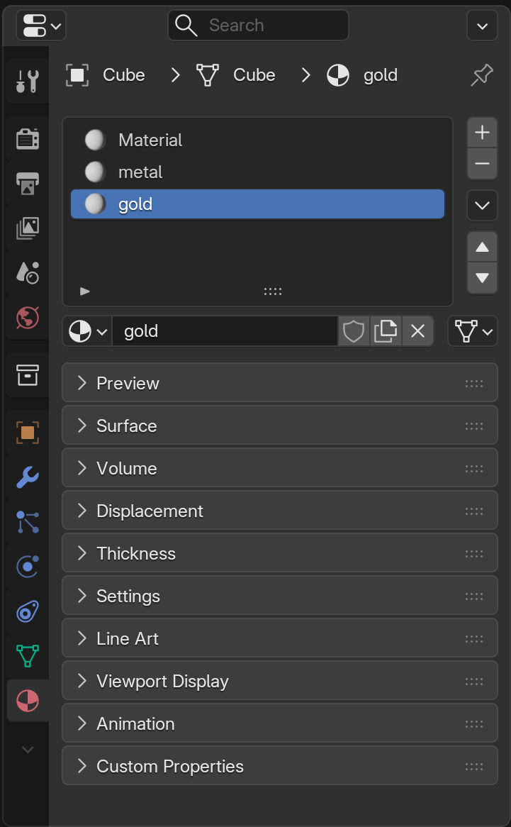
- Look at the Material Properties panel (sphere icon, usually on right side)
- You'll see material slots: A list showing all materials on this object
- The Shader Editor shows the selected slot's material
🎯 One Object, Multiple Materials: Think of material slots like layers on a wedding cake. Each layer (slot) can have different frosting (material). You assign specific faces to specific slots in Edit Mode. For now, we'll stick with one material per object, but knowing about slots prevents confusion later!
Your First Look at Nodes
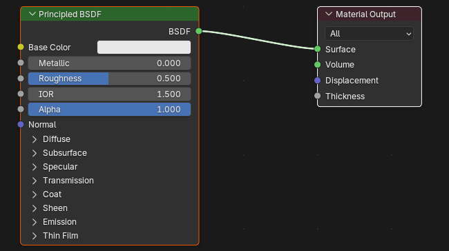
When you open the Shader Editor with an object selected, you'll typically see two nodes already connected:
🔷 The Default Material Setup
- Left Node: "Principled BSDF"
- This is your main shader
- Contains all the material properties you'll adjust
- Think of it as your material control panel
- Right Node: "Material Output"
- This is the final destination
- Only what's plugged into this node actually renders
- Think of it as the finish line for your shader network
- Green Line Connecting Them:
- The "BSDF" output socket connects to "Surface" input socket
- This connection tells Blender "use this shader for the surface"
Node Interaction Basics
Before diving deeper into what nodes do, let's learn how to interact with them physically:
📝 Basic Node Operations
| Action | How To Do It |
|---|---|
| Select a Node | Left-click on it (turns white/highlighted) |
| Move a Node | Click and drag, or select + G (like 3D Viewport) |
| Delete a Node | Select it, press X or Delete |
| Duplicate a Node | Select it, press Shift+D |
| Add a Node | Shift+A (opens Add menu) |
| Connect Nodes | Click output socket, drag to input socket |
| Disconnect | Click connection, drag away and release in empty space |
| Preview Node Output | Select node, Shift+Ctrl+Left Click (shows in viewport) |
Understanding Node Sockets
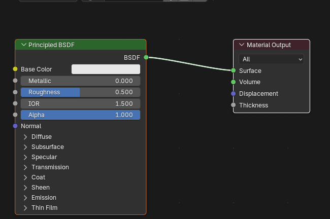
Nodes have colored circles on their sides called "sockets." These are connection points:
🎨 Socket Colors and Meanings
| Color | Data Type | What It Carries |
|---|---|---|
| Green | Shader | Complete shader information (light interaction rules) |
| Yellow | Color | RGB color values (can also carry single values) |
| Gray | Value/Scalar | Single number (like roughness: 0.5) |
| Purple | Vector | 3D coordinates or direction (X, Y, Z) |
💡 Color Coding Logic: Blender's socket colors aren't random—they indicate data type compatibility. Yellow (color) can connect to gray (value) because Blender can convert color to grayscale. But green (shader) only connects to green because shaders are special complete packages. Don't worry about memorizing this—Blender guides you visually!
Inputs vs. Outputs
Every node has two sides:
⬅️➡️ Node Directionality
- Left Side: Inputs
- Where data flows INTO the node
- You plug other nodes' outputs here
- Often have default values you can adjust
- Right Side: Outputs
- Where data flows OUT of the node
- You plug these into other nodes' inputs
- One output can connect to multiple inputs
Think of nodes like factory processing stations: raw materials enter on the left (inputs), the node processes them, and finished products exit on the right (outputs).
The Shader Editor Workflow
Here's the typical workflow when creating materials:
Quick Setup Exercise
Let's practice navigating the Shader Editor:
✅ Try It Now: Explore the Shader Editor
- Start with default scene (cube, light, camera)
- Select the cube
- Click "Shading" workspace tab at the top
- Look at the Shader Editor (usually top-right)
- You should see two nodes connected: Principled BSDF → Material Output
- Practice navigation:
- Middle-mouse drag to pan around
- Scroll to zoom in/out
- Press
Hometo frame all nodes
- Click the Principled BSDF node to select it
- Press
Gand move your mouse (node follows) - Click to place it in a new position
Result: You're now comfortable navigating and moving nodes! The connection stays intact even when you move nodes.
Common Interface Confusions
⚠️ Troubleshooting Common Issues
Problem: Shader Editor is empty or shows "No datablock"
- Cause: No object selected or object has no material
- Solution: Select object in 3D Viewport, click "New" material button (+ icon)
Problem: Can't see my nodes after panning
- Solution: Press
Homekey to frame all nodes
Problem: Connections won't attach
- Cause: Trying to connect incompatible socket types
- Solution: Check socket colors—green (shader) only connects to green
Problem: Changes don't appear in 3D Viewport
- Cause: Viewport shading mode not set to Material Preview or Rendered
- Solution: Click shading mode spheres in top-right of 3D Viewport (we'll cover this soon!)
🔗 Understanding the Node System
Now that you can navigate the Shader Editor, let's understand what nodes actually are and how they work together. The node system is the heart of Blender's material creation, and once you grasp the concept, you'll find it incredibly intuitive and powerful.
What Is a Node?
A node is a self-contained processing unit that takes inputs, does something with them, and produces outputs. Think of nodes as specialized workers in an assembly line—each has a specific job, and they pass their work to the next station.
💡 The Kitchen Analogy: Imagine making a cake. You have different stations: mixing (combines ingredients), baking (applies heat), frosting (adds final layer). Each station has inputs (flour, eggs, sugar) and outputs (mixed batter, baked cake, finished dessert). Nodes work the same way—each performs a specific operation and passes results to the next node.
Node Categories
Blender organizes shader nodes into categories based on their function. Understanding these categories helps you find the right node for the job:
🗂️ Shader Node Categories
| Category | Purpose | Examples |
|---|---|---|
| Shader | Define how surfaces interact with light | Principled BSDF, Diffuse, Glossy, Glass |
| Texture | Generate or load patterns and images | Image Texture, Noise, Voronoi, Wave |
| Color | Manipulate colors and values | Mix, ColorRamp, Hue/Saturation, Invert |
| Vector | Work with coordinates and directions | Mapping, Normal Map, Bump, Vector Math |
| Converter | Convert between data types | Math, ColorRamp, Separate/Combine RGB |
| Input | Provide information to other nodes | Texture Coordinate, Fresnel, Layer Weight |
| Output | Final destination for shader data | Material Output (the only one you'll use here) |
🎯 Don't Memorize Yet: You don't need to memorize these categories right now. As you work with materials, you'll naturally discover which nodes solve which problems. Think of it like learning vocabulary through usage rather than flashcards!
How Data Flows Through Nodes
The key to understanding nodes is understanding data flow. Information always flows from left to right, like reading a sentence:
Each node transforms the data it receives and passes the result to the next node. The final node in the chain connects to Material Output, which actually displays the result.
Simple Node Network Example
Let's look at a simple example to understand how nodes work together:
📝 Example: Adding Color Variation to a Surface
Goal: Create a surface with varied colors instead of solid color
Node Network:
- Noise Texture node: Generates random pattern → outputs pattern data
- ColorRamp node: Converts pattern to specific colors → outputs colored pattern
- Principled BSDF node: Receives colored pattern in Base Color input → creates shader
- Material Output node: Receives shader → displays on surface
Data flow: Pattern → Colors → Shader → Surface
Each node does one specific job. Noise Texture generates patterns (it doesn't know about colors), ColorRamp converts those patterns to colors (it doesn't know about shaders), Principled BSDF uses those colors to create a shader (it doesn't know how they were generated). This modular approach is powerful because you can swap any node without affecting the others!
The Material Output Node: Your Final Destination
The Material Output node is special—it's the only way to actually display your shader. Think of it as the "render this!" button:
🎯 Material Output Inputs
- Surface: Main surface shader (this is what you'll use 99% of the time)
- Volume: For volumetric effects like fog or smoke inside objects
- Displacement: Actually moves geometry based on texture (advanced)
For this lesson, we only care about the Surface input. That's where your Principled BSDF (or other shader) plugs in.
💡 The Stage Analogy: Material Output is like a theater stage. You can build elaborate sets, costumes, and lighting backstage (all your shader nodes), but nothing appears on stage until you physically move it there (connect to Material Output). Disconnected nodes do nothing—they're just preparations waiting to be used.
Connecting Nodes: The Mechanics
Let's practice the physical act of connecting nodes. This is a skill you'll use constantly:
📝 How to Connect Nodes
- Hover over the output socket (right side of source node)
- Click and hold
- Drag toward the target node (you'll see a line following cursor)
- Release over the input socket (left side of target node)
- Connection appears as a line/noodle!
You can also work in reverse—click an input socket and drag to an output socket. Either direction works!
Connection Rules and Compatibility
Not all sockets can connect to each other. Blender has rules:
🔌 Connection Compatibility
| Connection Type | Works? | What Happens |
|---|---|---|
| Green (Shader) → Green (Shader) | ✅ Yes | Shader data passes through |
| Yellow (Color) → Yellow (Color) | ✅ Yes | Color data passes through |
| Gray (Value) → Gray (Value) | ✅ Yes | Numerical value passes through |
| Yellow (Color) → Gray (Value) | ✅ Yes | Blender converts color to grayscale value |
| Gray (Value) → Yellow (Color) | ✅ Yes | Value becomes grayscale color |
| Green (Shader) → Yellow (Color) | ❌ No | Incompatible types |
| Purple (Vector) → Purple (Vector) | ✅ Yes | Coordinate data passes through |
Blender is smart about conversions—it automatically converts between compatible types. Don't worry about memorizing compatibility; Blender will guide you visually when you drag connections!
Multiple Connections from One Output
Here's something powerful: one output can connect to multiple inputs!
🌳 One-to-Many Connections
Example scenario: You want the same texture to control both color AND roughness.
- Image Texture output → Principled BSDF Base Color input
- Image Texture output → Principled BSDF Roughness input
Result: The same image data flows to two different properties!
However, each input can only have one connection at a time. If you connect a new node to an input that already has a connection, Blender replaces the old connection with the new one.
Disconnecting Nodes
Sometimes you need to remove a connection. There are several ways:
📝 Ways to Disconnect Nodes
- Click and drag method:
- Click anywhere on the connection line
- Drag away from the socket
- Release in empty space
- Connection disappears!
- Replace method:
- Simply connect a different output to the same input
- Old connection automatically disconnects
- Ctrl+Right-click method:
- Ctrl + Right-click on socket with connection
- Connection breaks instantly
Node Shortcuts and Efficiency
Working efficiently with nodes means learning some keyboard shortcuts:
⌨️ Essential Node Shortcuts
| Shortcut | Action | When to Use |
|---|---|---|
Shift+A |
Add node menu | Adding new nodes to your network |
X or Delete |
Delete selected node(s) | Removing nodes you don't need |
Shift+D |
Duplicate selected node(s) | Creating variations or copies |
Ctrl+Shift+Click |
Preview node output | Debugging—see what a node is producing |
Ctrl+G |
Group selected nodes | Organizing complex networks |
Tab (with grouped node) |
Enter/exit node group | Working inside node groups |
M |
Mute selected node | Temporarily disable without deleting |
Node Workflow Best Practices
Professional shader artists develop good habits that keep their node networks clean and manageable:
✅ Professional Node Organization
- Flow left-to-right: Keep data flowing in reading direction
- Organize vertically: Group related nodes in columns
- Use frames: Group conceptual sections (we'll cover this later)
- Label important nodes: Rename nodes to describe their purpose
- Keep it tidy: Arrange nodes so connections don't cross unnecessarily
- Delete unused nodes: Don't leave orphaned nodes lying around
- Use reroute nodes: For long connections that need to curve
Understanding Node Processing Order
Nodes don't process in the order you added them—they process based on connections:
Blender traces back from Material Output, following connections upstream to find all nodes it needs. Disconnected nodes are simply ignored—they do nothing even if they exist in your editor!
🎯 The River Analogy: Think of data like water flowing downstream. Material Output is the ocean. Blender traces upstream to find all the rivers (connections) feeding into it. Side pools (disconnected nodes) exist but don't contribute to the ocean—they're just sitting there waiting to be connected.
Practice: Building Your First Custom Network
Let's put theory into practice with a simple node network:
✅ Exercise: Create a Two-Tone Material
- Start with default cube and Principled BSDF setup
- Add a ColorRamp node:
- Press
Shift+A - Choose Converter → ColorRamp
- Place it to the left of Principled BSDF
- Press
- Add a Texture Coordinate node:
Shift+A→ Input → Texture Coordinate- Place it to the left of ColorRamp
- Connect the nodes:
- Texture Coordinate "Object" output → ColorRamp "Fac" input
- ColorRamp "Color" output → Principled BSDF "Base Color" input
- Look at your cube in Material Preview mode (more on this soon)
- Play with ColorRamp controls: Move the color stops, change colors
Result: You've created a material with color variation! The ColorRamp takes coordinate data and converts it to colors. You just built a 3-node network!
Troubleshooting Node Connections
⚠️ Common Node Connection Issues
Problem: Connection won't attach
- Check socket colors—are they compatible?
- Make sure you're dragging to an input, not another output
- Zoom in—small sockets are hard to hit precisely
Problem: My node setup doesn't do anything
- Trace connections to Material Output—is everything connected?
- Check if nodes are muted (they appear grayed out)
- Verify viewport shading mode shows materials
Problem: Connection lines cross and look messy
- Reorganize nodes so flow is clearer
- Use reroute nodes (
Shift+A→ Layout → Reroute) for long connections - Remember: functionality > appearance, but clean is easier to edit!
⚡ The Principled BSDF: Your Main Shader
The Principled BSDF is the Swiss Army knife of shaders—it can create almost any material you need, from chrome metal to rough wood to transparent glass. Understanding this one shader unlocks 90% of material creation. Let's master it!
💡 The All-in-One Tool Analogy: Before Principled BSDF existed, artists had to combine multiple specialized shaders (Diffuse + Glossy + Fresnel + more) to create realistic materials. It was like needing separate tools for every screw type. Principled BSDF is like a power drill with every bit included—one tool that adapts to whatever you need.
What Does "BSDF" Mean?
BSDF stands for "Bidirectional Scattering Distribution Function"—a fancy way of saying "how light bounces off and through this surface." Don't worry about the technical term; just know that BSDF shaders are the core of realistic rendering.
Why "Principled"?
The "Principled" part means it's based on PBR (Physically Based Rendering) principles. This is the modern standard in 3D graphics used by game engines, film studios, and professional renderers:
🎯 PBR Advantages
- Physically accurate: Light behaves realistically under all lighting conditions
- Predictable results: Same material looks right in any environment
- Industry standard: Works consistently across Blender, Unity, Unreal, etc.
- Artist-friendly: Parameters make intuitive sense
- Efficient workflow: One shader for everything instead of shader soup
The Principled BSDF Interface
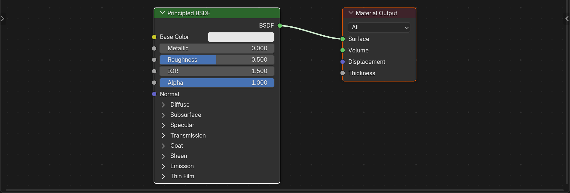
When you open a fresh Shader Editor, the Principled BSDF is already there. Let's understand its anatomy:
🎛️ Principled BSDF Structure
- Left side: 20+ input parameters controlling material properties
- Right side: BSDF output socket (green) connecting to Material Output
- Header dropdown: Distribution method (usually leave on default)
Those 20+ parameters might look overwhelming, but you'll use only a handful for most materials. Let's break them down into essential vs. advanced:
Essential Parameters (Use These All the Time)
🌟 Core Material Properties
| Parameter | What It Controls | Common Values |
|---|---|---|
| Base Color | The object's color | Any RGB color or texture |
| Metallic | Is it metal or not? | 0.0 (plastic/wood) or 1.0 (metal) |
| Roughness | How smooth/matte the surface is | 0.0 (mirror) to 1.0 (completely matte) |
| Transmission | Transparency amount | 0.0 (opaque) to 1.0 (fully transparent like glass) |
| Emission | Light emission color and strength | Color + Strength (0 = no glow) |
| Alpha | Visibility/opacity (different from transmission) | 1.0 (visible) to 0.0 (invisible) |
🎯 The 80/20 Rule: You'll spend 80% of your time adjusting just these six parameters: Base Color, Metallic, Roughness, Transmission, Emission, and occasionally Alpha. The other parameters are for specialized effects. Master these six first!
Base Color: The Foundation
Base Color is exactly what it sounds like—the main color of your material. But there's nuance:
🎨 Base Color Understanding
For Non-Metals (Metallic = 0):
- This is the "diffuse" color you see when light scatters from the surface
- Think: paint color, wood tone, plastic hue
- Full RGB range makes sense
For Metals (Metallic = 1):
- This determines the color of reflections (tinted reflections)
- Think: gold (yellow-orange), copper (orange-brown), steel (slight blue-gray)
- Metals show less color variation; their "color" is in their reflection tint
You can click the color swatch to choose colors manually, or plug in a texture node to use images or procedural patterns!
Metallic: The Binary Decision
In PBR, materials are either metallic or non-metallic (dielectric). There's no in-between in the real world:
🔩 Metallic Values
| Value | Material Type | Examples |
|---|---|---|
| 0.0 | Non-metal (dielectric) | Wood, plastic, rubber, ceramic, skin, fabric |
| 1.0 | Metal | Iron, gold, silver, copper, aluminum, chrome |
| 0.5 | ⚠️ Physically incorrect | Don't use unless stylized/artistic effect |
💡 The Physics Rule: In reality, materials are either conductors (metals) or insulators (everything else). Setting Metallic to 0.5 doesn't exist in nature. For realistic materials, use 0.0 or 1.0 only. The only exception is when you're deliberately creating stylized, non-realistic art.
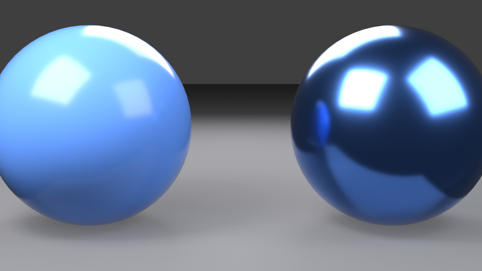
Roughness: Surface Microsurface Detail
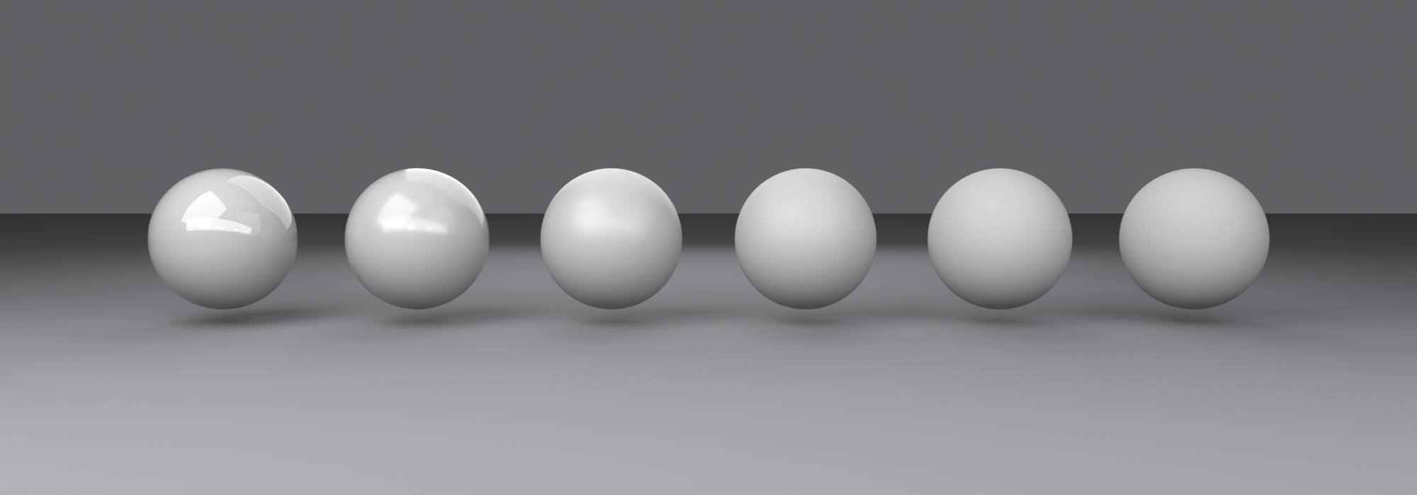
Roughness controls how much light scatters when it bounces off the surface. Think of it as microscopic bumpiness:
✨ Roughness Visualization
| Roughness | Surface Quality | Real-World Examples |
|---|---|---|
| 0.0 - 0.1 | Mirror-smooth, sharp reflections | Polished chrome, mirrors, new car paint, water |
| 0.1 - 0.3 | Glossy, slightly blurred reflections | Polished wood, glossy plastic, Apple products |
| 0.3 - 0.6 | Satin, soft reflections | Satin finish, brushed metal, semi-gloss paint |
| 0.6 - 0.9 | Matte, very diffuse | Unfinished wood, paper, chalk, concrete |
| 0.9 - 1.0 | Completely matte, no reflection | Clay, very rough stone, powder |
Roughness is probably the most important parameter for material realism. The difference between roughness 0.2 and 0.5 can completely change the perceived material!
Transmission: For Glass and Transparency
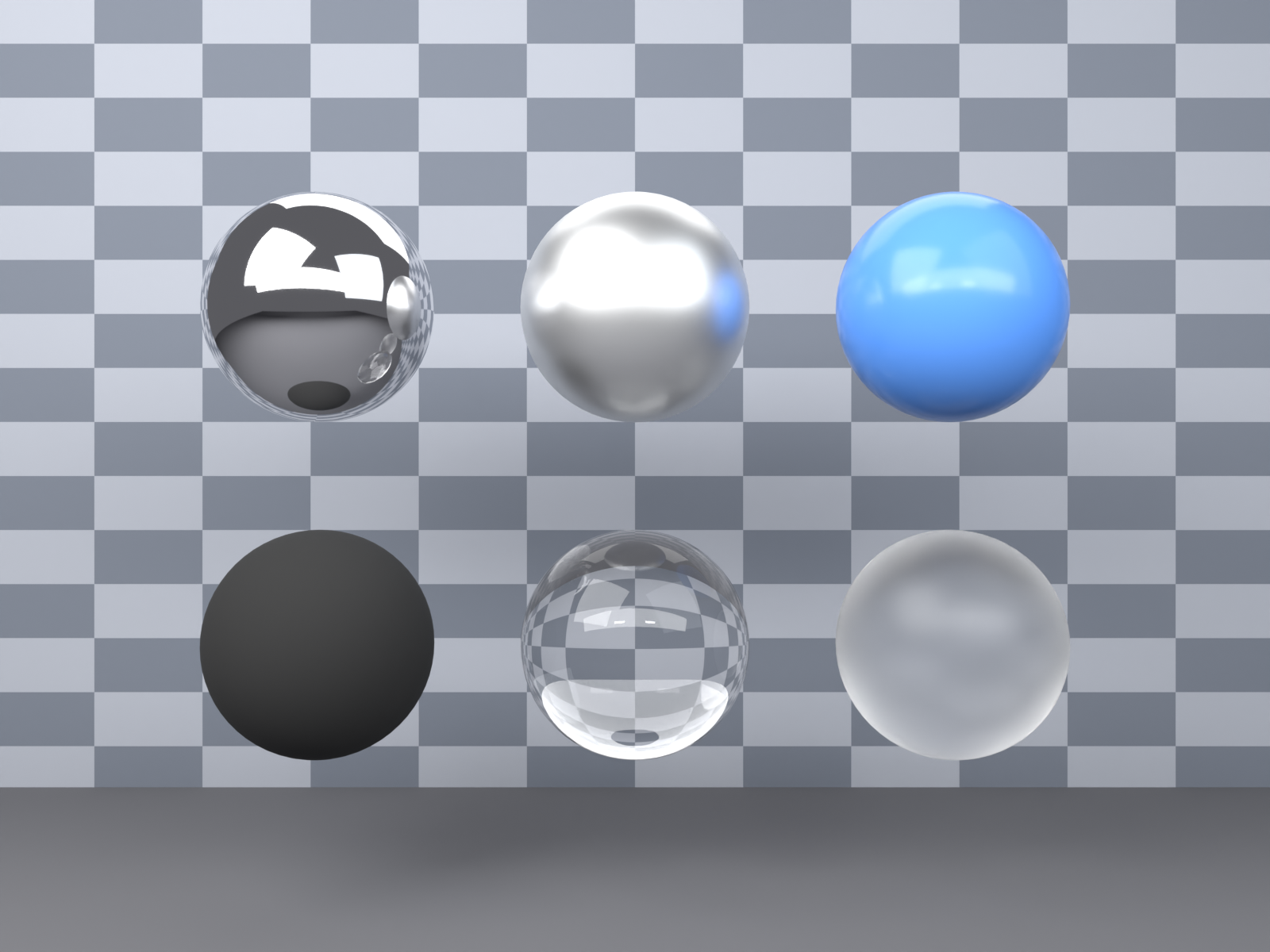
Transmission makes light pass through the object instead of bouncing off:
🔍 Transmission Explained
Transmission = 0.0 (default):
- Normal opaque materials
- Light bounces off the surface
Transmission = 1.0:
- Transparent materials like glass or water
- Light passes through and refracts
- Combine with low Roughness for clear glass
- Combine with higher Roughness for frosted glass
Partial values (0.3, 0.7):
- Semi-transparent materials
- Useful for things like thin fabric, colored glass, translucent plastic
For glass, you'll typically also adjust the IOR (Index of Refraction) parameter. Default is 1.45, which works for glass. Water is 1.33, diamond is 2.42.
Emission: Making Things Glow
Emission makes surfaces emit light. Think neon signs, screens, light bulbs:
💡 Emission Properties
- Emission Color: What color light the surface emits (click color swatch)
- Emission Strength: How bright the emission is (0 = no glow, 1+ = brighter)
- Default is 0: No emission, just normal surface
Emissive materials actually contribute light to your scene! A bright emission can illuminate nearby objects.
Alpha: Visibility Control
Alpha controls whether the surface is visible, which is different from transmission:
👻 Alpha vs. Transmission
| Property | What It Does | Use For |
|---|---|---|
| Alpha | Makes surface invisible (no light interaction) | Cutout textures (leaves, chains), fading effects |
| Transmission | Makes surface transparent (light passes through) | Glass, water, clear plastic |
Alpha is often controlled by texture maps—think of leaf textures where green parts are visible (alpha = 1) and background parts are invisible (alpha = 0).
Quick Material Recipes
Let's put theory into practice with some simple material recipes using just these core parameters:
✅ Basic Material Formulas
Shiny Plastic:
- Base Color: Any color you want
- Metallic: 0.0
- Roughness: 0.2
Polished Metal:
- Base Color: Gray (or tinted for gold/copper)
- Metallic: 1.0
- Roughness: 0.1
Clear Glass:
- Base Color: White or slight tint
- Metallic: 0.0
- Roughness: 0.0
- Transmission: 1.0
- IOR: 1.45
Matte Wood:
- Base Color: Brown/tan
- Metallic: 0.0
- Roughness: 0.8
Glowing Screen:
- Base Color: Black
- Emission Color: Blue (or any screen color)
- Emission Strength: 2.0-5.0
Advanced Parameters (Optional)
You don't need these for basic materials, but here's what they do:
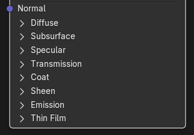
🔧 Advanced Principled BSDF Parameters
- Subsurface: Light scattering inside material (skin, wax, marble)
- Specular: Fresnel effect strength (usually leave at default)
- Sheen: Soft glow at edges (fabric, velvet)
- Clearcoat: Extra glossy layer on top (car paint)
- Anisotropic: Directional reflection stretching (brushed metal)
- Normal: Surface bump/detail from normal maps
We'll explore these in future lessons. For now, focus on the six core parameters!
🎛️ Basic Material Properties
Now that you understand the Principled BSDF's core parameters, let's explore how to actually use them to create realistic materials. The secret to great materials isn't about knowing every parameter—it's about understanding how materials behave in the real world and translating that to your shader settings.
💡 The Reference Photo Principle: Professional material artists keep reference photos handy—not to copy pixel-by-pixel, but to observe how real materials respond to light. Look at a plastic toy, polished wood furniture, brushed aluminum laptop case, or frosted glass window. Notice how light behaves on each surface. Your shader parameters simply recreate these behaviors mathematically!
The Metallic/Roughness Workflow
Modern material creation follows the "metallic/roughness" workflow, which is the foundation of PBR (Physically Based Rendering). Understanding this workflow is essential:
🎯 The Metallic/Roughness Decision Tree
This simple decision tree handles 80% of material creation. First, ask "metal or not-metal?" Then, ask "how smooth or rough?" Those two decisions give you the foundation!
Understanding Material "Personality"
Every material has a distinct personality defined by how it interacts with light. Let's understand the main categories:
🎨 Material Personality Types
| Material Type | Metallic | Roughness Range | Key Characteristic |
|---|---|---|---|
| Polished Metals | 1.0 | 0.0 - 0.2 | Sharp, tinted reflections; little color variation |
| Brushed Metals | 1.0 | 0.3 - 0.5 | Directional shine with slight blur |
| Glossy Plastics | 0.0 | 0.1 - 0.3 | Colored base with clean specular highlights |
| Matte Plastics | 0.0 | 0.6 - 0.9 | Solid color with minimal reflection |
| Polished Wood | 0.0 | 0.2 - 0.4 | Wood grain visible through glossy finish |
| Rough Wood | 0.0 | 0.7 - 0.9 | Texture dominates, little reflection |
| Clear Glass | 0.0 | 0.0 - 0.05 | Transparent with crisp refraction |
| Frosted Glass | 0.0 | 0.3 - 0.6 | Translucent with soft light diffusion |
| Rubber/Silicone | 0.0 | 0.8 - 1.0 | Deep matte with soft edge highlighting |
🎯 The Real-World Test: If you're unsure about roughness values, look at real objects around you right now. See how a phone screen (roughness ~0.1) reflects light differently than a notebook cover (roughness ~0.7)? Your desk lamp reflects sharply (roughness ~0.2), but your fabric mouse pad barely reflects at all (roughness ~0.95). Train your eye by observing reality!
Base Color: More Than Just Paint
Base Color is the most intuitive parameter, but there are subtleties worth understanding:
🎨 Base Color Best Practices
- For non-metals (Metallic = 0.0):
- This is the diffuse/albedo color you see when light scatters from the surface
- Think: paint color, plastic hue, fabric tone
- Use full RGB spectrum freely
- Avoid pure white (0.95 or less) and pure black (0.02 or more) for realism
- For metals (Metallic = 1.0):
- This tints the reflections, not a diffuse color
- Most metals are near-grayscale with slight tints
- Iron/Steel: Slight blue-gray (RGB: 0.56, 0.57, 0.58)
- Aluminum: Brighter gray (RGB: 0.91, 0.92, 0.92)
- Gold: Yellow-orange (RGB: 1.0, 0.71, 0.29)
- Copper: Reddish-brown (RGB: 0.95, 0.64, 0.54)
⚠️ The Pure Black/White Trap
Beginner material artists often use pure white (RGB: 1.0, 1.0, 1.0) or pure black (RGB: 0.0, 0.0, 0.0) for base colors. In reality, these values almost never exist:
- Pure white reflects 100% of light — even fresh snow is about 85-90% reflectance
- Pure black absorbs 100% of light — even charcoal and coal reflect 3-5% of light
- For realism: Keep base color values between 0.02-0.95 in RGB
- Exception: Stylized/artistic renders can break this rule deliberately
Specular: The Often-Ignored Parameter
The Specular parameter controls the Fresnel effect strength—how much reflection appears at glancing angles. For 99% of materials, the default value (0.5) is correct and you should leave it alone!
✨ When to Adjust Specular
- Default (0.5): Most dielectric materials (plastics, wood, stone, glass)
- Lower (0.3-0.4): Materials with less reflectivity at grazing angles (rare—mostly eye fluid, some gemstones)
- Higher (0.6-0.8): Extra-reflective materials (some crystals, very polished surfaces)
- Never adjust for metals: Metallic = 1.0 materials ignore this parameter!
💡 The Leave-It-Alone Rule: Specular is one of those parameters where the default is physically correct for 99% of cases. If your material doesn't look right, the problem is almost never Specular—check your Roughness, Metallic, or lighting instead. Resist the temptation to fiddle with every slider!
IOR: Index of Refraction
IOR controls how much light bends when passing through transparent materials. This parameter only matters when Transmission > 0 (transparent materials):
🔍 Common IOR Values
| Material | IOR Value | Visual Effect |
|---|---|---|
| Air/Vacuum | 1.0 | No refraction (reference point) |
| Water | 1.33 | Slight bending, like looking into a pool |
| Plastic/Acrylic | 1.45 - 1.49 | Moderate bending, typical for synthetics |
| Glass (standard) | 1.45 - 1.52 | Window glass, bottles, lenses |
| Quartz Crystal | 1.54 | Noticeable optical effect |
| Sapphire | 1.77 | Strong refraction, gemstone quality |
| Diamond | 2.42 | Extreme bending, brilliant sparkle |
The higher the IOR, the more dramatic the light bending. Diamond's high IOR (2.42) is part of what makes it sparkle so brilliantly!
Sheen: For Fabric and Velvet
Sheen adds a soft, velvet-like glow at the edges of objects. It's specialized for fabric materials:
✨ Sheen Usage
- Sheen = 0.0 (default): No sheen effect, for most materials
- Sheen = 0.3-0.7: Soft fabric glow (cotton, polyester)
- Sheen = 0.8-1.0: Strong velvet/satin effect
- Sheen Tint: Controls sheen color (0.0 = white, 1.0 = match base color)
For most hard-surface materials (metal, plastic, wood, glass), keep Sheen at 0.0. This parameter is specifically for textiles and soft materials that have that characteristic edge glow.
Clearcoat: The Extra Glossy Layer
Clearcoat simulates a glossy coating on top of another material—like car paint with a clear protective layer:
🚗 Clearcoat Applications
- Car paint: Colored base + glossy clearcoat on top
- Coated wood: Wood grain visible through polyurethane
- Lacquered surfaces: Furniture with protective finish
- Nail polish: Glossy layer over colored nails
🎛️ Clearcoat Parameters
- Clearcoat (0.0-1.0): Strength of the effect (0 = none, 1 = full)
- Clearcoat Roughness (0.0-1.0): How glossy the coat is (separate from base roughness!)
The beauty of clearcoat is that it gives you two layers of reflection with different roughness values. The base material can be rough while the clearcoat stays glossy!
Normal Maps: Surface Detail Without Geometry
The Normal input socket is how you add surface detail like bumps, scratches, and texture without adding actual geometry. We'll dive deep into this in future lessons, but here's the concept:
💡 The Movie Set Analogy: Normal maps are like painted detail on a movie set wall. From a distance, the wall looks like it has bricks, mortar lines, and texture. Up close, it's actually flat painted plywood. Normal maps trick the lighting calculations into seeing surface detail that doesn't geometrically exist. This saves massive amounts of polygons!
🗺️ Normal Map Types
- Bump Maps: Grayscale height information (simple, less accurate)
- Normal Maps: RGB direction information (standard, accurate)
- Displacement Maps: Actually moves geometry (expensive, most realistic)
For now, just know that the Normal input exists and can make flat surfaces appear incredibly detailed. We'll explore texture mapping and normal maps thoroughly in Lessons 12-14!
Putting It All Together: The Material Mindset
Creating materials isn't about randomly tweaking sliders—it's about understanding the material you're recreating and translating its real-world properties into parameters:
✅ The Professional Material Creation Process
- Observe Reference: Look at (or imagine) the real material. How does light behave on it?
- Identify Type: Is it metal or not? This determines Metallic (0.0 or 1.0)
- Assess Roughness: How smooth/shiny vs. rough/matte? Set Roughness accordingly
- Set Base Color: What color is it? (Or add texture later)
- Check Transparency: Does light pass through? Adjust Transmission if needed
- Add Emission: Does it glow? Set Emission color/strength if needed
- Refine Special Properties: Does it need clearcoat, sheen, or other advanced properties?
- Test Under Different Lighting: Good materials look correct in various lighting conditions
Common Material Mistakes to Avoid
⚠️ Material Creation Pitfalls
Mistake 1: Using Metallic = 0.5
- Why it's wrong: Materials are either conductors (metal) or insulators (non-metal)
- Fix: Use 0.0 or 1.0 only (exception: stylized art with deliberate unrealistic look)
Mistake 2: Everything is too glossy or too rough
- Why it happens: Not observing real-world roughness variety
- Fix: Most materials are in the 0.2-0.7 roughness range, not extremes
Mistake 3: Pure black or pure white base colors
- Why it's wrong: Nothing in nature reflects 0% or 100% of light
- Fix: Keep RGB values between 0.02 and 0.95
Mistake 4: Adjusting too many parameters at once
- Why it's confusing: You can't tell what's causing what effect
- Fix: Change one parameter at a time and observe the result
Mistake 5: Forgetting that materials respond to lighting
- Why it happens: Testing materials with default lighting only
- Fix: View your material under different lighting setups to verify it behaves correctly
Quick Material Reference Chart
Bookmark this chart for quick material creation:
📋 Fast Material Setup Guide
| Material | Metallic | Roughness | Base Color | Special Notes |
|---|---|---|---|---|
| Chrome | 1.0 | 0.05 | Light gray | Nearly mirror-like |
| Gold | 1.0 | 0.1 | RGB: 1.0, 0.71, 0.29 | Warm reflection tint |
| Brushed Steel | 1.0 | 0.4 | RGB: 0.56, 0.57, 0.58 | Use anisotropic for directional scratches |
| Glossy Plastic | 0.0 | 0.2 | Any color | Typical for toys, cases |
| Rubber | 0.0 | 0.9 | Dark colors typical | Very matte with soft highlights |
| Clear Glass | 0.0 | 0.0 | White/slight tint | Transmission: 1.0, IOR: 1.45 |
| Wood (Polished) | 0.0 | 0.3 | Brown tones | Add texture for grain |
| Concrete | 0.0 | 0.8 | Gray variations | Add bump map for realism |
| Car Paint | 0.0 | 0.4 | Any color | Clearcoat: 1.0, Clearcoat Roughness: 0.1 |
| Velvet Fabric | 0.0 | 0.8 | Rich colors | Sheen: 0.7, Sheen Tint: 0.5 |
🎨 Creating Your First Simple Materials
Theory is wonderful, but nothing beats hands-on practice! In this section, we'll create several essential materials from scratch. Follow along step-by-step, and by the end, you'll have a library of materials you can use in any project.
💡 The Cooking Class Analogy: We've covered the ingredients (node types) and techniques (connections and parameters). Now it's time to follow some recipes! Just like cooking, once you've made these materials a few times, you'll start improvising and creating your own variations. Let's get our hands dirty!
Setup: Preparing Your Workspace
Before we start creating materials, let's set up an ideal workspace for material testing:
📝 Workspace Setup
- Start with a fresh Blender file (or File → New → General)
- Delete the default camera and light (we'll add better lighting):
- Select camera (click it), press
X, confirm delete - Select light, press
X, confirm delete
- Select camera (click it), press
- Keep the default cube (our test object)
- Switch to Shading workspace (tab at top of screen)
- In the 3D Viewport, set shading to Material Preview:
- Look at top-right of 3D Viewport
- Find four sphere icons
- Click the third sphere (white sphere with checkerboard)
- Your cube now shows with preview lighting!
🎯 Material Preview Mode: This viewport shading mode shows your materials with studio-quality lighting instantly. It's perfect for material creation because you can see changes in real-time without rendering. Think of it as your material workshop's inspection station!
Material 1: Polished Gold
Let's start with something visually impressive—shiny metallic gold:
✅ Create: Polished Gold Material
- Select your cube (if not already selected)
- In the Shader Editor, you should see: Principled BSDF → Material Output
- If no material exists, click "+ New" button in Shader Editor header
- Rename the material:
- Click the material name field (says "Material")
- Type "Polished Gold"
- Press Enter
- Adjust Principled BSDF parameters:
- Base Color: Click the color swatch
- Set RGB values: R=1.0, G=0.71, B=0.29 (or use Hex: #FFB54A)
- Alternatively: Choose a rich golden yellow color
- Metallic: Set to 1.0 (drag slider all the way right or type 1)
- Roughness: Set to 0.1 (very smooth, polished look)
- Base Color: Click the color swatch
- Look at your cube in the 3D Viewport
- Rotate the view (Middle Mouse Button + Drag) to see the reflections!
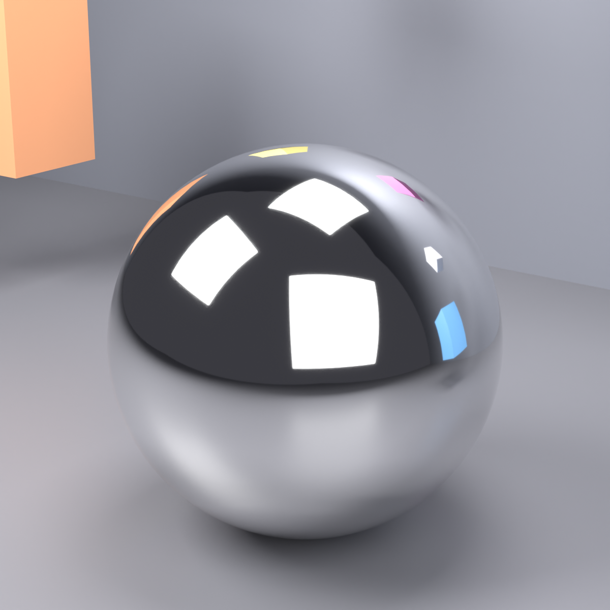
Result: Your cube now looks like polished gold with sharp, tinted reflections. The low roughness creates that mirror-like quality, and Metallic = 1.0 makes the color affect reflections rather than acting as surface color.
💡 Understanding What You Created
- Why Metallic = 1.0? Gold is a metal, so it conducts electricity and has metallic optical properties
- Why that specific Base Color? Real gold has a characteristic warm yellow-orange hue that's scientifically measurable
- Why Roughness = 0.1? Polished gold is very smooth but not perfectly mirror-like (that would be 0.0)
- The reflection tint: Notice how the reflections have a golden hue—that's the Base Color tinting the reflections!
Material 2: Matte Plastic
Now let's create something completely different—a matte, non-reflective plastic surface:
✅ Create: Matte Red Plastic
- Duplicate your cube to test multiple materials:
- Select cube, press
Shift+D - Move mouse to the right
- Click to place duplicate
- Select cube, press
- With new cube selected, create new material:
- In Material Properties (sphere icon on right panel)
- Click "+" icon to add new material slot
- Click "New" to create material
- Or in Shader Editor: material dropdown → "+ New"
- Rename material to "Matte Red Plastic"
- Adjust Principled BSDF:
- Base Color: Set to bright red (R=0.8, G=0.05, B=0.05)
- Metallic: Keep at 0.0 (plastic is not metal!)
- Roughness: Set to 0.9 (very matte, almost no reflection)
- Compare with the gold cube by rotating your view
Result: This cube looks like matte plastic—solid color with almost no reflections. It absorbs most light rather than reflecting it. Perfect for things like LEGO bricks, matte action figures, or rubber materials!
Material 3: Glossy Plastic
Now we'll create glossy plastic—similar to the matte version but with noticeable reflections:
✅ Create: Glossy Blue Plastic
- Duplicate a cube again (
Shift+D, move to side, click) - Create new material named "Glossy Blue Plastic"
- Set parameters:
- Base Color: Bright blue (R=0.05, G=0.3, B=0.9)
- Metallic: 0.0 (still plastic, not metal)
- Roughness: 0.2 (smooth and glossy!)
- Notice the difference from matte plastic!
Result: This looks like glossy toy plastic, phone cases, or shiny action figures. The low roughness (0.2) creates visible reflections while the Metallic = 0.0 keeps the base color vibrant and visible.
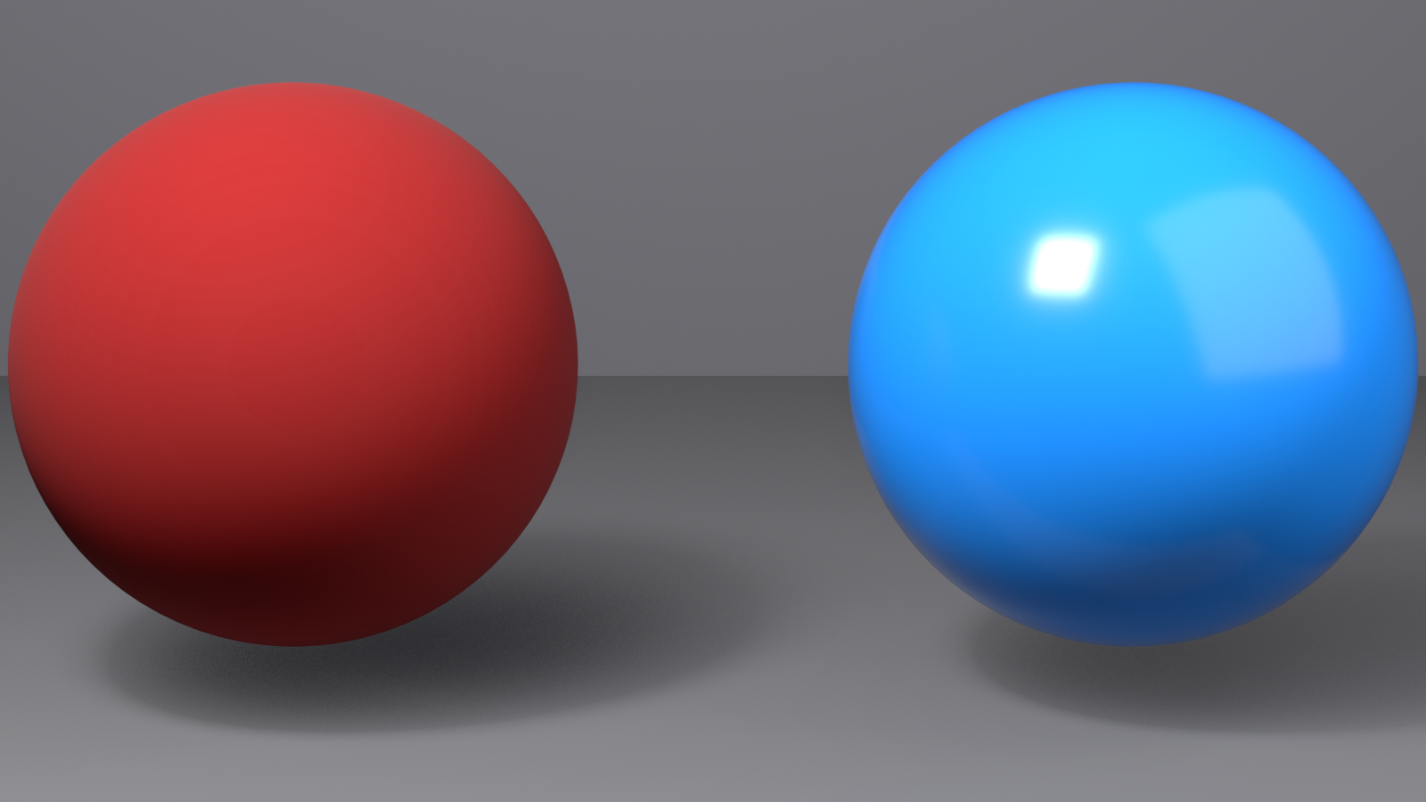
🎯 Comparing Glossy vs. Matte
Look at your matte red cube (Roughness = 0.9) and glossy blue cube (Roughness = 0.2) side-by-side:
- Matte (0.9): Color dominates, almost no environment reflections visible
- Glossy (0.2): Color still visible but with clear specular highlights and reflections
- The key difference: Roughness value, nothing else! Same Metallic (0.0), different roughness creates completely different materials.
Material 4: Clear Glass
Time to create something transparent—a realistic glass material:
✅ Create: Clear Glass
- Duplicate another cube (
Shift+D) - Create new material named "Clear Glass"
- Set parameters:
- Base Color: Pure white (R=1.0, G=1.0, B=1.0)
- Metallic: 0.0 (glass is not metallic)
- Roughness: 0.0 (perfectly smooth for clear glass)
- Transmission: 1.0 (fully transparent—drag slider all the way right!)
- IOR: 1.45 (standard glass—should be default, but verify)
- For best glass preview:
- In 3D Viewport shading options (click down arrow next to sphere icons)
- Under "Render Pass," try different options to see glass better
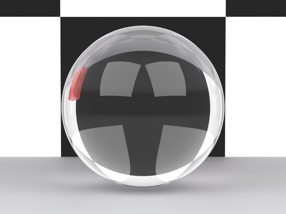
Result: Your cube is now transparent like glass! You can see through it, and it refracts (bends) light realistically. The cube behind it should appear distorted when viewed through the glass cube.
⚠️ Glass Preview Note
Glass looks better in full renders than in Material Preview mode. If your glass looks too dark or strange:
- This is normal—Material Preview has limitations with transparency
- Switch to Rendered viewport shading (fourth sphere icon) for better preview
- Or render with F12 to see true glass appearance
Material 5: Frosted Glass
Let's modify glass to create frosted, translucent glass:
✅ Create: Frosted Glass
- Duplicate the clear glass cube
- Duplicate its material:
- With new cube selected, look at material name
- Click the "2" button (number icon) next to material name
- This creates a copy you can edit independently
- Rename to "Frosted Glass"
- Adjust parameters:
- Keep everything the same except:
- Roughness: Change from 0.0 to 0.4
- Compare with clear glass cube!
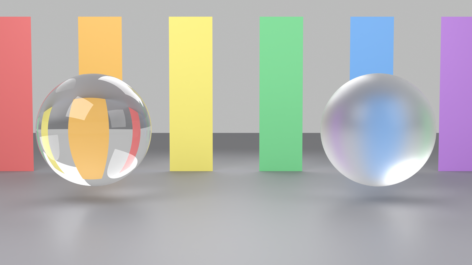
Result: Now your glass is frosted—still transparent but with a soft, diffused quality. Light passes through but gets scattered, like bathroom windows or shower doors. The higher roughness (0.4) creates this effect!
Material 6: Glowing Emissive Surface
Let's create a material that emits light—perfect for screens, neon signs, or sci-fi elements:
✅ Create: Cyan Emissive Material
- Create a new cube and new material named "Cyan Glow"
- Set parameters:
- Base Color: Dark gray or black (R=0.02, G=0.02, B=0.02)
- Metallic: 0.0
- Roughness: 0.8 (doesn't matter much for emissive)
- Emission Color: Click the Emission color swatch
- Set to bright cyan (R=0.0, G=1.0, B=1.0)
- Or any color you want!
- Emission Strength: 5.0 (bright enough to be clearly visible)
- Switch to Rendered viewport mode to see emission effect on nearby objects!
Result: Your cube glows with cyan light! In Rendered mode, it actually illuminates nearby objects. Perfect for creating screens, monitors, neon signs, sci-fi panels, or magical glowing elements!
💡 Emission Tip: Emission Strength determines brightness. Values of 1-3 create subtle glows, 5-10 create noticeable lighting, and 20+ create intense light sources that significantly illuminate the scene. Adjust based on the mood you want!
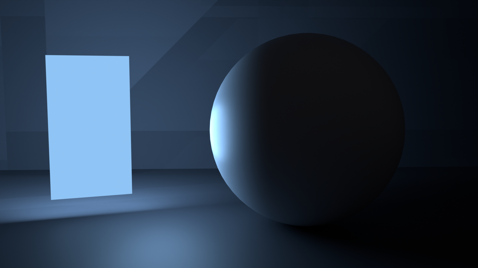
Material 7: Brushed Metal
Let's create brushed aluminum or steel—metal with a directional texture:
✅ Create: Brushed Aluminum
- Create new cube and material named "Brushed Aluminum"
- Set base parameters:
- Base Color: Light gray (R=0.91, G=0.92, B=0.92)
- Metallic: 1.0 (it's metal!)
- Roughness: 0.4 (brushed metal is rougher than polished)
- For more realism (optional advanced step):
- Scroll down in Principled BSDF to find "Anisotropic"
- Set Anisotropic to 0.7 (creates directional brushing effect)
- Set Anisotropic Rotation to 0.0 (brushing direction)
Result: Your cube looks like brushed aluminum—the kind you see on laptops, appliances, or modern architecture. The medium roughness (0.4) creates that satin finish, and if you added anisotropic, you'll see directional highlight streaks!
Material 8: Car Paint with Clearcoat
A sophisticated two-layer material—colored base with glossy clearcoat on top:
✅ Create: Red Car Paint
- Create new cube and material named "Red Car Paint"
- Set base layer:
- Base Color: Deep red (R=0.7, G=0.05, B=0.05)
- Metallic: 0.0 (car paint is not metallic—it's pigment)
- Roughness: 0.4 (base paint layer, semi-rough)
- Add clearcoat layer:
- Scroll down to find "Clearcoat"
- Clearcoat: 1.0 (full clearcoat effect)
- Clearcoat Roughness: 0.1 (very glossy protective layer)
- Rotate view to see two layers of reflection!
Result: Your cube has that distinctive car paint look—deep color with a glossy clear layer on top. Notice how you see two types of reflections: the rougher base color and the sharp clearcoat highlights. This is exactly how real car paint works!
🚗 Understanding Car Paint
Real car paint is a multi-layer system:
- Base layer: Pigmented color (your Base Color + Roughness)
- Clearcoat layer: Transparent protective gloss (Clearcoat parameters)
- The magic: Two independent roughness values create depth and realism
- Variations: Matte car paint = Clearcoat Roughness 0.6-0.8
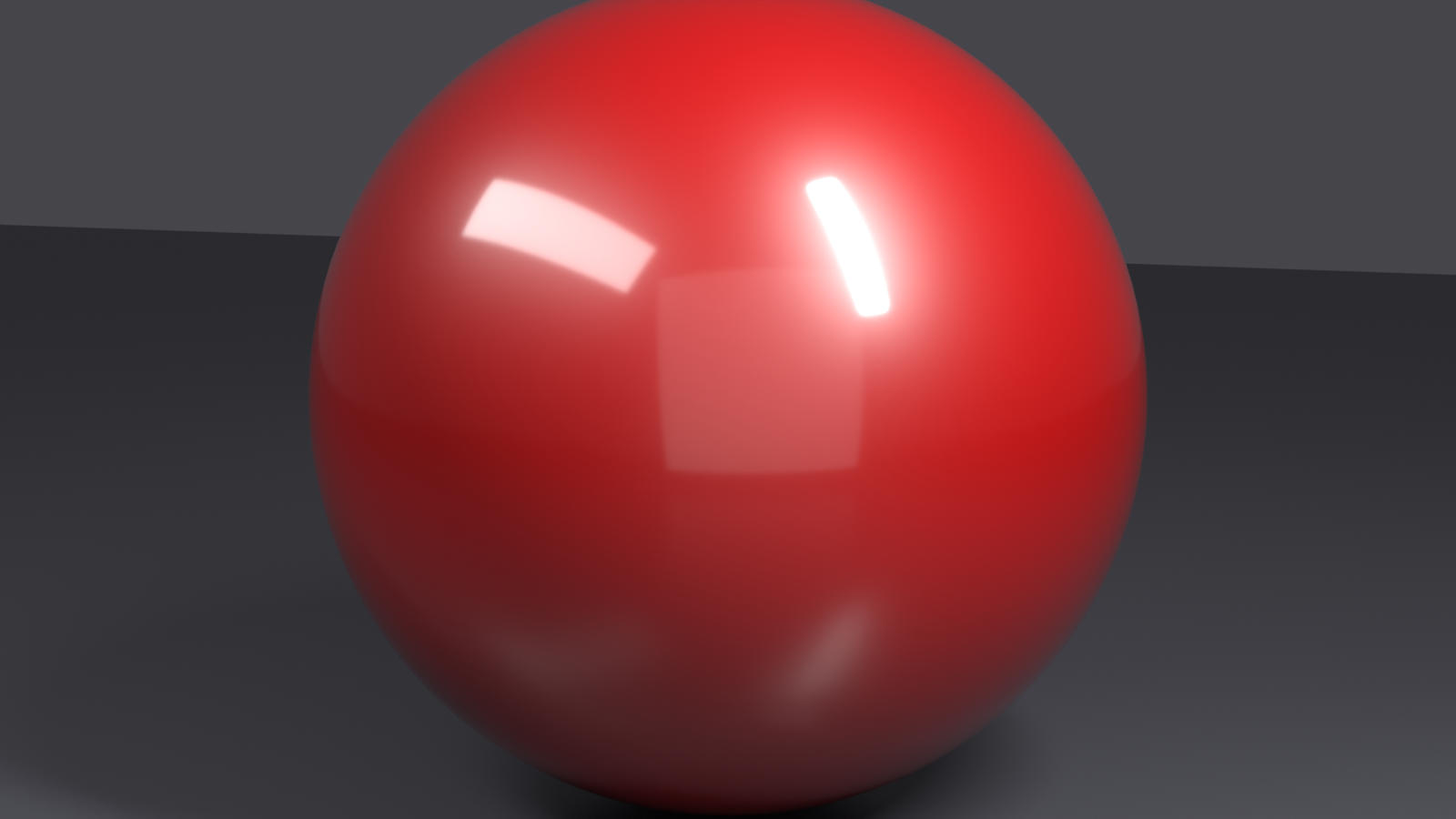
Organizing Your Material Library
You now have 8 materials! Let's organize them for future use:
📚 Material Library Best Practices
- Save this .blend file as "Material_Library.blend"
- File → Save As
- Choose location and name
- Click "Save"
- Enable Fake User for all materials:
- For each material, click the shield icon next to material name
- This prevents Blender from deleting unused materials when you close the file
- Materials become permanent library assets
- Arrange objects in a grid for easy viewing:
- Space cubes evenly in a row or grid
- Each shows a different material
💡 Appending Materials to Other Projects
To use these materials in future projects:
- In new project: File → Append
- Navigate to your Material_Library.blend file
- Open file → Material folder
- Select materials you want (Shift+click for multiple)
- Click "Append"
- Materials are now available in your new project!
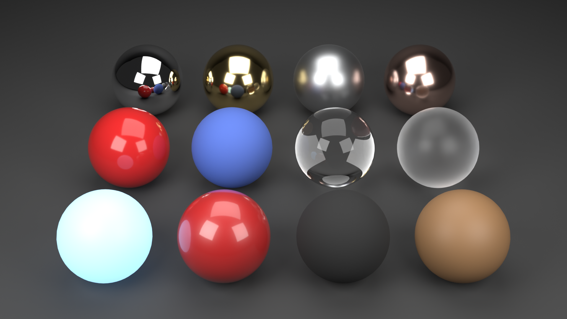
Experiment and Iterate
Now that you have these base materials, try variations:
✅ Practice Exercises
- Create copper:
- Start with gold material
- Change Base Color to RGB: 0.95, 0.64, 0.54 (reddish-brown)
- Adjust Roughness to 0.2 for polished copper
- Create colored glass:
- Start with clear glass
- Change Base Color to any hue (try green, blue, amber)
- Keep Transmission at 1.0
- Create various plastic colors:
- Duplicate glossy plastic
- Try different Base Colors
- Experiment with Roughness between 0.15-0.4
- Create neon signs:
- Start with emissive material
- Try different emission colors (pink, purple, orange)
- Adjust Emission Strength from 3 to 15
Material Testing Tips
🎯 How to Test Materials Effectively
- Use different object shapes: Materials look different on spheres vs. cubes vs. complex shapes
- Test under various lighting: Good materials work in bright, dim, and colored lighting
- View from multiple angles: Rotate around objects to see reflections and highlights
- Compare to reference: Look at real-world photos of the material you're recreating
- Render tests: Material Preview is fast but not final—render with F12 to see true result
Common Material Creation Issues
⚠️ Troubleshooting Your Materials
Problem: Material looks flat and boring
- Likely cause: Roughness too high (everything looks matte)
- Fix: Lower Roughness to 0.2-0.5 range to add some reflection
Problem: Material is too reflective/mirror-like
- Likely cause: Roughness too low
- Fix: Increase Roughness—most real materials are 0.2-0.7
Problem: Glass is black or too dark
- Cause: Material Preview mode has limitations with transparency
- Fix: Switch to Rendered viewport mode or add more lights to scene
Problem: Emissive material doesn't glow
- Cause: Emission Strength too low
- Fix: Increase to 5.0 or higher; switch to Rendered mode to see glow on other objects
Problem: Can't see material changes
- Cause: Viewport shading set to Solid mode
- Fix: Click third or fourth sphere icon (Material Preview or Rendered)
👁️ Material Preview and Viewport Shading
You've been using Material Preview mode to see your materials, but there's more to Blender's viewport shading modes than you might realize. Understanding these modes is crucial for efficient material creation—each serves a different purpose in your workflow.
💡 The Artist's Easel Analogy: Think of viewport shading modes like different lighting conditions in a painter's studio. Solid mode is like sketching in pencil (just shapes, no color). Material Preview is like painting under studio lights (quick preview). Rendered mode is like photographing your painting under perfect conditions (final quality). Each mode helps you focus on different aspects of your work!
The Four Viewport Shading Modes
In the top-right corner of your 3D Viewport, you'll see four sphere icons. Each represents a different way of displaying your scene:
🎨 Viewport Shading Modes
| Mode | Icon | What It Shows | When to Use |
|---|---|---|---|
| Solid | Gray sphere | Basic geometry with flat shading | Modeling, focusing on shape without distraction |
| Material Preview | White sphere with checkerboard | Materials with studio lighting (HDRI) | Material creation, quick preview, fast iteration |
| Rendered | White sphere (solid) | Full render engine preview (Eevee or Cycles) | Final look preview, testing lighting, accurate glass/transparency |
| Wireframe | Sphere with grid lines | Edge/vertex structure only | Technical modeling, seeing through objects, topology inspection |
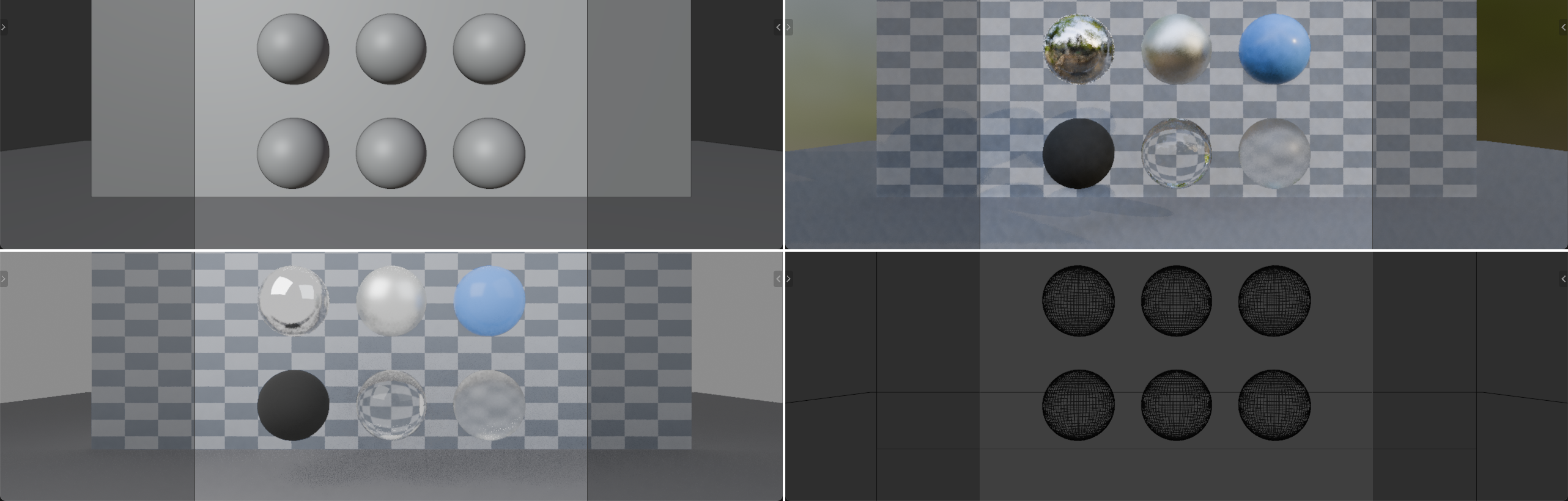
Each mode has keyboard shortcuts for quick switching: Z opens a radial menu where you can choose any mode!
Solid Mode: Focus on Form
Solid mode is your "don't distract me with fancy stuff" mode. It's perfect when you're modeling and just need to see shapes:
🔵 Solid Mode Features
- Fast performance: No expensive material calculations
- Clear visibility: See geometry without reflection/transparency confusion
- Customizable: Can show different lighting styles (studio, matcap, flat)
- Color options: Can display random object colors, material colors, or single color
⚙️ Solid Mode Settings
Click the down arrow next to the Solid mode icon to access options:
- Lighting: Studio (default), MatCap (material capture spheres), Flat (no shading)
- Color: Material (uses material colors), Object (random per-object), Single (one color for everything)
- Background: Theme (default), World (uses world background), Viewport (custom gradient)
- Options: Backface Culling, X-Ray mode, Shadow, Cavity effects
Most of the time, the default Solid mode settings work perfectly. You'll only adjust these when you have specific needs (like X-Ray mode to see through objects).
Material Preview: The Material Artist's Best Friend
Material Preview mode is where you'll spend most of your time when creating materials. It shows your materials with realistic lighting but renders fast enough for real-time interaction:
✨ Material Preview Mode Features
- Real-time material display: See changes instantly as you adjust parameters
- Studio lighting: Uses HDRI environment lighting (like a photography studio)
- Good performance: Fast enough to rotate and work smoothly
- Accurate for most materials: Metals, plastics, and basic materials look correct
- Some limitations: Glass, complex transparency, and volumetrics may not look perfect
Material Preview Settings
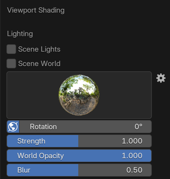
Click the dropdown arrow next to the Material Preview icon to customize how materials display:
🎛️ Key Material Preview Settings
- Lighting:
- Scene Lights: Uses lights you've placed in the scene
- Scene World: Uses your world background/HDRI
- Studio: (Default) Uses built-in studio HDRI—perfect for material creation
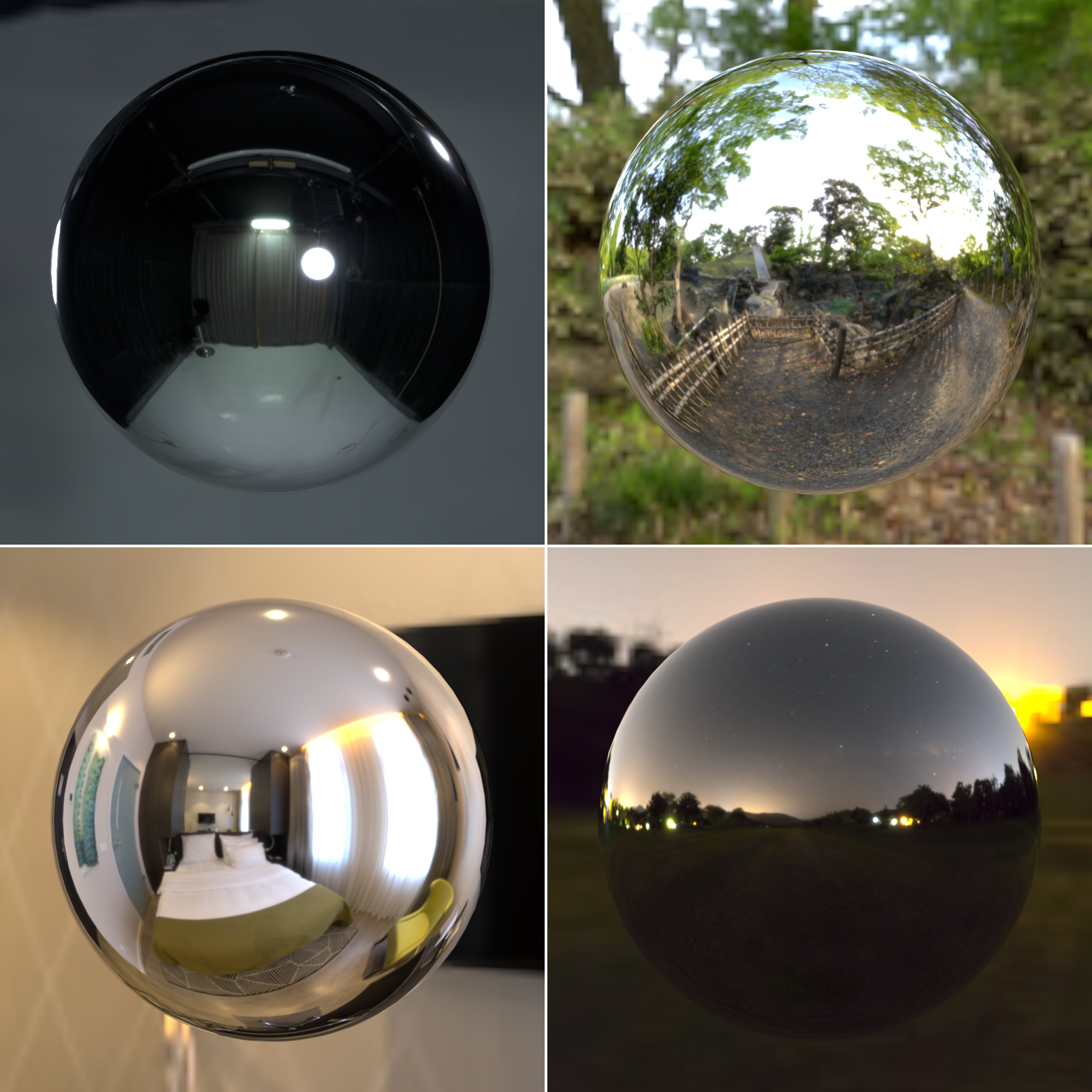
- HDRI Selection: If using Studio lighting, you can choose different environment maps
- forest.exr (outdoor, natural light)
- interior.exr (soft indoor lighting)
- studio.exr (neutral studio lighting—default)
- night.exr (dark, dramatic)
- Rotation: Rotate the HDRI environment to change light direction
- Strength: Adjust brightness of environment lighting
- Blur: Soften environment reflections (useful for less distracting backgrounds)
💡 HDRI Explained: HDRI stands for High Dynamic Range Image—a special type of image that captures the full range of light in an environment. When used as lighting, it provides realistic reflections and illumination as if your object was sitting in that real-world location. It's like wrapping a photograph around your entire scene as both background and light source!
Rendered Mode: The Final Preview
Rendered mode shows your scene exactly as it will render—the full power of Blender's render engine running in real-time (or as close as possible):
🎬 Rendered Mode Characteristics
- Accurate preview: What you see is what you'll get in final renders
- Full render features: Volumetrics, complex transparency, caustics, etc.
- Render engine dependent: Uses Eevee (fast) or Cycles (accurate) based on your settings
- Performance cost: Slower than Material Preview, especially with Cycles
- Real lighting: Uses actual scene lights and world settings
🎯 When to Use Rendered Mode
- Testing glass materials: Transmission and refraction render accurately here
- Emissive lighting: See how glowing materials actually illuminate the scene
- Final look verification: Check that your material works in your actual lighting setup
- Complex effects: Volumetrics, SSS (subsurface scattering), caustics
- Scene integration: Verify materials work with your specific lights and environment
For material creation, use Material Preview for speed, then switch to Rendered mode for final verification!
The Z-Key Quick Menu
Instead of clicking the sphere icons, you can quickly switch shading modes with the keyboard:
⌨️ Shading Mode Quick Switch
- Press
Z(with mouse over 3D Viewport) - A radial pie menu appears with all shading options
- Move mouse toward desired mode and click (or press number key)
- Alternatively, keep
Zheld and move mouse to option, releaseZ
Pie menu options:
1: Wireframe2: Solid3: Material Preview4: Rendered
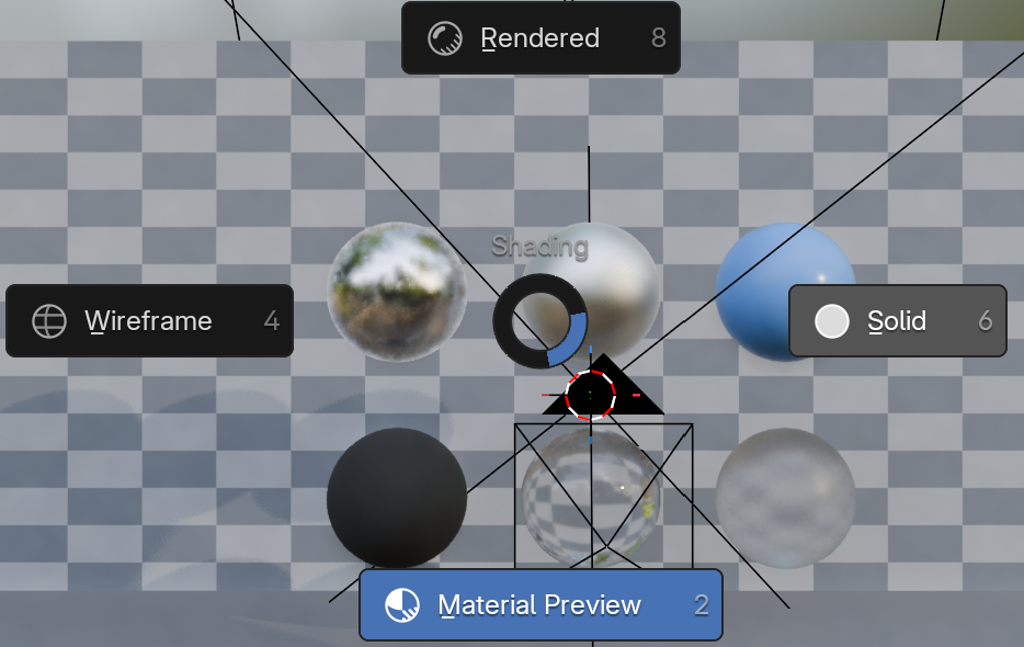
🎯 Pro Workflow Tip: Professional Blender artists constantly switch between shading modes. While modeling, use Solid (Z → 2). While creating materials, use Material Preview (Z → 3). For final checks, use Rendered (Z → 4). This constant switching becomes second nature and dramatically speeds up your workflow!
Understanding Render Engines: Eevee vs. Cycles
Rendered mode uses one of Blender's two render engines. Understanding the difference helps you choose the right tool:
🎨 Eevee vs. Cycles Comparison
| Feature | Eevee | Cycles |
|---|---|---|
| Technology | Real-time rasterization (like game engines) | Path tracing (physically accurate ray tracing) |
| Speed | Very fast, instant viewport updates | Slower, progressive refinement |
| Accuracy | Good approximation, some effects are "faked" | Physically accurate, true light simulation |
| Best For | Stylized work, fast turnaround, animations, games | Photorealism, accurate glass/caustics, product viz |
| Transparent Materials | Fast but requires special settings | Naturally handles complex transparency |
| Reflections | Reflection probes (limited accuracy) | Perfect reflections automatically |
🎯 Which Render Engine Should You Use?
Use Eevee when:
- You need fast results and quick iteration
- Creating stylized, non-photorealistic art
- Working on animations that need fast preview
- Your materials are mostly opaque (metals, plastics, wood)
Use Cycles when:
- You need maximum realism and accuracy
- Working with complex glass, water, or transparent materials
- Creating product visualization or architectural renders
- You need accurate caustics (light patterns from glass/water)
The pragmatic approach: Many artists use Eevee for material creation and fast previews, then switch to Cycles for final renders. Best of both worlds!
Switching Render Engines
You can change render engines at any time:
📝 How to Change Render Engine
- Open Render Properties panel (camera icon on right sidebar)
- Look at top dropdown labeled "Render Engine"
- Choose:
- Eevee: Real-time renderer (fast)
- Cycles: Path tracer (accurate)
- Workbench: Simple OpenGL (rarely used for final work)
- Rendered viewport mode immediately switches to use selected engine
Viewport Performance Tips
If your viewport becomes sluggish when working with materials, try these optimization techniques:
⚡ Speed Up Viewport Performance
- Use Material Preview instead of Rendered: Significantly faster for material work
- Reduce viewport samples: In shading mode dropdown, lower "Samples" value
- Simplify geometry: High polygon counts slow everything down
- Disable viewport overlays: Click overlays icon (two circles) to toggle off extras
- Use lower resolution HDRI: In Material Preview settings, increase Blur or use simpler HDRI
- Close other applications: Free up GPU memory for Blender
- Switch to Solid mode when not actively testing materials
Viewport vs. Final Render
It's important to understand that viewport display—even in Rendered mode—is not identical to a final render (F12):
🎬 Viewport vs. Final Render Differences
| Aspect | Viewport (Rendered Mode) | Final Render (F12) |
|---|---|---|
| Sample Count | Low (16-64 typically) for speed | High (128-4096) for quality |
| Resolution | Viewport size (lower) | Full render resolution |
| Noise | More visible (fewer samples) | Cleaner (more samples) |
| Purpose | Fast preview during work | Final output quality |
Always do a final test render (F12) before considering a material complete. The viewport is for iteration speed, final renders are for quality verification!
Practical Viewport Shading Workflow
Here's how professional artists typically use viewport shading modes throughout a project:
✅ Professional Shading Mode Workflow
- Modeling Phase:
- Primary: Solid mode (Z → 2)
- Occasional: Wireframe (Z → 1) to check topology
- Focus: Shape and form, no material distraction
- Material Creation Phase:
- Primary: Material Preview (Z → 3)
- Adjustments: Rapid iteration with instant feedback
- Testing: Different HDRI environments
- Material Verification:
- Switch to: Rendered mode (Z → 4)
- Check: Glass, transparency, emissive lighting effects
- Verify: Material works in actual scene lighting
- Final Polish:
- Test renders: F12 for full quality check
- Adjustments: Back to Material Preview for tweaks
- Iteration: Repeat until satisfied
Common Viewport Shading Mistakes
⚠️ Avoid These Viewport Pitfalls
Mistake 1: Only working in Solid mode
- Problem: You never see how materials actually look
- Fix: Switch to Material Preview when creating/adjusting materials
Mistake 2: Assuming Material Preview = Final Result
- Problem: Materials look different in final render
- Fix: Always test render (F12) before finishing materials
Mistake 3: Using Rendered mode constantly
- Problem: Slow performance, frustrating workflow
- Fix: Use Material Preview for iteration, Rendered for verification only
Mistake 4: Not understanding render engine differences
- Problem: Materials look wrong because you're using wrong engine
- Fix: Know whether you're viewing Eevee or Cycles in Rendered mode
🎯 Project: Essential Material Library
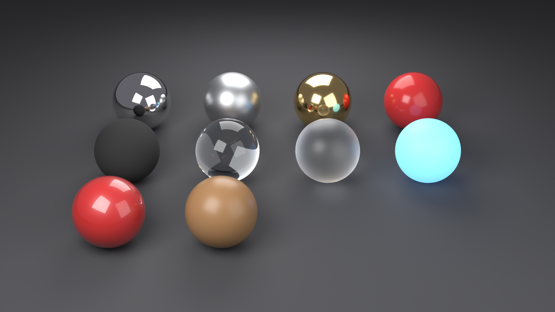
Time to put everything you've learned into practice! In this project, you'll create a comprehensive material library that you can use in all your future Blender projects. Think of this as building your own personal material database—a collection of go-to materials that will save you hours of work down the road.
💡 The Recipe Book Analogy: Every great chef has their collection of reliable recipes—dishes they've perfected and can make without thinking. This material library is your recipe book. Once you've created these materials, you'll have proven formulas you can use, modify, and adapt for any project. It's an investment that pays dividends forever!
Project Overview
📋 Project Objectives
- Create 10 essential materials covering different material types
- Organize materials in a reusable library file
- Test each material under different lighting conditions
- Document your materials with clear naming and notes
- Learn to append materials into new projects
⏱️ Estimated Time: 60-90 minutes
💾 Deliverable: A .blend file containing your personal material library
Step 1: Set Up Your Library Scene
📝 Scene Preparation
- Start fresh: File → New → General
- Delete default camera and light:
- Select camera, press
X, Delete - Select light, press
X, Delete
- Select camera, press
- Keep the default cube (this will be your first material tester)
- Switch to Shading workspace: Click "Shading" tab at top
- Set viewport to Material Preview: Click third sphere icon or press
Z → 3 - Save your file:
- File → Save As
- Name it "My_Material_Library.blend"
- Choose a location you'll remember
- Save!
Step 2: Create Your Material Collection
You'll create 10 essential materials. For each material, follow this process:
🔄 Per-Material Workflow
- Duplicate the cube:
Shift+D, move to side, click to place - Create new material: In Shader Editor, material dropdown → New
- Name it descriptively: Click material name and rename
- Set parameters: Follow specifications below
- Enable Fake User: Click shield icon next to material name (prevents deletion)
- Test: Rotate view, check in different viewport modes
- Save frequently!
Ctrl+S
Material 1: Chrome Metal
✅ Chrome Metal Specifications
Material Name: "Chrome_Metal"
Parameters:
- Base Color: RGB (0.85, 0.85, 0.85) - Light gray
- Metallic: 1.0
- Roughness: 0.05
Use Cases: Car bumpers, jewelry, bathroom fixtures, sci-fi elements
Notes: Almost mirror-like with slight blur. Very reflective!
Material 2: Brushed Steel
✅ Brushed Steel Specifications
Material Name: "Brushed_Steel"
Parameters:
- Base Color: RGB (0.56, 0.57, 0.58) - Blue-gray
- Metallic: 1.0
- Roughness: 0.4
- Anisotropic: 0.7 (for brushed effect)
- Anisotropic Rotation: 0.0
Use Cases: Appliances, tools, machinery, modern architecture
Notes: Satin finish with directional highlights. Professional industrial look.
Material 3: Gold
✅ Gold Specifications
Material Name: "Gold_Polished"
Parameters:
- Base Color: RGB (1.0, 0.71, 0.29) or Hex #FFB54A
- Metallic: 1.0
- Roughness: 0.1
Use Cases: Jewelry, coins, awards, luxury items, decorative elements
Notes: Warm reflections. Adjust roughness for matte gold (0.4) or pure mirror gold (0.0).
Material 4: Glossy Red Plastic
✅ Glossy Plastic Specifications
Material Name: "Plastic_Glossy_Red"
Parameters:
- Base Color: RGB (0.8, 0.05, 0.05) - Bright red
- Metallic: 0.0
- Roughness: 0.2
Use Cases: Toys, phone cases, product design, LEGO bricks
Notes: Change color for other plastic variants. Keep roughness 0.15-0.25 for glossy look.
Material 5: Matte Rubber
✅ Matte Rubber Specifications
Material Name: "Rubber_Matte_Black"
Parameters:
- Base Color: RGB (0.05, 0.05, 0.05) - Very dark gray (not pure black!)
- Metallic: 0.0
- Roughness: 0.95
Use Cases: Tires, rubber grips, gaskets, seals, mouse pads
Notes: Almost no reflection. Soft edge highlights only. Very diffuse appearance.
Material 6: Clear Glass
✅ Clear Glass Specifications
Material Name: "Glass_Clear"
Parameters:
- Base Color: RGB (1.0, 1.0, 1.0) - White
- Metallic: 0.0
- Roughness: 0.0
- Transmission: 1.0
- IOR: 1.45
Use Cases: Windows, bottles, lenses, transparent containers
Notes: Switch to Rendered mode for better preview. Add slight color tint for tinted glass.
Material 7: Frosted Glass
✅ Frosted Glass Specifications
Material Name: "Glass_Frosted"
Parameters:
- Base Color: RGB (1.0, 1.0, 1.0) - White
- Metallic: 0.0
- Roughness: 0.4
- Transmission: 1.0
- IOR: 1.45
Use Cases: Privacy glass, bathroom windows, light diffusers, shower doors
Notes: The roughness creates the frosted effect. Increase to 0.6 for more diffusion.
Material 8: Emissive Blue Glow
✅ Emissive Material Specifications
Material Name: "Emissive_Blue"
Parameters:
- Base Color: RGB (0.02, 0.02, 0.02) - Nearly black
- Metallic: 0.0
- Roughness: 0.8
- Emission Color: RGB (0.2, 0.5, 1.0) - Blue
- Emission Strength: 5.0
Use Cases: Screens, LED panels, neon signs, sci-fi elements, holographics
Notes: Adjust strength 1-20 based on desired brightness. Change emission color for other glow colors.
Material 9: Car Paint (Red)
✅ Car Paint Specifications
Material Name: "Car_Paint_Red"
Parameters:
- Base Color: RGB (0.7, 0.05, 0.05) - Deep red
- Metallic: 0.0
- Roughness: 0.4
- Clearcoat: 1.0
- Clearcoat Roughness: 0.1
Use Cases: Vehicles, coated surfaces, lacquered objects, nail polish
Notes: The clearcoat creates a glossy protective layer. Change base color for other paint colors.
Material 10: Polished Wood
✅ Polished Wood Specifications
Material Name: "Wood_Polished"
Parameters:
- Base Color: RGB (0.35, 0.2, 0.1) - Brown
- Metallic: 0.0
- Roughness: 0.3
- Specular: 0.5 (default)
Use Cases: Furniture, floors, decorative objects, architectural elements
Notes: This is a simplified wood. In future lessons, we'll add grain textures. For raw wood, increase roughness to 0.8.
Step 3: Organize Your Library
Now that you have 10 materials, let's organize them professionally:
📐 Organization Steps
- Arrange objects in a grid:
- Select all cubes:
A(select all) - Space them evenly: Select one cube,
G(move), position nicely - Create 2 rows of 5 cubes or 3 rows as preferred
- Select all cubes:
- Add text labels (optional but helpful):
Shift+A→ Text- Tab into Edit Mode, delete default text
- Type material name
- Position below corresponding cube
- Repeat for each material
- Enable Fake User for all materials:
- For each material, click the shield icon
- This ensures materials save even if objects are deleted
- Critical step—don't skip!
- Create a camera view (optional):
Shift+A→ Camera- Position to frame all cubes nicely
- Useful for quick reference renders
Step 4: Test Your Materials
Before finishing, thoroughly test each material:
🧪 Material Testing Checklist
- Viewport rotation: Rotate view (
Middle Mouse) to see materials from all angles - Different shading modes:
- Material Preview (
Z → 3): Fast preview - Rendered (
Z → 4): Accurate preview, especially for glass
- Material Preview (
- Different HDRI environments:
- In Material Preview mode settings (dropdown arrow)
- Try: studio.exr, forest.exr, interior.exr
- Good materials look correct in any lighting!
- Test render:
- Press
F12to render - Check if materials render correctly
- Esc to close render window
- Press
Step 5: Document and Save
💾 Final Documentation
- Create a reference sheet (optional):
- Take screenshots of each material
- Create a simple text document with material parameters
- Note any special considerations
- Add file notes:
- In Outliner, click File menu
- Add description: "Personal Material Library - 10 Essential Materials"
- Final save:
Ctrl+S(or File → Save)- Verify file location
- You now have a permanent material library!
- Back up your file:
- Copy to cloud storage (Google Drive, Dropbox, etc.)
- Or duplicate to external drive
- This file is valuable—protect it!
Bonus Challenge: Expand Your Library
If you finish early and want to continue practicing, try creating these additional materials:
🌟 Bonus Materials to Add
- Copper Metal: Base Color RGB (0.95, 0.64, 0.54), Metallic 1.0, Roughness 0.2
- White Ceramic: Base Color RGB (0.9, 0.9, 0.9), Metallic 0.0, Roughness 0.15
- Leather: Base Color RGB (0.3, 0.15, 0.1), Metallic 0.0, Roughness 0.7
- Concrete: Base Color RGB (0.5, 0.5, 0.5), Metallic 0.0, Roughness 0.85
- Green Screen Material: Base Color RGB (0.0, 1.0, 0.0), Metallic 0.0, Roughness 0.8, Emission Green, Strength 2.0
How to Use Your Material Library in Future Projects
You've created this library—now learn how to use it effectively:
✅ Appending Materials to New Projects
- Open your new project (or create one)
- File → Append (NOT "Link"—Append makes a copy)
- Navigate to your My_Material_Library.blend file
- Double-click to open the file structure
- Open the "Material" folder
- You'll see all your materials listed!
- Select materials you want:
- Single click to select one
Shift+Clickto select multipleAto select all
- Click "Append" button (bottom right)
- Materials are now available in your project!
- Select object
- In Shader Editor, click material dropdown
- Your appended materials appear in the list
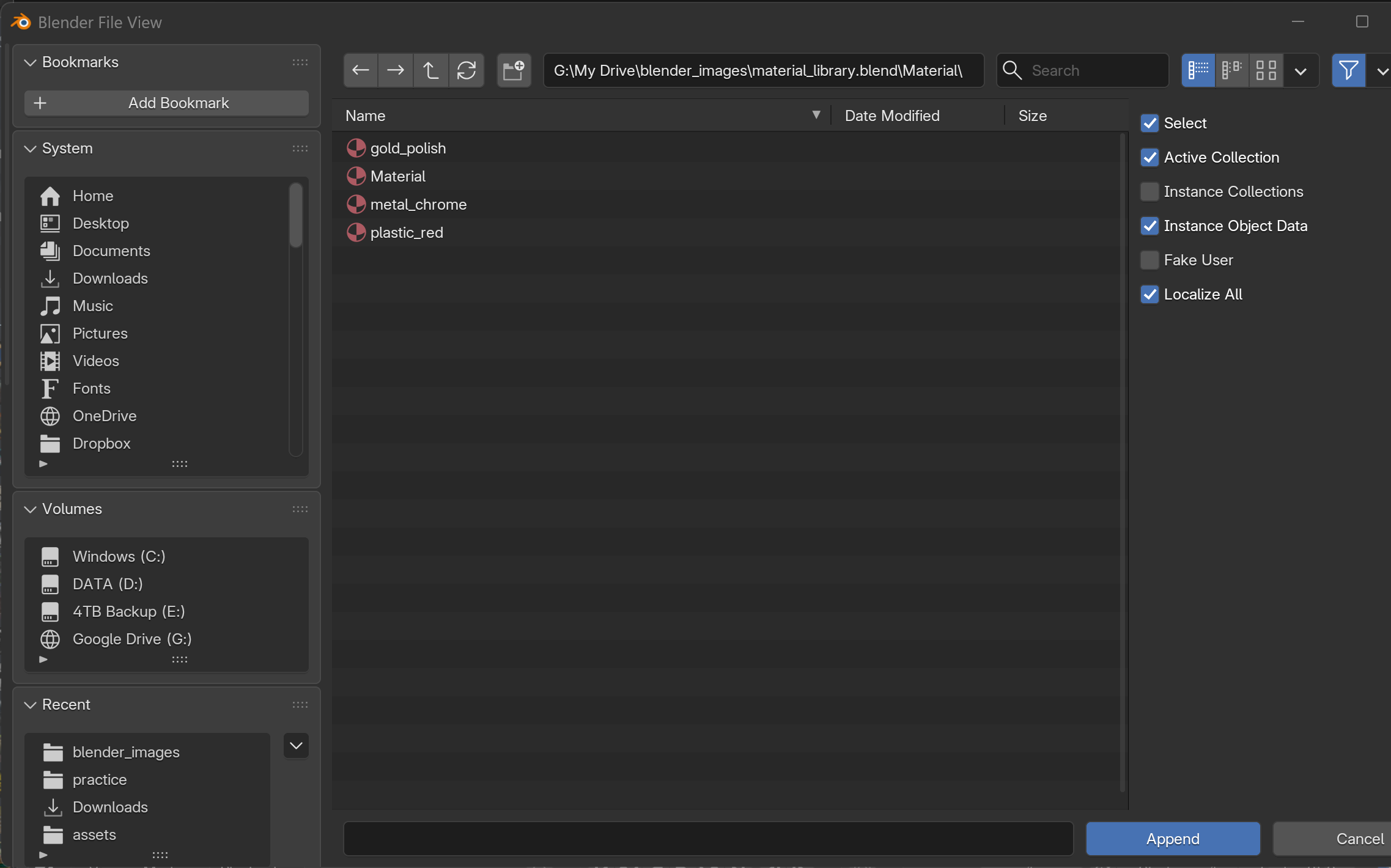
💡 Pro Tips for Material Library Usage
- Append vs. Link: Always use Append (makes independent copy). Link creates dependency on library file.
- Modify after appending: Appended materials can be freely modified without affecting library
- Keep library updated: When you create great new materials, add them to your library file
- Create category files: As library grows, consider separate files: Metals.blend, Plastics.blend, Glass.blend
- Share with team: Your library can be shared with collaborators—great for consistent look across projects!
Project Success Criteria
You've successfully completed this project when you can check off all these items:
✅ Project Completion Checklist
- ☐ Created all 10 essential materials with correct parameters
- ☐ Each material has a descriptive, clear name
- ☐ All materials have Fake User enabled (shield icon)
- ☐ Objects are organized neatly in viewport
- ☐ Tested materials in different viewport shading modes
- ☐ Tested materials with different HDRI environments
- ☐ Completed at least one test render (F12)
- ☐ File saved as "My_Material_Library.blend"
- ☐ Successfully appended materials into a new test project
- ☐ File backed up to safe location
What You've Accomplished
🎉 Congratulations!
By completing this project, you've:
- Built a reusable asset library that will accelerate all future projects
- Mastered the Principled BSDF shader across diverse material types
- Learned professional material organization and workflow practices
- Understood the relationship between material parameters and real-world appearance
- Gained hands-on experience with metals, dielectrics, glass, and emissive materials
- Created something immediately useful that you'll reference constantly
This library is the foundation of your material creation skills. Every professional 3D artist has material libraries they've built over time. You've just started yours!
Next Steps Beyond This Project
🚀 Continue Your Material Journey
- Experiment with variations: Try different colors, roughness values, and combinations
- Study real materials: Take photos of interesting surfaces and try to recreate them
- Add to your library: Whenever you create a great material, save it to your library
- Practice appending: Use your library in actual projects to build the habit
- Learn texturing: The next lessons will teach you how to add image textures to these base materials
- Explore node networks: Future lessons cover advanced node combinations and techniques
🎓 Lesson Summary
What a journey! You've gone from complete material beginner to creating professional-quality materials with confidence. Let's review everything you've mastered in this comprehensive lesson.
🌟 Key Takeaways
- Materials define how surfaces interact with light—they're crucial for realism
- The Shader Editor is node-based—visual programming that's powerful and flexible
- Principled BSDF is your main shader—one node handles 90% of material types
- Metallic and Roughness are the two most important parameters for basic materials
- PBR (Physically Based Rendering) follows real-world physics for predictable results
- Material Preview mode is perfect for material creation—fast and accurate enough
- Different viewport shading modes serve different purposes in your workflow
- Building a material library saves time and improves consistency across projects
🎯 Skills You've Gained
- Navigate the Shader Editor with confidence
- Understand node connections and data flow
- Use Principled BSDF parameters to create any material type
- Create metals, plastics, glass, and emissive materials from scratch
- Distinguish between material types and choose correct parameters
- Use viewport shading modes effectively for different tasks
- Test materials under various lighting conditions
- Organize and reuse materials through library files
- Append materials between projects efficiently
From Gray to Gorgeous
Remember that gray cube you started with? Now you can make it look like polished gold, rough rubber, transparent glass, glowing neon, or anything else you can imagine. That's the power of materials—transforming geometry into convincing, beautiful surfaces.
🎨 The Artist's Perspective: Materials are like the paint and finish on a sculpture. The geometry is your form, but materials give it character, believability, and emotion. A steel sphere feels cold and industrial. A gold sphere feels luxurious and precious. The geometry is identical—the material tells the story!
What's Next: Your Material Mastery Path
🗺️ Looking Ahead
Lesson 11: PBR Materials Explained
- Deep dive into Physically Based Rendering theory
- Advanced Principled BSDF techniques
- Understanding material properties scientifically
- Complex material combinations
Lesson 12: UV Unwrapping Basics
- How to control where textures appear
- UV mapping fundamentals
- Unwrapping different object types
- Seam placement strategies
Lesson 13: Texture Painting
- Paint directly on 3D models
- Create custom textures in Blender
- Hand-painted detail work
Lesson 14: Procedural Textures
- Generate textures mathematically
- Noise, Voronoi, and pattern nodes
- Infinitely flexible, resolution-independent textures
Practice Recommendations
To truly master materials, practice is essential. Here are some exercises to reinforce your skills:
✅ Recommended Practice Exercises
- Material study: Find reference photos of materials and try to recreate them exactly
- Create material variations: Take one of your library materials and create 5 variations
- Material scenes: Create a simple scene (e.g., desk with objects) and apply different materials
- Challenge yourself: Try creating materials like: wet surfaces, dirty metals, weathered wood, frosted candy
- Speed rounds: Set a timer for 5 minutes and create as many distinct materials as possible
- Real-world observation: Look at objects around you and identify their material properties (metallic? roughness level?)
Common Questions Answered
❓ Frequently Asked Questions
Q: Can I use these materials commercially?
A: Absolutely! Materials you create are yours to use however you want—personal, commercial, anything!
Q: Why don't my materials look exactly like the photos I'm referencing?
A: Lighting! The same material looks completely different under different lights. Try changing your HDRI or adding lights.
Q: How many materials should be in my library?
A: Start with these 10, then add as you go. Professional artists have hundreds, but they build them over years.
Q: Can I edit materials after appending them to a project?
A: Yes! Appended materials are independent copies. Edit freely without affecting your library.
Q: Should I learn Cycles or Eevee?
A: Both! The materials you create work in both engines. Learn what each is good at and use appropriately.
Q: My glass looks wrong/dark in the viewport.
A: Switch to Rendered mode (Z → 4) for accurate glass preview. Material Preview has limitations with transparency.
🎊 Congratulations on Completing Lesson 10!
You've taken a massive step forward in your Blender journey. Materials are what separate amateur CG from professional work, and you now have the foundation to create stunning, believable surfaces. Your material library will grow with every project, becoming an increasingly valuable asset.
Keep experimenting, keep observing the real world, and most importantly—keep creating!
Ready for even deeper material knowledge? Lesson 11 awaits, where we'll explore the science and advanced techniques behind PBR materials. See you there! 🚀